Copperplate Script features elegant, flowing strokes that mimic traditional 18th-century calligraphy, making it popular for formal invitations and decorative writing. Its distinct contrast between thick and thin lines requires precise pressure control with a pointed nib to achieve the signature look. Explore the rest of this article to master Copperplate Script and enhance your handwriting skills.
Table of Comparison
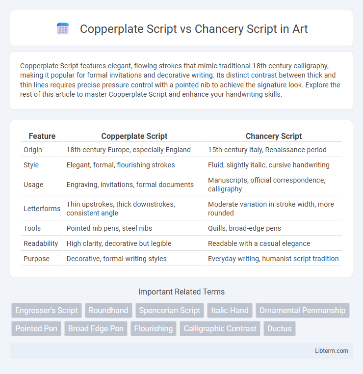
| Feature | Copperplate Script | Chancery Script |
|---|---|---|
| Origin | 18th-century Europe, especially England | 15th-century Italy, Renaissance period |
| Style | Elegant, formal, flourishing strokes | Fluid, slightly italic, cursive handwriting |
| Usage | Engraving, invitations, formal documents | Manuscripts, official correspondence, calligraphy |
| Letterforms | Thin upstrokes, thick downstrokes, consistent angle | Moderate variation in stroke width, more rounded |
| Tools | Pointed nib pens, steel nibs | Quills, broad-edge pens |
| Readability | High clarity, decorative but legible | Readable with a casual elegance |
| Purpose | Decorative, formal writing styles | Everyday writing, humanist script tradition |
Introduction to Copperplate Script
Copperplate Script, known for its elegant and ornate style, features flowing, looped strokes created with a pointed pen, often used in formal invitations and certificates. It emphasizes consistent slant angles and intricate hairlines alongside thick downstrokes, making it distinct from the more structured and angular Chancery Script. Originating in the 18th century, Copperplate Script remains a popular choice for calligraphers seeking refined decorative lettering.
Overview of Chancery Script
Chancery Script, originating in 15th-century Italy, is characterized by its italicized, flowing strokes and clear, elegant letterforms designed for legibility and speed in official documents. It influenced the development of modern cursive handwriting and maintains a formal yet approachable style, distinguished from the more ornamental and elaborate Copperplate Script. The script's emphasis on balanced proportions and diagonal stress creates a harmonious and readable text widely used in calligraphy and typography.
Historical Origins and Development
Copperplate Script originated in the 17th century as a calligraphic style engraved on copper plates for printing, emphasizing fluid, elegant strokes and uniformity perfected during the English Renaissance. Chancery Script traces back to the 15th century Italian Renaissance, evolving from the cursive hand used by papal scribes to a more formal yet expressive hand known as Cancelleresca, characterized by its rhythmic and slanted letterforms. Both scripts significantly influenced the development of modern calligraphy, with Copperplate emphasizing precision and refinement while Chancery emphasized legibility and decorative flair in official documentation.
Distinctive Stylistic Features
Copperplate Script is characterized by its fine hairlines and thick downstrokes created through pointed pen calligraphy, featuring highly ornate loops and flourishing letters that convey elegance and formality. Chancery Script, originating from the Italian Renaissance, displays more upright and less exaggerated strokes with moderate contrast, emphasizing legibility and rhythmic, flowing letterforms. The primary distinction lies in Copperplate's dramatic contrast and elaborate embellishments versus Chancery's balanced proportions and restrained decorative elements.
Tools and Materials Used
Copperplate Script requires a pointed nib dip pen and smooth, high-quality paper to achieve its characteristic thin and thick stroke contrasts through pressure variation. Chancery Script traditionally uses a broad-edged pen or quill, paired with parchment or vellum, producing uniform, angular strokes ideal for formal documents. Ink quality also plays a crucial role; Copperplate favors fluid inks for seamless flow, while Chancery benefits from slightly viscous inks to maintain crisp edges.
Writing Techniques and Letterforms
Copperplate Script features precise, flowing strokes created with pointed nibs that vary line thickness through pressure, emphasizing elegant, looped ascenders and descenders with consistent slant angles. Chancery Script, originating from Renaissance chancery hands, employs a slightly broader nib to produce more uniform, angular letterforms with less contrast between thick and thin strokes and distinct open counters. Writing techniques in Copperplate require delicate pressure control for smooth curves and elaborate flourishes, while Chancery relies on careful angle maintenance for legibility and rapid, rhythmic pen movements.
Common Uses and Applications
Copperplate Script is commonly used for formal invitations, certificates, and elegant branding due to its intricate, flowing strokes that evoke sophistication and tradition. Chancery Script often appears in calligraphy books, historical documents, and artistic projects, valued for its slightly more casual, medieval-inspired style that balances readability with decorative flair. Both scripts serve distinct purposes in design, with Copperplate favored for luxury and formality, while Chancery enhances creative and historical aesthetics.
Legibility and Readability Comparison
Copperplate Script features elegant, flowing strokes with consistent thin and thick lines, making it visually appealing but often challenging for quick reading due to its ornate flourishes. Chancery Script offers clearer letterforms and more uniform spacing, enhancing legibility, especially in longer texts or formal documents. Readers generally find Chancery Script easier to decipher at smaller sizes, while Copperplate Script suits decorative purposes where style takes precedence over readability.
Influence on Modern Calligraphy
Copperplate Script's elegant, flowing curves and precise, thin hairlines have significantly influenced modern calligraphy styles, inspiring many contemporary artists to incorporate its refined structure and delicate strokes. Chancery Script, with its dynamic, slightly slanted letterforms and historic Renaissance origin, contributes to modern calligraphy by offering a more casual yet sophisticated alternative emphasizing legibility and rhythm. Both scripts continue to shape digital font design and hand-lettering trends, merging classical techniques with modern aesthetics.
Choosing Between Copperplate and Chancery Scripts
Choosing between Copperplate and Chancery scripts depends on the desired aesthetic and application context, with Copperplate offering elegant, flowing strokes ideal for formal invitations and certificates, while Chancery provides a more historic, slightly angular style suited for literary and historical documents. Copperplate's fine hairlines and consistent contrast require precise tools like pointed nibs, whereas Chancery embraces broader strokes and variable angles, often executed with a broad-edged pen. Understanding the script's historical use and visual impact helps in selecting the appropriate style for branding, typography, or calligraphy projects.
Copperplate Script Infographic