Local color brings a sense of authenticity and vividness to storytelling by highlighting the unique customs, dialects, landscapes, and traditions of a specific region. This technique enriches narratives by immersing readers in the cultural and environmental details that define a place, making the story more relatable and engaging. Explore the rest of the article to discover how local color can deepen your understanding and appreciation of diverse settings.
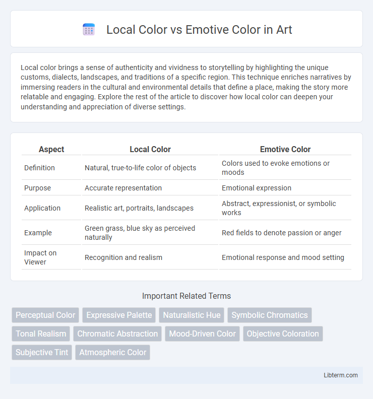
Table of Comparison
| Aspect | Local Color | Emotive Color |
|---|---|---|
| Definition | Natural, true-to-life color of objects | Colors used to evoke emotions or moods |
| Purpose | Accurate representation | Emotional expression |
| Application | Realistic art, portraits, landscapes | Abstract, expressionist, or symbolic works |
| Example | Green grass, blue sky as perceived naturally | Red fields to denote passion or anger |
| Impact on Viewer | Recognition and realism | Emotional response and mood setting |
Defining Local Color: Capturing True Hues
Local color refers to the inherent and objective hues of objects as they appear under neutral lighting conditions, emphasizing accurate and consistent representation of colors in art and design. This concept captures the true color characteristics of surfaces independent of light effects, shadows, or emotional interpretations. Understanding local color is essential for achieving realistic depictions and serves as a foundation for distinguishing between natural coloration and emotive color used to evoke mood or atmosphere.
Understanding Emotive Color: Conveying Feeling Through Shades
Emotive color transcends the literal representation of objects by using shades and hues to evoke specific feelings and moods, enhancing the emotional impact in visual art and design. This approach contrasts with local color, which depicts the object's true color under neutral lighting, focusing instead on the psychological and atmospheric effects of colors like warm reds to convey passion or cool blues to evoke calmness. Mastering emotive color enables artists to create immersive experiences that communicate beyond visual accuracy, engaging viewers through subtle emotional cues embedded in color choices.
Historical Context: Local Color in Classical Art
Local color in classical art refers to the natural, inherent colors of objects as perceived in neutral lighting, emphasizing realistic representation prevalent in Renaissance and Baroque periods. This focus on natural hues allowed artists like Vermeer and Caravaggio to achieve lifelike depictions, aligning with the era's pursuit of humanism and scientific observation. Emotive color, contrastingly, emerged later with movements such as Romanticism, prioritizing psychological impact over strict realism.
Emotion in Art: The Rise of Emotive Color
Emotive color in art transcends the realistic depiction of objects by utilizing hues to evoke deep emotional responses, contrasting with local color which represents the natural color of subjects under neutral lighting. Artists increasingly harness emotive color to convey mood, atmosphere, and psychological intensity, transforming viewers' experiences and interpretations. This rise reflects a broader movement in modern art prioritizing subjective perception and emotional resonance over strict visual accuracy.
Techniques for Painting Local Color
Techniques for painting local color involve accurately capturing the true, inherent hues of objects as perceived under neutral lighting conditions, emphasizing precision in pigment application to reflect their natural appearance. Artists utilize methods such as layering pure colors, employing flat washes, and careful color mixing to maintain the integrity of an object's authentic shade without distortion from lighting or atmosphere. Mastery in observing and replicating local color enhances realism and provides a foundational palette before introducing emotive or atmospheric variations.
Techniques for Creating Emotive Color Effects
Techniques for creating emotive color effects involve manipulating hue, saturation, and value to evoke specific psychological responses beyond the true-to-life representation of local color. Artists often employ exaggerated contrasts, warm or cool color palettes, and color symbolism to intensify emotional impact and convey mood. Layering glazes, blending seamlessly, and strategic color placement further enhance the expressive quality of emotive color in visual compositions.
Local Color vs Emotive Color: Key Differences
Local color refers to the natural, true-to-life color of an object as perceived under standard lighting conditions, essential for accurate visual representation in art and design. Emotive color, by contrast, is used to evoke specific emotions or moods, often distorting local color to create psychological impact within the viewer. The key difference lies in local color's objective realism versus emotive color's subjective, expressive function in visual communication.
Case Studies: Famous Works Using Local Color
Local color refers to the natural, objective hues of objects under neutral lighting, exemplified by Claude Monet's "Water Lilies," where the colors reflect true-to-life appearances. Emotive color, in contrast, emphasizes subjective feelings and mood, as seen in Edvard Munch's "The Scream," which uses intense reds and oranges to evoke anxiety. Monet's use of local color showcases the transient effects of natural light on water and foliage, highlighting how specific environments shape color perception.
Case Studies: Masterpieces Employing Emotive Color
Emotive color in masterpieces like Edvard Munch's "The Scream" uses intense reds and oranges to evoke psychological distress, contrasting with local colors that represent objects' natural hues. Vincent van Gogh's "Starry Night" employs swirling blues and yellows to convey emotional turbulence and hope beyond realistic color depiction. These case studies illustrate how emotive color manipulation enhances narrative depth and viewer engagement beyond the physical accuracy of local color.
Choosing Between Local and Emotive Color in Contemporary Art
Choosing between local color and emotive color in contemporary art involves balancing objective representation with expressive impact. Local color refers to the true color of objects under natural light, whereas emotive color employs hues to evoke specific feelings or moods regardless of realism. Artists often prioritize emotive color to create atmosphere and convey psychological depth, while local color anchors the work in reality and familiarity.
Local Color Infographic