A split-complementary palette offers a rich and balanced color scheme by combining one base color with two adjacent hues to its complementary color. This approach creates striking contrast without the intensity of direct complementary colors, making your designs visually appealing and harmonious. Explore the rest of this article to learn how to effectively apply the split-complementary palette in your creative projects.
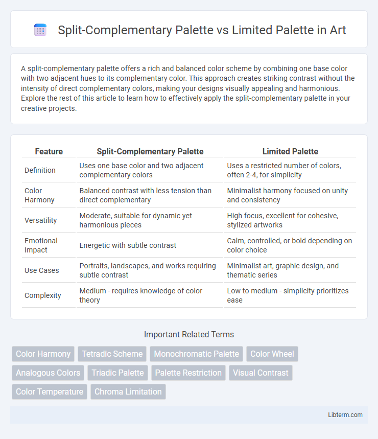
Table of Comparison
| Feature | Split-Complementary Palette | Limited Palette |
|---|---|---|
| Definition | Uses one base color and two adjacent complementary colors | Uses a restricted number of colors, often 2-4, for simplicity |
| Color Harmony | Balanced contrast with less tension than direct complementary | Minimalist harmony focused on unity and consistency |
| Versatility | Moderate, suitable for dynamic yet harmonious pieces | High focus, excellent for cohesive, stylized artworks |
| Emotional Impact | Energetic with subtle contrast | Calm, controlled, or bold depending on color choice |
| Use Cases | Portraits, landscapes, and works requiring subtle contrast | Minimalist art, graphic design, and thematic series |
| Complexity | Medium - requires knowledge of color theory | Low to medium - simplicity prioritizes ease |
Introduction to Color Palettes
Split-complementary palettes use one base color and two adjacent complementary hues, offering vibrant contrast with balanced harmony, ideal for dynamic designs. Limited palettes restrict colors to a small range, enhancing cohesion and simplicity while emphasizing tone and texture. Understanding these palettes unlocks effective color strategies for visual impact and consistency.
What is a Split-Complementary Palette?
A Split-Complementary Palette consists of one base color paired with two adjacent colors to its complement, creating high contrast with less tension than a traditional complementary scheme. This approach offers balanced visual interest and versatility in design, making it ideal for achieving harmonious yet dynamic color combinations. Compared to a Limited Palette, which uses fewer colors for simplicity and minimalism, the Split-Complementary Palette provides more diversity while maintaining cohesion.
Key Features of Split-Complementary Palettes
Split-complementary palettes feature one base color paired with two adjacent colors to its complementary, creating vibrant contrasts and balanced harmony, ideal for dynamic and visually engaging designs. This palette enhances color variety without overwhelming, offering more flexibility than limited palettes, which rely on fewer colors for simplicity and cohesion. Key features include improved visual interest, ease of color pairing, and strong contrast with less tension than direct complementary schemes.
Understanding Limited Palettes
Limited palettes consist of a restricted number of colors, focusing on cohesion and simplicity to create visually harmonious designs. Unlike split-complementary palettes that use three colors with one base and two adjacent complementary hues, limited palettes emphasize fewer colors to enhance versatility and reduce visual complexity. This approach streamlines color choices, making it easier to maintain consistency and balance throughout a creative project or artwork.
Benefits of Using Limited Palettes
Using a limited palette enhances color harmony by restricting the number of hues, making it easier to create cohesive and balanced designs. This approach improves visual clarity and reduces cognitive load for viewers, ensuring the message stands out effectively. Limited palettes also streamline the decision-making process for artists and designers, fostering creativity within defined constraints.
Visual Contrast: Split-Complementary vs Limited
Split-complementary palettes offer stronger visual contrast by combining one base color with two adjacent colors to its complement, enhancing dynamic color interaction. Limited palettes use a narrow selection of hues, which results in subtler contrast and a more harmonious, understated look. The split-complementary approach increases vibrancy without overwhelming, while limited palettes prioritize cohesion and simplicity in design.
Creative Applications in Art and Design
Split-complementary palettes offer artists and designers a balanced color scheme by combining one base color with two adjacent complementary colors, enhancing visual interest and dynamic contrast in creative projects. Limited palettes restrict the color range to few hues, promoting cohesion and strong thematic expression while encouraging innovative mixing techniques to achieve depth and variation. Both approaches support unique artistic styles, with split-complementary palettes excelling in vibrancy and limited palettes shining in minimalism and mood-focused designs.
Color Harmony and Mood
A split-complementary palette enhances color harmony by combining one base color with two adjacent colors to its complement, creating vibrant yet balanced contrasts that evoke dynamic and energetic moods. In contrast, a limited palette restricts colors to a few harmonious hues, fostering cohesion and subtlety that often produce calm, minimalist, or sophisticated atmospheres. Both palettes influence emotional response by carefully controlling color relationships, but split-complementary emphasizes contrast and vibrancy while limited palettes prioritize unity and simplicity.
Tips for Choosing a Suitable Palette
When selecting between a split-complementary palette and a limited palette, consider the project's emotional tone and complexity requirements; split-complementary offers vibrant contrast without overwhelming, ideal for dynamic visuals, while limited palettes ensure simplicity and cohesion, perfect for minimalist designs. Analyze the color harmony needed: split-complementary schemes balance three colors with two adjacent complements for visual interest, whereas limited palettes reduce color variety to emphasize branding consistency or mood. Evaluate audience perception and medium constraints to choose a palette that enhances clarity and engagement without sacrificing versatility or accessibility.
Conclusion: Which Palette Works Best?
Split-complementary palettes offer vibrant color contrast by combining one base color with two adjacent complementary hues, creating dynamic and visually striking designs. Limited palettes focus on simplicity and cohesion, using fewer colors to evoke harmony and clarity, ideal for minimalist or refined aesthetics. Selecting the best palette depends on the project's goals: use split-complementary for energetic and engaging visuals, and limited palettes for subtle, elegant, and focused compositions.
Split-Complementary Palette Infographic