Monet's Blues explores the profound emotions captured in Claude Monet's use of color and light to evoke a sense of melancholy and tranquility in his artwork. The interplay of cool blue tones creates a soothing yet introspective atmosphere that resonates deeply with viewers. Discover how Monet's masterful technique transforms ordinary scenes into timeless expressions of emotion by reading the full article.
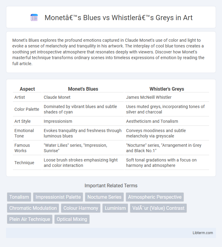
Table of Comparison
| Aspect | Monet's Blues | Whistler's Greys |
|---|---|---|
| Artist | Claude Monet | James McNeill Whistler |
| Color Palette | Dominated by vibrant blues and subtle shades of cyan | Uses muted greys, incorporating tones of silver and charcoal |
| Art Style | Impressionism | Aestheticism and Tonalism |
| Emotional Tone | Evokes tranquility and freshness through luminous blues | Conveys moodiness and subtle melancholy via greyscale |
| Famous Works | "Water Lilies" series, "Impression, Sunrise" | "Nocturne" series, "Arrangement in Grey and Black No.1" |
| Technique | Loose brush strokes emphasizing light and color interaction | Soft tonal gradations with a focus on harmony and atmosphere |
Introduction: Contrasting Palettes in Art History
Monet's Blues embody vibrant, luminous hues that capture transient light and atmosphere, contrasting sharply with Whistler's Greys, which emphasize subdued, harmonious tones reflecting mood and subtlety. This dichotomy between the Impressionist's dynamic color intensities and the Tonalist's nuanced greyscale palette highlights distinct artistic philosophies in 19th-century art history. Their contrasting palettes reveal fundamental differences in approaches to color theory and emotional expression in painting.
Claude Monet’s Signature Use of Blue
Claude Monet's signature use of blue in his paintings is characterized by vibrant, luminous shades that capture the shifting qualities of light and atmosphere, often evoking a sense of tranquility and depth. In contrast to James McNeill Whistler's preference for muted grey tones, Monet employed blues to articulate reflections, water, and sky with dynamic intensity and emotional resonance. This strategic application of blue underscores Monet's commitment to Impressionist principles, emphasizing natural light and color over detailed realism.
James Whistler and His Mastery of Grey Tones
James Whistler revolutionized the use of grey tones by masterfully blending subtle variations to create atmospheric depth and mood in his paintings, a technique exemplified in his "Whistler's Greys" series. Unlike Monet's vibrant, color-intensive blues, Whistler's subdued palette emphasized tonal harmony and nuanced contrast, enhancing the emotional resonance of urban and nocturnal scenes. His innovative approach to grey tones influenced modern art by demonstrating how restrained color schemes can evoke complex visual narratives and sophisticated aesthetic balance.
Color Symbolism: Emotional Impact of Blue vs Grey
Monet's blues evoke tranquility, depth, and introspection, symbolizing calmness and spiritual reflection in his paintings. Whistler's greys convey melancholy, sophistication, and ambiguity, creating a mood of subtle elegance and muted emotional intensity. The emotional impact of blue centers on serenity and peacefulness, while grey emphasizes restraint and contemplative detachment.
Technique and Brushwork: Monet vs Whistler
Monet's brushwork in Blues emphasizes vivid, loose, and rapid strokes that capture the transient effects of light and atmosphere, highlighting his Impressionist technique of layering color to evoke emotion. Whistler's approach in Greys employs more controlled, subtle brushstrokes with a focus on tonal harmony and muted color palettes, reflecting his Tonalist method of creating mood through delicate gradations. The contrast between Monet's vibrant, textured application and Whistler's restrained, smooth execution underscores their distinct artistic philosophies and mastery of technique.
Light, Atmosphere, and Mood in Their Works
Monet's blues capture the transient effects of natural light, creating vibrant, atmospheric depth that conveys a sense of fleeting serenity and dynamic movement. Whistler's greys emphasize subtle tonal variations and muted palettes, generating a contemplative, almost somber mood with a focus on harmony and refinement. Both artists manipulate light and color to evoke distinct emotional responses: Monet with luminous intensity and Whistler with understated elegance.
Influences: Impressionism Meets Tonalism
Monet's blues capture the vibrant light and color shifts characteristic of Impressionism, emphasizing atmospheric effects and fleeting moments, while Whistler's greys reflect Tonalism's muted palette and focus on mood and harmony through subtle tonal variations. Impressionist techniques in Monet's work draw from plein air painting and natural light observation, contrasting with Whistler's Tonalist approach inspired by Japanese aesthetics and the emphasis on harmony and simplicity. This interplay highlights how Impressionism's dynamic color contrasts and Tonalism's restrained, monochromatic schemes each shape the emotional resonance of their respective landscapes.
Iconic Paintings: Notable Examples of Blues and Greys
Monet's Blues, exemplified in works like "Water Lilies" and "Impression, Sunrise," showcase vibrant, luminous blues that capture natural light and atmospheric effects with fluid brushstrokes. Whistler's Greys, as seen in "Nocturne in Grey and Gold" and "Arrangement in Grey and Black No.1," emphasize subtle tonal variations and muted greys, creating a refined, moody ambiance focused on composition and harmony. These iconic paintings highlight the distinct emotional and visual impact achieved through the masterful use of blues and greys in Impressionism and Tonalism.
Critical Reception: How Audiences Perceive Their Colors
Monet's blues evoke a vibrant, luminous quality that critics praise for capturing the ephemeral nature of light and water, often describing his palette as emotionally resonant and dynamic. Whistler's greys are acclaimed for their subtle tonal variations and atmospheric depth, with audiences appreciating the sophisticated restraint and elegance that convey mood through minimal color contrasts. The critical reception reveals Monet's colors as expressive and sensory, while Whistler's hues emphasize compositional harmony and tonal balance.
Legacy: The Enduring Influence of Monet’s Blues and Whistler’s Greys
Monet's blues embody the vibrant, dynamic brushstrokes characteristic of Impressionism, influencing generations of artists through their vivid exploration of light and atmosphere. Whistler's greys, marked by subtle tonal variations and refined composition, have inspired modern approaches to minimalism and tonal harmony in art. The enduring legacy of these color palettes is evident in their continued study and adaptation across contemporary painting, design, and visual culture.
Monet’s Blues Infographic