Dot density mapping visually represents data by placing dots proportionally to a variable's frequency within geographic areas, enhancing spatial understanding of distributions. This method helps in identifying patterns and clusters that might be overlooked in other mapping techniques. Explore the full article to discover how dot density maps can transform your data visualization and analysis.
Table of Comparison
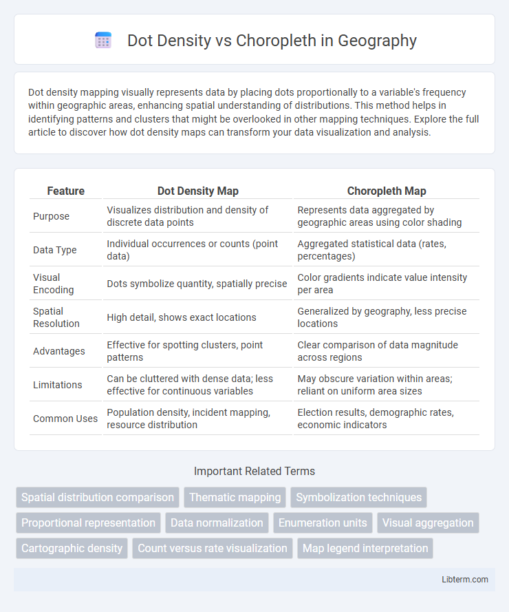
| Feature | Dot Density Map | Choropleth Map |
|---|---|---|
| Purpose | Visualizes distribution and density of discrete data points | Represents data aggregated by geographic areas using color shading |
| Data Type | Individual occurrences or counts (point data) | Aggregated statistical data (rates, percentages) |
| Visual Encoding | Dots symbolize quantity, spatially precise | Color gradients indicate value intensity per area |
| Spatial Resolution | High detail, shows exact locations | Generalized by geography, less precise locations |
| Advantages | Effective for spotting clusters, point patterns | Clear comparison of data magnitude across regions |
| Limitations | Can be cluttered with dense data; less effective for continuous variables | May obscure variation within areas; reliant on uniform area sizes |
| Common Uses | Population density, incident mapping, resource distribution | Election results, demographic rates, economic indicators |
Introduction to Dot Density and Choropleth Maps
Dot density maps represent data using dots where each dot corresponds to a specific quantity, providing a clear visual density of features across a geographic area. Choropleth maps display data by shading predefined areas, such as states or counties, based on variable intensity or value, offering an easy comparison of relative data magnitudes. Both map types are essential for spatial data visualization but serve distinct purposes depending on whether the focus is on exact quantities or overall distribution patterns.
Understanding Dot Density Maps
Dot density maps use individual dots to represent a specific quantity of a variable within defined geographic areas, providing precise spatial distribution insights. Each dot corresponds to a fixed number of occurrences, allowing users to visually assess patterns such as population density or incidence rates at a granular level. This method enhances the detection of clusters and variations within regions compared to choropleth maps, which aggregate data into color-coded regions based on averages or totals.
Exploring Choropleth Maps
Choropleth maps visually represent data through varying shades of color applied to predefined geographic areas, making it easier to identify patterns and trends across regions. These maps excel at displaying normalized data such as population density or election results by using color gradients to depict different data ranges. Their effectiveness depends on careful classification of data and color selection to ensure clear, accurate interpretation without misrepresenting spatial distribution.
Data Visualization Purposes
Dot density maps excel in representing precise quantities and distribution patterns by placing individual dots for specific data points, making them ideal for visualizing population density or event occurrences. Choropleth maps use color gradients to depict aggregated statistical values across predefined areas, enhancing comprehension of regional variations and trends like income levels or election results. Choosing between the two depends on the need for granular spatial detail versus summarizing data across geographic boundaries in visual analytics.
Types of Data Best Suited for Each Map
Dot density maps are ideal for representing discrete data points such as population counts or event locations, capturing exact numbers and spatial distribution with individual dots. Choropleth maps suit aggregated data like rates, averages, or percentages within predefined areas, effectively illustrating regional variations and trends. Choosing the appropriate map depends on whether the data is precise point-based or summarized over geographic units.
Advantages of Dot Density Maps
Dot density maps provide a clear visualization of population distribution by representing individual data points, allowing precise identification of clusters and patterns within geographic areas. These maps effectively avoid the misleading generalizations common in choropleth maps by showing the actual density rather than aggregated averages across regions. The granularity of dot density maps enhances spatial analysis accuracy, making them ideal for detailed urban planning and resource allocation.
Benefits of Choropleth Maps
Choropleth maps effectively visualize spatial data by shading geographic areas in proportion to the statistical variable, making it easier to identify patterns and trends across regions. They provide clear, immediate comparisons between different geographic units, which enhances interpretability for demographic, economic, or environmental data. The use of color gradients in choropleth maps improves data communication by highlighting intensity variations, aiding decision-making processes in fields like public health and urban planning.
Limitations and Common Pitfalls
Dot density maps often struggle with overplotting in densely populated areas, leading to misinterpretation of data clusters and uneven visual emphasis. Choropleth maps can suffer from the modifiable areal unit problem (MAUP), where arbitrary boundary definitions distort spatial patterns and skew statistical analysis. Both methods risk misleading interpretation if data normalization is neglected, causing erroneous conclusions about absolute versus relative measures.
Choosing the Right Map for Your Data
Choosing the right map depends on the nature and precision of your data: dot density maps are ideal for displaying exact locations and counts of individual occurrences, offering granular insight into distribution patterns. Choropleth maps, on the other hand, effectively represent aggregated data values within defined geographic boundaries, making them suitable for illustrating density or intensity variations across regions. Selecting between these map types hinges on whether your goal is to emphasize discrete data points or summarize quantitative information spatially.
Best Practices in Thematic Mapping
Dot Density maps effectively represent quantitative spatial data by placing dots proportional to values, enhancing pattern recognition and avoiding aggregation bias common in Choropleth maps, which use color gradients to visualize density or intensity. Best practices recommend choosing Dot Density for detailed event distributions and small area variations, ensuring dot size and placement avoid overlap and clutter, while Choropleth maps suit aggregated data with clear class intervals and color schemes that maintain perceptual uniformity for easy comparison. Combining both methods or integrating interactive elements can improve thematic map readability, accuracy, and user engagement in spatial data analysis.
Dot Density Infographic