Sepia wash enhances artwork by adding warm, vintage tones that create depth and texture. This technique uses diluted sepia ink or watercolor to produce subtle shading and an antique aesthetic that enriches your illustrations. Discover how to master sepia wash for stunning, timeless effects by exploring the full guide ahead.
Table of Comparison
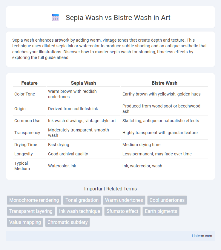
| Feature | Sepia Wash | Bistre Wash |
|---|---|---|
| Color Tone | Warm brown with reddish undertones | Earthy brown with yellowish, golden hues |
| Origin | Derived from cuttlefish ink | Produced from wood soot or beechwood ash |
| Common Use | Ink wash drawings, vintage-style art | Sketching, antique or naturalistic effects |
| Transparency | Moderately transparent, smooth wash | Highly transparent with granular texture |
| Drying Time | Fast drying | Medium drying time |
| Longevity | Good archival quality | Less permanent, may fade over time |
| Typical Medium | Watercolor, ink | Ink, watercolor, wash |
Introduction to Sepia Wash and Bistre Wash
Sepia wash, derived from the ink sac of the cuttlefish Sepia officinalis, offers rich, warm brown tones ideal for creating depth and subtle shading in artworks. Bistre wash, made from the soot of burned wood, produces a lighter, yellowish-brown hue commonly used in traditional ink drawings and watercolors for its transparent and luminous qualities. Both washes serve distinct artistic purposes, with sepia providing a darker, more saturated effect and bistre lending softness and warmth to compositions.
Historical Origins of Sepia Wash
Sepia wash originated from ancient use of the ink derived from the cuttlefish Sepia officinalis, prized by artists for its rich brown pigment and long-lasting quality. It became prominent during the Renaissance period when artists sought more natural and earthy tones for their sketches and watercolors. Bistre wash, on the other hand, is made from the soot of wood fires, creating a lighter, more translucent brown, and was commonly used in European drawings from the 17th century onward.
Historical Background of Bistre Wash
Bistre wash has a rich historical background dating back to the Renaissance when artists used it for its warm brown tones and fluid application in sketches and washes. Derived from the soot of burned wood, bistre was favored for its ability to create depth and texture in drawings by masters like Rembrandt and Albrecht Durer. In contrast, sepia wash, extracted from cuttlefish ink, gained popularity later for its darker, more sepia-toned effects, often used in ink wash painting and calligraphy.
Composition and Color Characteristics
Sepia wash is composed primarily of natural brown pigment derived from cuttlefish ink, producing rich, warm tones that range from reddish-brown to deep brown. Bistre wash, made from soot or charcoal mixed with water, yields cooler, grayish-brown hues with a more muted, earthy appearance. Both washes differ in pigment source and color intensity, with sepia offering a glossier, more saturated finish compared to the matte, desaturated effect typical of bistre.
Techniques for Applying Sepia Wash
Sepia wash involves diluting sepia ink to create translucent layers that enhance artwork with warm, brown tones, applied using soft brushes or cotton swabs for controlled shading and depth. Techniques emphasize layering thin washes to build gradients and subtle textures without overpowering underlying details. Mastery of drying times and brush pressure helps achieve smooth transitions and organic effects unique to sepia wash compared to the darker, earthier tones of bistre wash.
Techniques for Applying Bistre Wash
Bistre wash involves diluting powdered soot pigment with water to create a translucent, warm brown wash ideal for adding depth and texture in drawings. Techniques for applying bistre wash include layering thin glazes to build tonal variation, using broad, soft brushes for smooth gradients, and controlling drying times to avoid streaks or patchiness. Unlike sepia wash, bistre offers a more earthy, muted tone that enhances shadows and highlights in detailed pen and ink illustrations.
Key Differences Between Sepia and Bistre Wash
Sepia wash is derived from the ink sac of cuttlefish, offering a rich, dark brown tone with warm reddish undertones ideal for detailed artistic shading and monochromatic artworks. In contrast, bistre wash comes from the soot of wood or tar, producing a lighter, cooler brown with yellowish hues favored for soft washes and vintage effects in ink drawings. Key differences between sepia and bistre washes include their source materials, color temperature, and application intensity, where sepia provides deeper contrast and bistre yields more translucent, airy washes.
Artistic Applications and Styles
Sepia wash offers warm brown hues ideal for creating vintage or classical-style artwork, often used in portraiture and landscapes to evoke nostalgia and depth. Bistre wash provides a cooler, yellowish-brown tone favored in sketching and ink drawings, enhancing linear details and textures while allowing subtle gradients in tonal studies. Both washes excel in watercolor and ink techniques, but sepia suits rich, warm atmospheres whereas bistre enhances delineation and soft shadow effects.
Conservation and Longevity Considerations
Sepia wash, derived from cuttlefish ink, offers better lightfastness and chemical stability compared to bistre wash, which is made from wood soot and tends to fade more rapidly when exposed to UV light. Conservation efforts favor sepia wash for its archival qualities and resistance to discoloration over time, making it suitable for long-term preservation. Bistre's susceptibility to fading and smudging necessitates controlled environmental conditions, including low light and stable humidity, to maintain artwork integrity.
Choosing Between Sepia Wash and Bistre Wash
Choosing between sepia wash and bistre wash depends on the desired tonal warmth and historical context of the artwork. Sepia wash offers a rich, warm brown hue derived from cuttlefish ink, lending a vintage and elegant aesthetic suitable for aged effects, while bistre wash produces a lighter, yellowish-brown tone made from wood soot, ideal for soft shadows and landscape sketches. Artists prioritize sepia wash for deep contrast and classic appeal, whereas bistre wash is favored for subtle gradations and atmospheric softness.
Sepia Wash Infographic