Sans-serif fonts are characterized by their clean, modern appearance without the small projecting features called serifs at the ends of strokes. These fonts improve readability on digital screens, making them ideal for websites, apps, and user interfaces. Explore the rest of this article to discover how choosing the right sans-serif typeface can enhance your design and communication.
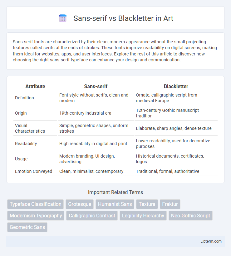
Table of Comparison
| Attribute | Sans-serif | Blackletter |
|---|---|---|
| Definition | Font style without serifs, clean and modern | Ornate, calligraphic script from medieval Europe |
| Origin | 19th-century industrial era | 12th-century Gothic manuscript tradition |
| Visual Characteristics | Simple, geometric shapes, uniform strokes | Elaborate, sharp angles, dense texture |
| Readability | High readability in digital and print | Lower readability, used for decorative purposes |
| Usage | Modern branding, UI design, advertising | Historical documents, certificates, logos |
| Emotion Conveyed | Clean, minimalist, contemporary | Traditional, formal, authoritative |
Introduction to Sans-serif and Blackletter
Sans-serif fonts are characterized by clean, simple lines without decorative strokes, making them highly legible and widely used in digital and modern design contexts. Blackletter, originating from medieval manuscripts, features intricate, bold, and angular strokes that convey a traditional, historical, and formal aesthetic. Choosing between sans-serif and blackletter depends on the desired tone, readability, and cultural connotations in various design applications.
Historical Origins of Sans-serif Fonts
Sans-serif fonts originated in the early 19th century as a response to the ornate and complex styles like Blackletter, which dominated medieval European manuscripts. The first commercially successful sans-serif typeface, created by William Caslon IV in 1816, emphasized simplicity and legibility by eliminating decorative strokes. This design philosophy aligned with the Industrial Revolution's focus on clarity and efficiency, contrasting sharply with the dense, calligraphic forms of Blackletter fonts.
The Evolution of Blackletter Typography
Blackletter typography originated in the 12th century, characterized by its dense, ornate, and angular letterforms designed for handwritten manuscripts. Its evolution reflects a transition from medieval calligraphy to print, maintaining its Gothic aesthetic while adapting to new printing techniques. Despite the rise of modern sans-serif fonts in the 20th century, Blackletter remains influential in decorative and cultural contexts, symbolizing tradition and historical depth.
Key Visual Differences: Sans-serif vs Blackletter
Sans-serif fonts feature clean, straightforward lines without decorative strokes, creating a modern and minimalist appearance ideal for digital readability and contemporary branding. Blackletter fonts exhibit intricate, dense, and angular letterforms with ornate, calligraphic strokes rooted in medieval manuscript traditions, conveying a historic and dramatic visual style. The stark contrast in line weight and ornamental detail clearly differentiates the sleek simplicity of sans-serif from the complex, textured design of blackletter typefaces.
Cultural Significance and Associations
Sans-serif fonts, characterized by their clean and modern appearance, are widely associated with contemporary design, technology, and minimalism, reflecting a universal and accessible cultural identity. Blackletter, with its intricate, ornate strokes, evokes historical European heritage, often linked to medieval manuscripts, tradition, and formality, conveying a sense of authority and nostalgia. The cultural significance of sans-serif lies in its embodiment of progress and clarity, while blackletter symbolizes heritage and craftsmanship within graphic design and typography.
Readability and Usability in Modern Design
Sans-serif fonts offer superior readability and clean aesthetics, making them ideal for digital interfaces and user-focused designs. Blackletter, with its intricate and historical style, often reduces readability in small sizes and digital contexts, limiting its usability to decorative or branding purposes. Modern design favors sans-serif for clarity and accessibility, while blackletter serves niche roles where traditional or gothic appeal is desired.
Popular Uses of Sans-serif Fonts Today
Sans-serif fonts dominate digital interfaces, mobile apps, and website designs due to their clean, modern appearance and superior legibility on screens. Brands and advertising campaigns prefer sans-serif fonts for logos and promotional materials to project a contemporary and approachable image. User interfaces, including software menus and e-commerce platforms, heavily rely on sans-serif typography to enhance user experience and readability across various devices.
Blackletter in Branding and Media
Blackletter typefaces, characterized by their intricate, gothic strokes and dense texture, evoke a historic and authoritative aesthetic that brands use to convey tradition and craftsmanship. In media, Blackletter stands out for editorial headlines and logos aiming to create a strong visual impact rooted in heritage, often found in newspapers like The New York Times and in luxury brand identities. The style's dramatic flair and cultural associations enhance brand storytelling, making it a preferred choice for niche markets seeking authenticity and differentiation.
Choosing Between Sans-serif and Blackletter
Choosing between sans-serif and blackletter fonts depends on the desired tone and readability of the design. Sans-serif fonts, characterized by clean lines and minimalistic shapes, enhance modernity and clarity, making them ideal for digital content and user interfaces. Blackletter fonts, with their intricate, historical style, evoke tradition and formality but may reduce legibility, so they are best suited for logos, headlines, or decorative contexts where stylistic impact is prioritized over readability.
Future Trends in Font Design and Typography
Future trends in font design indicate a growing blend of sans-serif's clean, minimalist aesthetics with blackletter's historic, ornate characteristics, creating hybrid typefaces that cater to modern digital interfaces and nostalgic branding. Variable fonts and responsive typography enhance the adaptability of both sans-serif and blackletter styles, optimizing readability across diverse screen sizes and devices. Advances in AI-driven design tools accelerate the creation of innovative typefaces, allowing designers to experiment with complex blackletter forms and sleek sans-serif structures for unique, dynamic visual identities.
Sans-serif Infographic