Crafting an effective script requires clear dialogue and well-defined scenes that engage the audience throughout the narrative. Focusing on character development and pacing ensures your story remains compelling from start to finish. Explore the rest of the article to discover expert tips for writing a captivating script that holds viewers' attention.
Table of Comparison
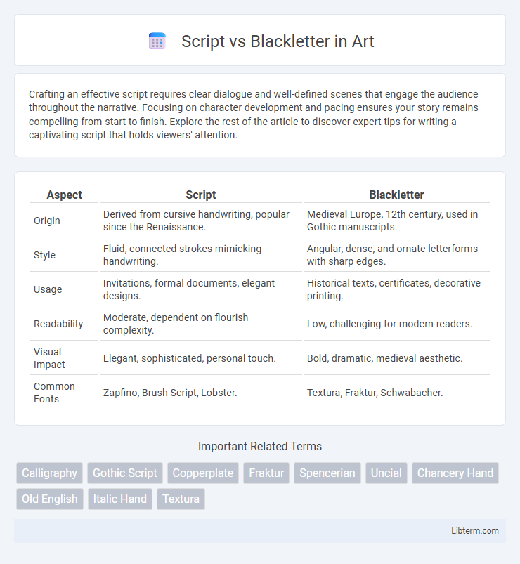
| Aspect | Script | Blackletter |
|---|---|---|
| Origin | Derived from cursive handwriting, popular since the Renaissance. | Medieval Europe, 12th century, used in Gothic manuscripts. |
| Style | Fluid, connected strokes mimicking handwriting. | Angular, dense, and ornate letterforms with sharp edges. |
| Usage | Invitations, formal documents, elegant designs. | Historical texts, certificates, decorative printing. |
| Readability | Moderate, dependent on flourish complexity. | Low, challenging for modern readers. |
| Visual Impact | Elegant, sophisticated, personal touch. | Bold, dramatic, medieval aesthetic. |
| Common Fonts | Zapfino, Brush Script, Lobster. | Textura, Fraktur, Schwabacher. |
Script vs Blackletter: An Overview
Script fonts emulate fluid, cursive handwriting with intricate strokes and elegant flourishes, commonly used for invitations and formal occasions to convey sophistication. Blackletter fonts feature dense, angular, and ornamental letterforms originating from medieval manuscripts, often associated with historical, gothic, or traditional contexts. The primary distinction lies in Script's smooth, connected letterforms versus Blackletter's rigid, ornate structure, influencing their respective uses in design and typography.
Historical Origins of Script and Blackletter
Script fonts trace their origins to the flowing handwriting styles of the Renaissance period, designed to emulate elegant calligraphy used by scribes and in personal letters. Blackletter, also known as Gothic script, originated in the 12th century and was commonly used throughout medieval Europe for manuscripts, especially in Germany with its dense and angular strokes. Both styles reflect distinct cultural and functional influences, with Script emphasizing fluidity and Blackletter embodying formality and tradition.
Key Characteristics of Script Fonts
Script fonts feature fluid, cursive strokes that mimic natural handwriting, often with connecting letterforms and elegant flourishes. These fonts convey a sense of formality, sophistication, and personalization, making them popular for wedding invitations, logos, and greeting cards. Script fonts typically have varying stroke widths and a dynamic, flowing rhythm that enhances their decorative appeal compared to the rigid, angular forms of Blackletter fonts.
Distinctive Features of Blackletter Fonts
Blackletter fonts are characterized by their dense, angular strokes and intricate, ornate detailing, often featuring sharp serifs and dramatic contrasts between thick and thin lines. These fonts exhibit a rigid, vertical stress and elaborate letterforms that evoke a medieval or Gothic aesthetic, distinguishing them from the flowing and cursive nature of script fonts. Blackletter typefaces are commonly associated with historical manuscripts, formal documents, and traditional European printing styles, emphasizing their decorative and authoritative visual impact.
Popular Uses of Script Typography
Script typography, characterized by its fluid, cursive strokes, is widely popular in wedding invitations, branding, and logos to evoke elegance and personal touch. It is commonly used in packaging design, greeting cards, and advertisements to convey sophistication and warmth. Businesses leverage script fonts for handwritten effects, enhancing emotional appeal and visual interest in marketing materials.
Common Applications of Blackletter Typography
Blackletter typography is predominantly used in traditional and formal contexts such as certificates, diplomas, and official documents to convey a sense of historical significance and authority. It frequently appears in newspaper mastheads, especially in publications like The New York Times, enhancing brand identity with a classic, gothic aesthetic. Additionally, blackletter fonts are popular in logos and signage for breweries, tattoo parlors, and heavy metal bands, where the intricate, bold letterforms evoke a strong, edgy character.
Legibility and Readability Comparison
Script fonts often feature fluid, cursive strokes that mimic handwriting, which can reduce legibility in small sizes or dense text blocks compared to Blackletter styles known for their sharp, angular, and highly structured forms. Blackletter's strong vertical lines and consistent stroke widths improve readability in printed materials or headlines but may appear ornate and overwhelming in longer texts. Legibility tends to favor Blackletter for clear distinction of characters, while Script is better suited for decorative purposes where expressive, artistic representation is prioritized over ease of reading.
Cultural and Artistic Impact
Script and Blackletter typefaces both hold significant cultural and artistic importance, with Script fonts evoking elegance and fluidity often associated with personal handwriting and formal invitations. Blackletter, rooted in medieval manuscripts, conveys a sense of tradition, authority, and historic gravitas, frequently used in Gothic art and religious texts. The distinct aesthetic qualities of Script and Blackletter continue to influence contemporary graphic design, reflecting diverse cultural identities and artistic legacies.
Modern Innovations in Script and Blackletter
Modern innovations in Script typefaces incorporate fluid, hand-drawn aesthetics with digital techniques to enhance legibility and versatility across digital platforms. Blackletter fonts have evolved by integrating sleek, minimalist elements and variable font technology, allowing for customizable weight and style adaptations in contemporary design. Both styles benefit from advanced vector rendering and OpenType features, expanding their usability in branding, web design, and user interfaces.
Choosing Between Script and Blackletter: Practical Tips
When choosing between script and blackletter fonts, consider the context and readability: script fonts, characterized by fluid, cursive strokes, are ideal for elegant invitations and branding that require a personal touch, while blackletter fonts, known for their ornate, gothic style, suit formal or historical documents that need a strong, traditional appearance. Evaluate the target audience and medium to ensure legibility; script fonts may struggle at small sizes, whereas blackletter can appear dense or complex. Testing both fonts in your specific design environment helps balance aesthetic appeal with clarity.
Script Infographic