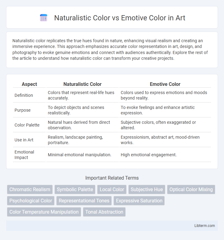
Naturalistic color replicates the true hues found in nature, enhancing visual realism and creating an immersive experience. This approach emphasizes accurate color representation in art, design, and photography to evoke genuine emotions and connect with audiences authentically. Explore the rest of the article to understand how naturalistic color can transform your creative projects.
Table of Comparison
| Aspect | Naturalistic Color | Emotive Color |
|---|---|---|
| Definition | Colors that represent real-life hues accurately. | Colors used to express emotions and moods beyond reality. |
| Purpose | To depict objects and scenes realistically. | To evoke feelings and enhance artistic expression. |
| Color Palette | Natural hues derived from direct observation. | Subjective colors, often exaggerated or altered. |
| Use in Art | Realism, landscape painting, portraiture. | Expressionism, abstract art, mood-driven works. |
| Emotional Impact | Minimal emotional manipulation. | High emotional engagement. |
Understanding Naturalistic Color
Naturalistic color emphasizes accurately representing colors as they appear in the natural environment, enhancing realism in art and design. It relies on precise observation of light, shadow, and hue to mimic the way human eyes perceive the world. Understanding naturalistic color involves studying color theory, light behavior, and the interaction between objects and their surroundings to achieve faithful visual replication.
Defining Emotive Color
Emotive color refers to hues chosen specifically to evoke emotional responses or convey psychological states rather than to represent objects realistically. Unlike naturalistic color, which aims to replicate colors as perceived in nature, emotive color prioritizes symbolic meanings, mood, and subjective experiences associated with colors. Artists utilize emotive color palettes to influence viewers' feelings, such as using red to invoke passion or blue to evoke calmness, enhancing the expressive power of visual compositions.
Historical Contexts of Color Usage
Naturalistic color use in art stems from the Renaissance period, emphasizing accurate representation of the visible world through lifelike hues to enhance realism and depth. Emotive color, prominent in Expressionism and Fauvism during the early 20th century, prioritizes vivid, exaggerated tones to convey subjective feelings and psychological states. Historical shifts in color theory reveal evolving cultural attitudes, where naturalistic palettes align with scientific observation and emotive palettes reflect personal and societal emotions.
The Science Behind Color Perception
Naturalistic color relies on accurate replication of colors based on light wavelengths and human cone cells' response, ensuring a realistic visual experience. Emotive color leverages psychological and cultural associations, influencing moods and emotions through specific color choices rather than strict spectral accuracy. The science behind color perception involves photoreceptor activation in the retina and neural processing in the brain, integrating physical stimuli with cognitive and emotional interpretations.
Psychological Impact of Color Choices
Naturalistic color replicates hues found in the real world, enhancing visual realism and facilitating cognitive processing by aligning with viewers' everyday experiences. Emotive color uses intensified or altered hues to evoke specific emotional responses, directly influencing mood, attention, and memory retention. Psychological studies show naturalistic colors promote comfort and trust, while emotive colors can stimulate excitement, urgency, or calmness depending on their saturation and brightness levels.
Naturalistic Color in Art and Design
Naturalistic color in art and design replicates hues as they appear in the natural world, emphasizing realism and accurate representation of light, shadow, and texture. This approach enhances visual coherence and fosters viewer recognition by adhering to true-to-life palettes found in nature, promoting authenticity in visual storytelling. Artists and designers use naturalistic color to evoke a sense of place and atmosphere, grounding their work in observable reality.
Emotive Color in Storytelling and Media
Emotive color in storytelling and media harnesses hues to evoke specific psychological responses and emotional connections, enhancing narrative impact beyond realistic representation. By strategically using warm colors like red to signify passion or danger, and cool colors like blue to convey calm or sadness, creators deepen audience engagement and convey subtext. This deliberate color choice drives mood, character perception, and thematic undercurrents, making emotive color a powerful tool in visual storytelling and media production.
Comparing Audience Reactions
Naturalistic color uses realistic hues that mirror the natural world, fostering a sense of familiarity and comfort in the audience. Emotive color employs exaggerated or symbolic tones to evoke strong psychological responses and intensify emotional engagement. Audience reactions to naturalistic color often involve calmness and clarity, while emotive color sparks heightened feelings such as excitement, tension, or empathy.
When to Use Naturalistic vs Emotive Color
Naturalistic color is ideal for projects requiring accurate representation and realism, such as scientific illustrations, product design, and architectural visualization, where true-to-life hues enhance credibility and clarity. Emotive color should be used when the goal is to evoke specific feelings, moods, or psychological responses, frequently applied in marketing, branding, and artistic endeavors to create a strong emotional connection with the audience. Choosing between naturalistic and emotive color depends on whether the emphasis is on realistic depiction or expressive impact to best support the communication objectives.
Future Trends in Color Theory
Future trends in color theory emphasize the integration of naturalistic color, which replicates real-world hues and lighting, with emotive color, designed to evoke psychological responses and enhance user experience. Advances in AI-driven color analysis and virtual reality enable dynamic color adjustments that balance authenticity with emotional impact. Emerging research highlights personalized color palettes tailored to individual emotional and sensory preferences, revolutionizing design, marketing, and digital environments.
Naturalistic Color Infographic

 libterm.com