Gothic script, also known as Blackletter, is a medieval writing style characterized by its dense, angular, and ornate letterforms commonly used in Europe from the 12th to the 17th century. This script is notable for its dramatic contrasts in line thickness and elaborate decorative elements, making it a popular choice for manuscripts, religious texts, and early printed books. Discover how Gothic script influences modern typography and explore its historical significance in the rest of the article.
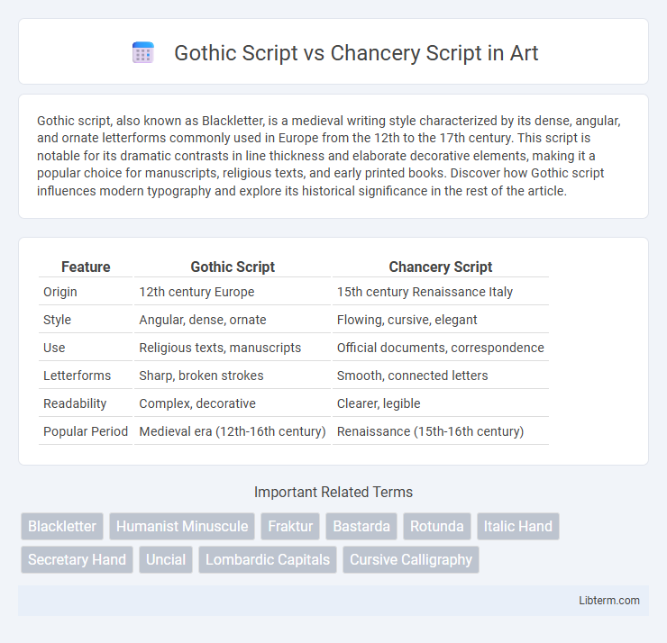
Table of Comparison
| Feature | Gothic Script | Chancery Script |
|---|---|---|
| Origin | 12th century Europe | 15th century Renaissance Italy |
| Style | Angular, dense, ornate | Flowing, cursive, elegant |
| Use | Religious texts, manuscripts | Official documents, correspondence |
| Letterforms | Sharp, broken strokes | Smooth, connected letters |
| Readability | Complex, decorative | Clearer, legible |
| Popular Period | Medieval era (12th-16th century) | Renaissance (15th-16th century) |
Introduction to Gothic Script and Chancery Script
Gothic Script, originating in the 12th century, is characterized by its dense, angular letterforms and intricate strokes, commonly used in medieval manuscripts and religious texts. Chancery Script emerged during the Renaissance as a more fluid and legible cursive writing style, developed for official documents and correspondence. Both scripts reflect distinct cultural and functional purposes, with Gothic emphasizing decoration and formality, while Chancery prioritizes clarity and efficiency.
Historical Origins and Development
Gothic Script originated in the 12th century during the High Middle Ages, characterized by its dense and angular letterforms used primarily in medieval manuscripts and religious texts across Europe. Chancery Script emerged in the 15th century Italian Renaissance, evolving from humanist handwriting to serve as an elegant, legible style for official documents and correspondence within the papal chancery. The development of Gothic Script reflects medieval scholasticism and ecclesiastical influence, while Chancery Script represents a shift toward clarity and humanist ideals in Renaissance bureaucracy and art.
Key Characteristics of Gothic Script
Gothic Script is characterized by its dense, angular letterforms with sharp, pointed arches and vertical strokes, creating a dramatic, blackletter appearance. The script features tightly packed letters with elaborate ornamentation and distinctive broken curves, making it highly legible for medieval manuscripts. This style contrasts with the more fluid and rounded Chancery Script, which emphasizes elegant, cursive strokes and greater readability for official documents.
Key Characteristics of Chancery Script
Chancery Script is characterized by its elegant, flowing cursive style with clear, rounded letter forms designed for swift, legible handwriting in official documents during the Renaissance. Unlike the angular, dense, and heavy strokes of Gothic Script, Chancery Script displays a light, graceful rhythm, combining distinct ascenders and descenders with moderate slant and smooth connections between characters. Its emphasis on readability and ornamental fluidity made it a preferred script for legal and formal correspondence in 15th- and 16th-century Europe.
Visual Differences: Gothic vs Chancery Script
Gothic Script features dense, angular strokes with tightly packed letters and elaborate decorations, creating a dark, textured appearance characteristic of medieval manuscripts. Chancery Script displays fluid, rounded forms with more open spacing and elegant flourishes, reflecting the Renaissance emphasis on readability and style. The sharp, rigid structure of Gothic contrasts with the smooth, cursive flow of Chancery, making each script visually distinct for different historical and functional contexts.
Cultural and Geographic Influences
Gothic Script, dominant in medieval Europe, particularly in Germany and England, reflects the era's ecclesiastical and scholastic culture with dense, angular letterforms suited for manuscript illumination and religious texts. In contrast, Chancery Script, emerging during the Italian Renaissance, embodies the humanist emphasis on clarity and elegance, influenced by Italian chancery offices and the spread of Renaissance humanism across Italy. These scripts illustrate how geographic regions and cultural movements shaped manuscript aesthetics, with Gothic emphasizing solemnity and formality and Chancery promoting legibility and artistic refinement.
Usage in Manuscripts and Documents
Gothic Script was predominantly used in medieval manuscripts, especially for religious texts, legal documents, and formal records in Europe from the 12th to 16th centuries, characterized by its dense and angular letterforms that enhanced readability in handwritten codices. Chancery Script emerged during the Renaissance as a more legible and elegant handwriting style, widely adopted for official correspondence, administrative records, and humanist literature, praised for its flowing, cursive strokes and clarity. Manuscript usage favored Gothic for its formality and tradition, while Chancery became favored for speed and legibility in bureaucratic and literary contexts.
Modern Applications and Revivals
Gothic Script remains popular in modern tattoo designs, branding, and fashion logos due to its dramatic and intricate appearance, evoking a medieval and rebellious aesthetic. Chancery Script experiences revival in digital typography and wedding invitations, appreciated for its elegant, flowing strokes that convey sophistication and historical refinement. Both scripts are increasingly incorporated into graphic design software, enabling contemporary artists to blend traditional calligraphy with modern visual trends.
Legibility and Aesthetic Comparison
Gothic Script features dense, angular letterforms with tightly spaced strokes, often reducing legibility in continuous reading but providing a distinct, medieval aesthetic ideal for decorative purposes. Chancery Script employs fluid, cursive-like forms with clear, open letter shapes that enhance legibility and convey an elegant, formal appearance suitable for official documents. The contrast between Gothic's ornate complexity and Chancery's graceful simplicity highlights the balance between visual impact and readability in historical calligraphy styles.
Choosing Between Gothic and Chancery Script
Gothic Script features dense, angular letterforms ideal for historical or medieval-themed designs, emphasizing a dramatic, textured appearance. Chancery Script offers elegant, flowing strokes with a calligraphic style suited for formal invitations, certificates, or literary works requiring readability and sophistication. Choosing between Gothic and Chancery Script depends on balancing the need for ornamental impact versus graceful legibility to match the intended tone and audience.
Gothic Script Infographic