Blackletter, often referred to as Gothic script, is a distinctive style of calligraphy characterized by its dense, angular, and ornate letterforms. This medieval script was widely used in Western Europe from the 12th to the 17th century and remains popular today in graphic design, tattoos, and typography for its dramatic and historical aesthetic. Discover how Blackletter can transform your creative projects by exploring its rich history and modern applications in the rest of this article.
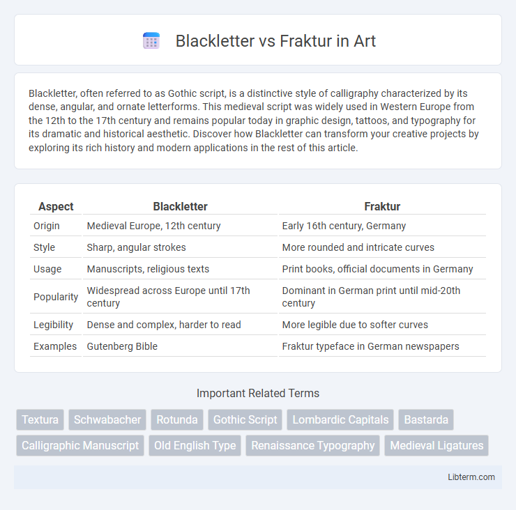
Table of Comparison
| Aspect | Blackletter | Fraktur |
|---|---|---|
| Origin | Medieval Europe, 12th century | Early 16th century, Germany |
| Style | Sharp, angular strokes | More rounded and intricate curves |
| Usage | Manuscripts, religious texts | Print books, official documents in Germany |
| Popularity | Widespread across Europe until 17th century | Dominant in German print until mid-20th century |
| Legibility | Dense and complex, harder to read | More legible due to softer curves |
| Examples | Gutenberg Bible | Fraktur typeface in German newspapers |
Introduction to Blackletter and Fraktur
Blackletter is a script style characterized by its dense, angular, and dark appearance, originating in Western Europe during the 12th century and widely used for manuscripts and early printed books. Fraktur, a specific form of Blackletter developed in the 16th century, features more elaborate and ornamental letterforms with broken strokes and sharp angles, becoming prominent in German-speaking regions. Both scripts exhibit distinct Gothic influences, but Fraktur is recognized for its decorative complexity compared to the more straightforward and uniform structure of other Blackletter styles.
Historical Origins of Blackletter
Blackletter, also known as Gothic script, originated in the 12th century during the medieval period in Western Europe, primarily within the Holy Roman Empire, where its dense and angular strokes suited the era's manuscript culture. It evolved from Carolingian minuscule to accommodate the rise of monastic scriptoria and the increasing demand for durability in book production. This script formed the foundation for later variations such as Fraktur, which emerged in the 16th century as a more decorative and legible adaptation favored in German-speaking regions.
The Emergence of Fraktur Script
Fraktur script emerged in the early 16th century as a distinctive form of Blackletter, characterized by its broken and angular strokes that enhanced legibility compared to earlier Gothic scripts. It gained prominence in German-speaking regions, becoming the dominant typeface for printed books, official documents, and religious texts throughout the Renaissance and Baroque periods. The script's intricate design and cultural association with German identity contributed to its widespread adoption, differentiating it from other Blackletter styles like Textura and Schwabacher.
Key Differences Between Blackletter and Fraktur
Blackletter and Fraktur are both historic typefaces originating from medieval Europe, but they exhibit distinct stylistic differences. Blackletter features sharp, angular lines with uniform thickness and dense, compact letterforms, while Fraktur displays more elaborate curves, broken strokes, and varied line weights creating a more decorative appearance. Fraktur evolved as a refined branch of Blackletter, becoming the predominant script in German-speaking regions from the 16th century onward, distinguished by its distinctive broken and ornate letter shapes.
Visual Characteristics: Blackletter vs Fraktur
Blackletter features sharp, angular lines with tightly spaced letters emphasizing vertical strokes, while Fraktur presents more rounded and broken curves, adding decorative flair and a softer visual rhythm. Blackletter's uniform height and rigid structure contrast with Fraktur's elaborate serifs and distinctive flourishes that create a more ornate and textured appearance. The visual distinction between Blackletter and Fraktur is evident in their letterforms: Blackletter's pointed edges oppose Fraktur's combination of straight lines and intricate, curved embellishments.
Cultural and Regional Usage
Blackletter, a script style originating in Western Europe during the 12th century, was predominantly used in Germany, England, and France for religious manuscripts and official documents. Fraktur, a distinct Blackletter variant developed in the early 16th century, became the predominant typeface in German-speaking regions, symbolizing national identity and cultural heritage until its decline after World War II. While Blackletter styles faded in most of Europe with the rise of Antiqua typefaces, Fraktur remained a strong cultural marker in German print, influencing modern Gothic-inspired designs.
Influence on Modern Typography
Blackletter and Fraktur have significantly shaped modern typography by inspiring the design of contemporary typefaces that evoke historical and cultural authenticity. Blackletter's dense, angular forms influence gothic and medieval-themed fonts, while Fraktur's more ornate, flowing strokes inform elegant and decorative type styles. These traditional scripts contribute to modern design by providing distinctive visual textures used in branding, headlines, and digital media to convey heritage and sophistication.
Notable Examples in History
Blackletter, characterized by its dense and angular strokes, gained prominence in Gutenberg's 42-line Bible, the first major book printed using movable type, marking a milestone in typographic history. Fraktur, a specific form of Blackletter with more broken and ornate letterforms, was widely used in German-speaking regions from the 16th century onward and appears in the works of the German printer Anton Koberger and official documents of the Holy Roman Empire. Both styles significantly influenced the visual identity of European texts during the Renaissance and early modern periods, with Blackletter dominating early English printing and Fraktur shaping German print culture.
Contemporary Applications and Revivals
Blackletter and Fraktur scripts experience growing use in contemporary design, especially in branding and editorial projects seeking a historic yet modern feel. Fraktur's intricate curves appeal to fashion labels and music industry visuals, while Blackletter's sharp, bold strokes dominate tattoo art and alternative culture graphics. Both scripts see revival through digital typography platforms, enabling designers worldwide to integrate traditional Germanic typefaces into modern media.
Choosing Between Blackletter and Fraktur
Choosing between Blackletter and Fraktur hinges on the specific historical and stylistic context desired, as Blackletter features sharp, angular strokes ideal for a medieval Gothic aesthetic, while Fraktur offers more ornate, rounded curves suited for traditional German script representation. Blackletter is often favored for its bold, dramatic impact in headlines and logos, making it a strong choice for medieval or Gothic-themed designs, whereas Fraktur's intricate flourishes enhance authenticity in historical documents or German typography projects. Selecting the right script depends on the visual tone and cultural accuracy required, ensuring the chosen typeface aligns with the audience's expectations and the design's purpose.
Blackletter Infographic