A monochromatic palette uses varying shades, tints, and tones of a single color to create a cohesive and visually appealing design. This approach adds depth and harmony without overwhelming the viewer, making it ideal for minimalist and elegant compositions. Explore the rest of the article to discover how you can apply a monochromatic palette to enhance your creative projects.
Table of Comparison
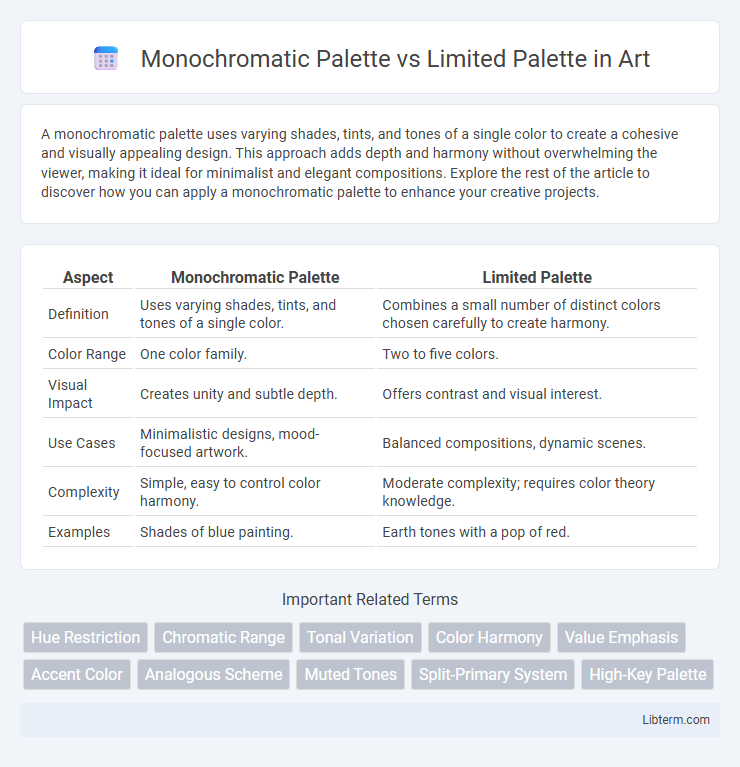
| Aspect | Monochromatic Palette | Limited Palette |
|---|---|---|
| Definition | Uses varying shades, tints, and tones of a single color. | Combines a small number of distinct colors chosen carefully to create harmony. |
| Color Range | One color family. | Two to five colors. |
| Visual Impact | Creates unity and subtle depth. | Offers contrast and visual interest. |
| Use Cases | Minimalistic designs, mood-focused artwork. | Balanced compositions, dynamic scenes. |
| Complexity | Simple, easy to control color harmony. | Moderate complexity; requires color theory knowledge. |
| Examples | Shades of blue painting. | Earth tones with a pop of red. |
Understanding Monochromatic and Limited Palettes
A monochromatic palette uses variations of a single hue, incorporating different shades, tints, and tones to create a cohesive and harmonious visual effect. A limited palette involves selecting a small number of distinct colors, often three to five, to maintain simplicity while allowing contrast and variety in design. Understanding these palettes helps designers balance unity and diversity, optimizing color harmony and visual impact in compositions.
Key Characteristics of Monochromatic Palettes
Monochromatic palettes utilize varying shades, tints, and tones of a single hue to create harmonious and cohesive designs with subtle depth and contrast. This approach simplifies color selection, enhances visual unity, and emphasizes texture and form without the distraction of multiple colors. Monochromatic schemes are often favored for minimalist aesthetics and projects requiring a calm, elegant, or sophisticated atmosphere.
Defining Features of Limited Palettes
Limited palettes consist of a carefully selected range of colors, typically including complementary or analogous hues to create visual harmony and contrast. Unlike monochromatic palettes that use variations of a single color, limited palettes balance diversity and simplicity, enhancing depth and interest while maintaining cohesion. This intentional restriction in color variety supports clear communication and mood setting in design and artwork.
Advantages of Using a Monochromatic Palette
A monochromatic palette enhances visual harmony by using varying shades, tints, and tones of a single hue, creating a cohesive and unified design. It simplifies color selection, reducing the risk of clashing colors while emphasizing texture and form. This palette boosts emotional impact by focusing on subtle variations, making it ideal for minimalist and sophisticated aesthetics.
Benefits of Working with a Limited Palette
Working with a limited palette enhances color harmony by restricting the number of hues, allowing artists to create cohesive and unified compositions. This approach simplifies color mixing, reducing decision fatigue and enabling faster, more efficient painting sessions. It also encourages creative problem-solving, as artists must explore variations in value, saturation, and temperature within a confined color range.
Challenges and Limitations of Each Approach
A monochromatic palette presents challenges such as limited tonal variation, which can make it difficult to create depth and dynamic contrast in a composition. This approach restricts color diversity, potentially resulting in a visually monotonous or less engaging design. In contrast, a limited palette, while offering more color variety, poses limitations in color harmony and balance, requiring careful selection to avoid clashing hues and maintain cohesion.
Visual Impact: Mood and Expression Differences
A monochromatic palette, composed of varying shades, tints, and tones of a single color, creates a cohesive and harmonious visual impact that evokes calm, unity, and subtle emotional depth. In contrast, a limited palette uses two to four colors, generating more dynamic contrasts and visual interest, which can express a broader range of moods from vibrant energy to restrained intensity. The choice between these palettes profoundly influences mood and expression, with monochromatic schemes favoring introspection and serenity while limited palettes offer nuanced emotional complexity through color interaction.
Practical Applications in Art and Design
Monochromatic palettes, utilizing variations of a single hue, streamline visual coherence and enhance depth through tints, tones, and shades, making them ideal for minimalist designs and mood-focused artworks. Limited palettes, combining a select few complementary or analogous colors, enable artists and designers to create balanced, harmonious compositions with greater versatility in contrast and emphasis. These approaches optimize color strategy in branding, interior design, and digital media by controlling emotional impact and visual interest while maintaining aesthetic unity.
Choosing the Right Palette for Your Project
Choosing the right palette for your project depends on the mood and visual impact you aim to achieve; a monochromatic palette, featuring variations of a single hue, creates a cohesive and harmonious look ideal for minimalist or elegant designs. In contrast, a limited palette incorporates a select few colors, offering more contrast and vibrancy while maintaining visual balance, perfect for projects needing subtle complexity without overwhelming the viewer. Consider the emotional tone and clarity needed in your design to determine whether a monochromatic or limited palette best enhances your project's narrative and user experience.
Tips for Mastering Monochromatic and Limited Palettes
Mastering a monochromatic palette involves varying shades, tints, and tones of a single hue to create depth and interest while maintaining unity. When working with a limited palette, select a few harmonious colors that contrast well and use color temperature to enhance visual dynamics. Experiment with texture and opacity to add dimension without overwhelming the simplicity of the chosen palette.
Monochromatic Palette Infographic