Duotone is a graphic design technique that uses two contrasting colors to create striking images with depth and visual interest. This method enhances your designs by simplifying complex visuals while maintaining strong emotional and aesthetic appeal. Explore the full article to discover how duotone can transform your creative projects.
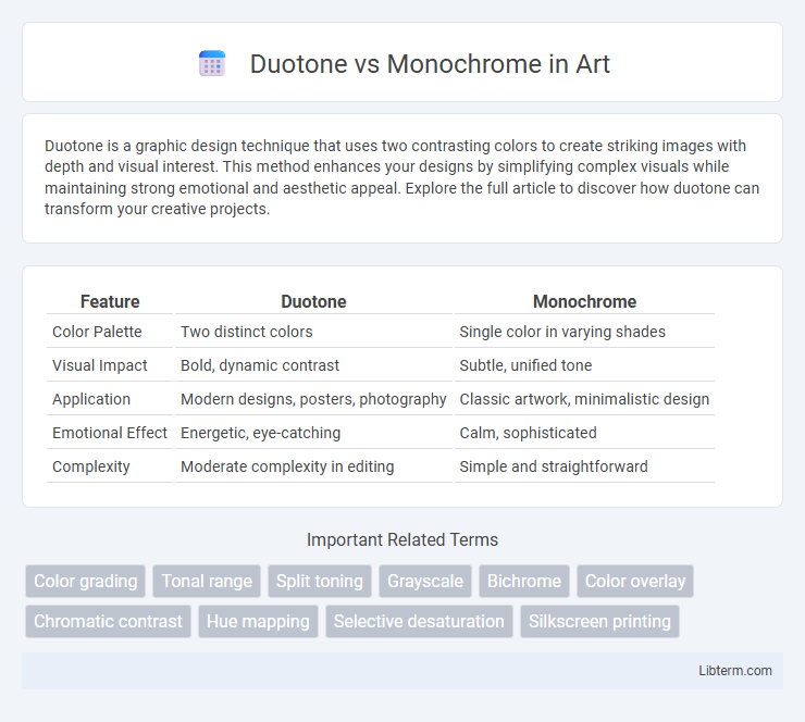
Table of Comparison
| Feature | Duotone | Monochrome |
|---|---|---|
| Color Palette | Two distinct colors | Single color in varying shades |
| Visual Impact | Bold, dynamic contrast | Subtle, unified tone |
| Application | Modern designs, posters, photography | Classic artwork, minimalistic design |
| Emotional Effect | Energetic, eye-catching | Calm, sophisticated |
| Complexity | Moderate complexity in editing | Simple and straightforward |
Introduction to Duotone and Monochrome
Duotone images use two distinct colors to create contrast and depth, enhancing the visual interest and mood compared to monochrome, which relies on various shades of a single color, typically black and white. Duotone often combines complementary or contrasting colors to highlight details, while monochrome emphasizes texture and form through gradients of the same hue. Both techniques are popular in graphic design and photography for their ability to convey emotion and style with simplicity and elegance.
What is Duotone?
Duotone is a graphic design technique that uses two contrasting colors to create images with enhanced depth and visual interest, typically combining a dark and a light shade for dramatic effect. Unlike monochrome, which utilizes varying tones of a single color, duotone adds dimension and vibrancy by blending two distinct hues, often chosen to evoke specific moods or brand identities. This method is widely applied in photography, print media, and digital design to transform grayscale images into striking visuals with a limited color palette.
What is Monochrome?
Monochrome refers to images composed of varying tones of a single color, typically black and white or shades of gray, emphasizing contrast and texture without color distractions. This technique highlights the subject's details through light and shadow variations, enhancing depth and mood. Commonly used in photography and design, monochrome creates a timeless and classic aesthetic that directs attention to composition and form.
Key Visual Differences
Duotone images utilize two distinct colors to enhance contrast and create depth, often blending a base color with a secondary hue for artistic effect, while monochrome images rely on varying shades of a single color, typically grayscale, to emphasize texture and form. Duotone emphasizes dynamic color interaction and emotional impact, whereas monochrome focuses on tonal range and simplicity. The key visual difference lies in duotone's dual-color vibrancy compared to monochrome's singular color uniformity.
Creative Applications of Duotone
Duotone enhances creative applications by using two contrasting colors to add depth and vibrancy, making images more visually striking compared to monochrome's single-tone approach. This technique allows designers to evoke specific moods and highlight details, fostering unique visual storytelling in branding, advertising, and digital art. By manipulating color pairs, duotone offers greater flexibility and artistic expression for creative projects seeking bold, contemporary aesthetics.
Artistic Uses of Monochrome
Monochrome art emphasizes tonal variation within a single hue, creating depth and mood through contrast and shading rather than color diversity. Its artistic uses include highlighting texture and form, making it ideal for portraiture, landscapes, and abstract compositions where emotional intensity and simplicity are desired. Monochrome techniques often evoke timelessness and elegance, enhancing visual storytelling by focusing attention on structure and light interplay.
Duotone and Monochrome in Modern Design
Duotone enhances modern design by using two contrasting colors that create depth and visual interest, making images more dynamic and engaging. Monochrome relies on variations of a single hue to convey elegance and simplicity, often emphasizing texture and form for a minimalist aesthetic. Both techniques are popular in branding and digital media for their ability to evoke strong emotions and maintain visual coherence.
Pros and Cons: Duotone vs Monochrome
Duotone images leverage two contrasting colors to create depth and visual interest, enhancing mood and detail, but can be complex to design and may require more processing power. Monochrome images, using a single color or grayscale, offer simplicity and timeless elegance, making them easier to produce and ideal for minimalist aesthetics; however, they may lack the dynamic range and vibrancy of duotone. Choosing between duotone and monochrome depends on the desired emotional impact, visual complexity, and project requirements.
Choosing the Right Style for Your Project
Duotone uses two contrasting colors to create dynamic, visually stimulating images, enhancing depth and mood, making it ideal for bold, artistic projects or modern branding. Monochrome employs varying shades of a single color, offering a clean, elegant aesthetic suitable for minimalist designs, professional presentations, and classic themes. Selecting the right style depends on your project's objective: choose duotone for vibrant impact and emotional resonance, or monochrome for simplicity and timeless sophistication.
Conclusion: Which is Best for You?
Duotone enhances images with two contrasting colors, adding depth and visual interest, while monochrome emphasizes simplicity and timelessness using varying shades of a single color. Duotone is best for creating vibrant, eye-catching designs that stand out, making it ideal for marketing and artistic projects, whereas monochrome suits minimalist aesthetics and professional presentations where subtlety is key. Choose duotone for bold expression and emotional impact, or monochrome for elegance and clarity depending on your design goals.
Duotone Infographic