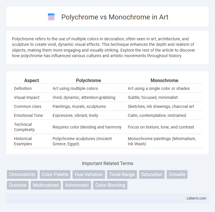
Polychrome refers to the use of multiple colors in decoration, often seen in art, architecture, and sculpture to create vivid, dynamic visual effects. This technique enhances the depth and realism of objects, making them more engaging and visually striking. Explore the rest of the article to discover how polychrome has influenced various cultures and artistic movements throughout history.
Table of Comparison
| Aspect | Polychrome | Monochrome |
|---|---|---|
| Definition | Art using multiple colors | Art using a single color or shades |
| Visual Impact | Vivid, dynamic, attention-grabbing | Subtle, focused, minimalist |
| Common Uses | Paintings, murals, sculptures | Sketches, ink drawings, charcoal art |
| Emotional Tone | Expressive, vibrant, lively | Calm, contemplative, restrained |
| Technical Complexity | Requires color blending and harmony | Focus on texture, tone, and contrast |
| Historical Examples | Polychrome sculptures (Ancient Greece, Egypt) | Monochrome paintings (Minimalism, Ink Wash) |
Introduction to Polychrome and Monochrome
Polychrome refers to the use of multiple colors in art, design, or decoration, creating visually rich and vibrant compositions that emphasize variety and contrast. Monochrome, by contrast, utilizes a single color or varying shades of one hue, fostering a cohesive and harmonious aesthetic that highlights texture and form over color diversity. Understanding these approaches is essential for selecting the appropriate visual strategy in fields like painting, interior design, and digital media.
Defining Polychrome: Characteristics and Uses
Polychrome refers to the use of multiple colors in art, design, and decoration, characterized by vibrant, varied hues that create dynamic visual interest. This technique is commonly employed in architectural details, sculptures, textiles, and digital media to enhance depth and emotional impact. Its applications range from historical frescoes and stained glass windows to contemporary graphic design, emphasizing contrast, richness, and cultural symbolism.
Understanding Monochrome: Simplicity and Impact
Monochrome design utilizes a single color in varying shades, creating a cohesive and focused visual impact that simplifies the viewer's experience. This approach enhances clarity and emotional resonance by minimizing distractions and emphasizing texture, form, and contrast within the composition. Monochrome's streamlined palette supports powerful storytelling and strong brand identity through its elegant simplicity.
Historical Context of Color Usage
Throughout history, polychrome art and architecture flourished in ancient civilizations such as Egypt, Greece, and Rome, where vibrant color palettes were used to symbolize status, divinity, and cultural narratives. Monochrome aesthetics gained prominence during periods like the Renaissance and Modernism, emphasizing form, texture, and chiaroscuro to evoke emotion and depth without relying on multiple colors. The shift from polychrome to monochrome reflects evolving artistic philosophies and advances in pigment technology, shaping how societies perceive and utilize color in visual storytelling.
Artistic Expression: Polychrome vs Monochrome
Polychrome art utilizes multiple colors to create vibrant, dynamic compositions that convey a rich range of emotions and complex narratives, enhancing visual interest and depth. Monochrome art focuses on variations of a single color, emphasizing texture, form, and tonal contrast to evoke mood and introspection with minimalistic elegance. The choice between polychrome and monochrome fundamentally shapes artistic expression by directing viewers' attention to either chromatic diversity or subtle nuances within a unified color scheme.
Psychological Effects of Color and Monotone
Polychrome environments, rich in multiple colors, stimulate cognitive functions and elevate mood by activating neural pathways linked to creativity and emotion. Monochrome settings, dominated by variations of a single hue, promote focus and calmness by reducing visual clutter and minimizing cognitive overload. Psychological studies reveal that polychrome spaces encourage energy and social interaction, while monochrome environments support relaxation and mental clarity.
Applications in Design and Architecture
Polychrome design enhances spatial experiences by incorporating multiple colors, creating vibrant and dynamic environments ideal for cultural institutions, retail spaces, and public art installations. Monochrome schemes emphasize simplicity and coherence, often used in minimalist architecture, corporate offices, and modern residential projects to evoke elegance and focus on form and texture. Both approaches influence mood and perception, with polychrome adding complexity and energy while monochrome emphasizes unity and sophistication in design and architectural applications.
Advantages and Disadvantages of Each Approach
Polychrome designs offer vibrant, multi-hued visuals that enhance user engagement and convey complexity, but they can overwhelm users and complicate interface clarity. Monochrome schemes simplify visual interpretation and improve focus by limiting color variation, yet they risk appearing dull and may reduce the ability to distinguish between elements. Choosing between polychrome and monochrome depends on balancing aesthetic appeal with usability requirements specific to the design context.
Modern Trends: Polychrome and Monochrome in Contemporary Art
Modern trends in contemporary art showcase a dynamic interplay between polychrome and monochrome techniques, with polychrome emphasizing vivid, multi-hued palettes to evoke emotional depth and cultural diversity. Monochrome art, often characterized by single-color schemes, explores minimalism and conceptual purity, highlighting texture, form, and shadow play. Leading artists and galleries increasingly experiment with these contrasting styles to challenge traditional perceptions and enhance viewer engagement.
Choosing the Right Scheme for Your Project
Selecting between polychrome and monochrome color schemes depends on the project's goal and audience engagement. Polychrome palettes offer vibrant and dynamic visuals ideal for creative, playful, or diverse content, while monochrome schemes provide a clean, cohesive look that enhances readability and professionalism. Consider color psychology and brand identity to ensure the chosen scheme aligns with your design objectives and user experience.
Polychrome Infographic