A high-key palette features predominantly light colors that create a bright, airy, and uplifting atmosphere in design or photography. This technique enhances a sense of cleanliness and spaciousness, helping to convey optimism and clarity in your visuals. Explore the rest of the article to discover how to effectively apply a high-key palette in your creative projects.
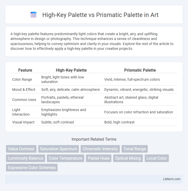
Table of Comparison
| Feature | High-Key Palette | Prismatic Palette |
|---|---|---|
| Color Range | Bright, light tones with low saturation | Vivid, intense, full-spectrum colors |
| Mood & Effect | Soft, airy, delicate, calm atmosphere | Dynamic, vibrant, energetic, striking visuals |
| Common Uses | Portraits, pastels, ethereal landscapes | Abstract art, stained glass, digital illustrations |
| Light Interaction | Emphasizes brightness and highlights | Focuses on color refraction and saturation |
| Visual Impact | Subtle, soft contrast | Bold, high contrast |
Understanding the High-Key Palette
The High-Key Palette features colors with high brightness and low contrast, emphasizing pastel and light tones ideal for creating soft, airy visuals. It enhances subjects by reducing shadows and highlights, resulting in a fresh, luminous effect that suits minimalist and delicate designs. Understanding the High-Key Palette involves recognizing its capacity to evoke clarity and positivity through a gentle, light-dominant color range.
Exploring the Prismatic Palette
The Prismatic Palette offers vibrant, multifaceted hues that create a dynamic and visually stimulating effect, making it ideal for designs seeking bold expression and contrast. Unlike the softer, more subdued tones of the High-Key Palette, the Prismatic Palette emphasizes saturated colors that evoke energy and depth. Exploring the Prismatic Palette allows artists and designers to experiment with rich blends and striking color interactions that enhance visual complexity and emotional impact.
Key Characteristics of High-Key Colors
High-key colors are defined by their high brightness and low saturation, creating a light, airy aesthetic with soft, pastel-like hues that evoke feelings of calmness and purity. These colors have a high value on the lightness scale, often including whites, pale pinks, light blues, and gentle yellows, which contribute to a clean and spacious visual effect. In contrast to the vibrant and intensely saturated tones of prismatic palettes, high-key palettes maintain a subtle and soothing presence, making them ideal for minimalistic and serene design schemes.
Distinct Features of Prismatic Colors
Prismatic Palette colors exhibit a unique ability to shift and refract light, creating a dynamic spectrum of hues that change with perspective, unlike the High-Key Palette's consistently bright and evenly toned shades. These prismatic colors often contain iridescent or holographic pigments that enhance visual depth and luminosity, offering multidimensional effects not found in traditional color schemes. The distinct light-reflecting properties of prismatic colors make them ideal for applications requiring vibrant, eye-catching visuals that respond to environmental lighting.
Visual Impact: High-Key vs Prismatic
The High-Key palette emphasizes light, bright tones, creating an airy and soft visual impact that enhances clarity and perceived spaciousness. In contrast, the Prismatic palette employs saturated and vivid colors, delivering a dynamic and energetic visual impact marked by intense contrast and vibrant depth. Choosing High-Key favors subtlety and lightness, while Prismatic commands attention through bold, multicolored highlights.
Emotional Effects and Mood
High-Key Palette utilizes bright, light colors that evoke feelings of happiness, openness, and positivity, often creating an uplifting and airy mood. Prismatic Palette features a full spectrum of vivid hues, generating dynamic, energetic emotions and a sense of vibrancy and excitement. The High-Key Palette soothes with subtle brightness, while the Prismatic Palette stimulates with intense color contrasts.
Techniques for Achieving High-Key Palettes
High-key palettes emphasize light tones and minimal contrast, achieved by using colors with high value and low saturation, often blended with plenty of white or pale hues. Techniques include layering thin washes of translucent colors, maintaining soft edges, and avoiding dark pigments to preserve luminosity and airiness. Artists frequently apply glazing methods and use desaturated, pastel versions of colors to keep the palette bright and harmonious without overpowering shadows.
Methods to Create Prismatic Color Schemes
Prismatic color schemes are created by carefully blending multiple hues that reflect the spectrum of light, often using techniques like color layering, gradient transitions, and selective saturation adjustments to enhance vibrancy and depth. Unlike high-key palettes, which emphasize light, pastel tones with minimal contrast, prismatic palettes rely on the interplay of saturated, transparent pigments and precise color mixing to achieve a dynamic, multi-dimensional effect. Methods such as using interference pigments or digital color modeling further enable artists and designers to simulate the shifting qualities of prismatic colors across different lighting conditions.
Artistic Applications and Styles
The High-Key Palette emphasizes light, desaturated hues creating airy, delicate artworks often used in portraits and ethereal landscapes to evoke softness and subtlety. In contrast, the Prismatic Palette employs vibrant, saturated colors across the spectrum, ideal for dynamic, energetic compositions like abstracts and contemporary art that demand visual intensity and contrast. Artists select the High-Key Palette for moods of calmness and refinement, while the Prismatic Palette suits expressive, bold styles highlighting diversity and chromatic richness.
Choosing the Right Palette for Your Artwork
Choosing the right palette for your artwork depends on the mood and lighting effects you want to achieve; a High-Key Palette uses predominantly light tones and pastel colors to create a bright, airy atmosphere, while a Prismatic Palette incorporates vivid hues and sharp contrasts for a vibrant, dynamic look. Artists working on ethereal or soft-themed compositions benefit from High-Key color schemes, emphasizing light and subtle variations, whereas those aiming for bold, energetic pieces should opt for Prismatic palettes that highlight color saturation and diversity. Understanding these differences helps you align your color choices with the emotional tone and visual impact desired in your finished artwork.
High-Key Palette Infographic