Cerulean Blue is a vibrant, sky-inspired pigment prized for its bright, cool tones and excellent lightfastness, making it a favorite choice among artists seeking to capture clear skies and serene waters. Its unique composition, often including cobalt stannate, creates a stable, non-toxic color that maintains intensity over time without fading. Discover how Cerulean Blue can enhance your artwork and explore techniques to incorporate this stunning hue in the rest of the article.
Table of Comparison
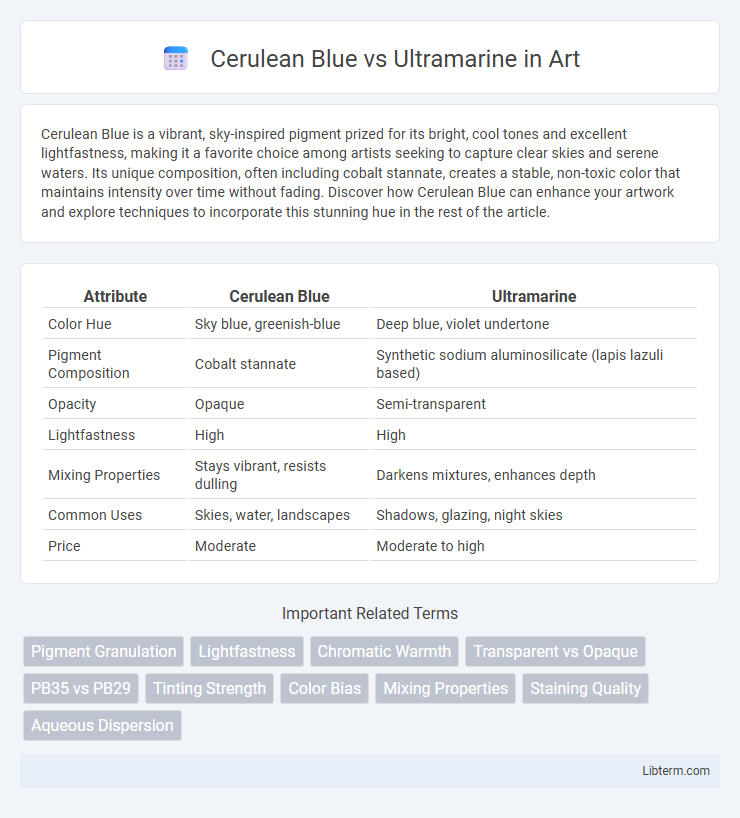
| Attribute | Cerulean Blue | Ultramarine |
|---|---|---|
| Color Hue | Sky blue, greenish-blue | Deep blue, violet undertone |
| Pigment Composition | Cobalt stannate | Synthetic sodium aluminosilicate (lapis lazuli based) |
| Opacity | Opaque | Semi-transparent |
| Lightfastness | High | High |
| Mixing Properties | Stays vibrant, resists dulling | Darkens mixtures, enhances depth |
| Common Uses | Skies, water, landscapes | Shadows, glazing, night skies |
| Price | Moderate | Moderate to high |
Introduction to Cerulean Blue and Ultramarine
Cerulean Blue is a vibrant, cool-toned pigment made from cobalt stannate, renowned for its bright turquoise hue and excellent durability in oil and acrylic painting. Ultramarine, derived from the semi-precious stone lapis lazuli or synthesized as a synthetic pigment, offers a deep, rich blue with a subtle red undertone, favored for its intense color and versatility in various art mediums. Both pigments are staples in fine art, each providing unique properties essential for achieving different atmospheric and tonal effects in painting.
Origins and Historical Background
Cerulean Blue, first synthesized in the 19th century by Swiss chemist Albrecht Hopfner, is made from cobalt stannate and derived from cobalt ore, offering a stable, bright blue pigment favored in modern painting. Ultramarine, historically sourced from the semi-precious stone lapis lazuli mined primarily in Afghanistan, dates back to ancient civilizations and was prized during the Renaissance for its intense, vivid blue color and rarity. Both pigments hold significant cultural and artistic value, with Cerulean Blue representing scientific innovation and Ultramarine embodying traditional artistry and luxury.
Chemical Composition and Production
Cerulean Blue primarily consists of cobalt(II) stannate (Co2SnO4), producing a bright and opaque sky-blue pigment through high-temperature solid-state reactions. Ultramarine is composed of a complex sodium aluminum sulfosilicate (Na7Al6Si6O24S3), derived from the mineral lapis lazuli or synthesized via a clay and sulfur reaction under controlled heating. Cerulean Blue offers consistent chemical stability and lightfastness due to its inorganic metal oxide base, whereas Ultramarine's vibrant hue results from its sulfur-containing molecular structure sensitive to acidic environments during production.
Color Appearance and Undertones
Cerulean Blue exhibits a bright, sky-like blue appearance with cool green undertones, making it ideal for painting clear skies and water reflections. Ultramarine shows a rich, deep blue hue with warm violet undertones, providing depth and intensity in landscape and portrait painting. Both pigments differ significantly in opacity and granulation, affecting texture and layering in artwork.
Lightfastness and Durability
Cerulean Blue offers superior lightfastness compared to Ultramarine, maintaining color integrity over extended exposure to sunlight. Ultramarine, while vibrant, tends to fade more quickly under UV rays and harsh environmental conditions. In terms of durability, Cerulean Blue is more resistant to discoloration and chemical reactions, making it ideal for long-lasting artworks.
Mixing Properties and Compatibility
Cerulean Blue offers excellent mixing properties with its strong opacity and granulating texture, producing vibrant, clean greens when combined with yellows. Ultramarine's transparent nature and smooth flow create richer, deeper purples and muted greens when blended with warm or cool colors, enhancing color depth. Cerulean Blue and Ultramarine both exhibit high compatibility with other pigments but serve different purposes in mixtures due to Cerulean's bright, chalky finish versus Ultramarine's intense, glazing quality.
Common Uses in Art and Applications
Cerulean Blue is frequently used in landscape painting for its bright, sky-like hue and excellent opacity, making it ideal for depicting clear skies and water reflections. Ultramarine is favored for its deep, rich color and strong tinting power, commonly applied in portraiture and abstract art to create depth and vibrant shadows. Both pigments are essential in watercolor, acrylic, and oil painting, with artists selecting between them based on transparency and tonal requirements.
Pros and Cons: Cerulean Blue
Cerulean Blue offers excellent opacity and lightfastness, making it ideal for vibrant sky and water scenes, but its limited tinting strength can be a drawback in mixing. The pigment's cool greenish-blue tone provides a unique hue that differs significantly from the warmer, reddish Ultramarine, appealing for achieving specific atmospheric effects. However, Cerulean Blue is often more expensive and less versatile in blending compared to Ultramarine, which may limit its use in diverse palettes.
Pros and Cons: Ultramarine
Ultramarine offers vibrant, deep blue hues with excellent lightfastness, making it ideal for long-lasting artwork. However, its slower drying time compared to Cerulean Blue can be a drawback for artists seeking quick layering. Ultramarine's granulating texture adds rich visual interest but may require more careful blending to achieve smooth gradients.
Choosing the Right Blue for Your Palette
Cerulean Blue offers a bright, greenish-blue hue with excellent opacity, ideal for skies and natural landscapes, while Ultramarine provides a deeper, reddish-blue with transparent qualities perfect for shadows and atmospheric effects. Artists seeking vivid vibrancy often select Cerulean Blue for its high pigment concentration and permanence, whereas Ultramarine is favored for its subtle gradations and versatility in mixing. Balancing opacity, color temperature, and mixing properties helps painters choose the right blue to enhance their palette and achieve desired tonal ranges.
Cerulean Blue Infographic