A flow map visually represents the sequence of steps or events in a process, making complex information easier to understand and follow. By organizing data into clearly defined stages, it helps you identify bottlenecks, streamline workflows, and improve decision-making. Explore the rest of the article to discover how implementing flow maps can enhance your project management and productivity.
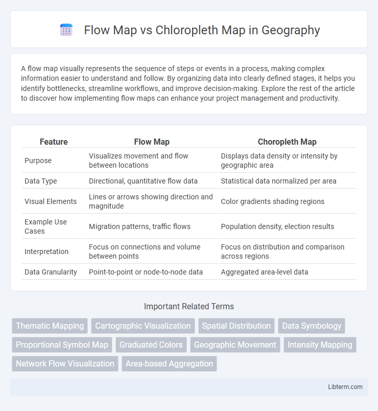
Table of Comparison
| Feature | Flow Map | Choropleth Map |
|---|---|---|
| Purpose | Visualizes movement and flow between locations | Displays data density or intensity by geographic area |
| Data Type | Directional, quantitative flow data | Statistical data normalized per area |
| Visual Elements | Lines or arrows showing direction and magnitude | Color gradients shading regions |
| Example Use Cases | Migration patterns, traffic flows | Population density, election results |
| Interpretation | Focus on connections and volume between points | Focus on distribution and comparison across regions |
| Data Granularity | Point-to-point or node-to-node data | Aggregated area-level data |
Introduction to Flow Maps and Choropleth Maps
Flow maps visualize movement patterns between geographic locations, representing quantities with lines whose thickness indicates flow magnitude, making them essential for analyzing migration, trade, or traffic. Choropleth maps use color shading to represent data density or intensity across predefined regions like states or counties, providing a clear view of spatial distribution for variables such as population, income, or election results. Both map types enhance spatial data interpretation but differ fundamentally in illustrating dynamic flows versus static regional statistics.
Definition and Core Concepts
Flow maps visualize movement or flow between locations, emphasizing direction and volume through varying line widths or colors. Choropleth maps represent data distribution across geographic areas by shading regions according to data values, highlighting spatial patterns. Understanding these core concepts aids in selecting the appropriate map type for visualizing relationships versus density-based data.
Key Differences Between Flow Maps and Choropleth Maps
Flow maps visualize the movement or flow of quantities between locations using lines or arrows, highlighting direction and volume, whereas choropleth maps use color gradients to represent data density or values within predefined geographic areas such as states or counties. Flow maps emphasize relationships and connectivity across regions, making them ideal for migration, trade, or transportation patterns, while choropleth maps excel in showing spatial distribution of variables like population density, election results, or economic indicators. The primary difference lies in flow maps representing dynamic interactions and choropleth maps displaying static, area-based data aggregates.
Data Types Best Suited for Each Map
Flow maps are best suited for representing movement data such as migration patterns, traffic flow, or trade routes where direction and volume are critical. Choropleth maps effectively display aggregated statistical data like population density, income levels, or election results across predefined geographic areas. Selecting a flow map versus a choropleth map depends on whether the primary focus is on spatial movement or spatial distribution of attribute values.
Design Principles and Visualization Techniques
Flow maps emphasize the visualization of movement or flow between locations, using lines or arrows whose thickness or color represents volume or direction, optimizing spatial accuracy and clarity. Choropleth maps depict statistical data through varying shades or colors within predefined geographic boundaries, relying on color gradients to convey intensity or density and requiring careful classification and legend design for effective interpretation. Both map types prioritize visual hierarchy and appropriate symbolization to enhance comprehension while minimizing visual clutter and maintaining geographic context.
Advantages of Flow Maps
Flow maps excel at visualizing movement and connections between locations, making them ideal for illustrating migration patterns, trade routes, or traffic flows. They provide clear directional information and the magnitude of flows through varying line thickness or color intensity, enhancing the understanding of dynamic spatial interactions. Unlike choropleth maps, which focus on static regional data, flow maps reveal interactions and relationships across geographic areas.
Advantages of Choropleth Maps
Choropleth maps excel at visually representing data distribution across predefined geographic areas using color gradients, making them ideal for illustrating variables like population density, election results, or income levels. Their straightforward design enables easy comparison between regions and quick identification of spatial patterns or trends. These maps effectively communicate summary statistics by aggregating data within political or administrative boundaries, enhancing interpretability for diverse audiences.
Common Use Cases and Applications
Flow maps effectively visualize movement patterns such as migration, trade routes, and transportation logistics by illustrating direction and volume between locations. Choropleth maps are ideal for representing regional data distributions, including population density, election results, and income levels across administrative boundaries. Both types enhance spatial analysis but serve distinct purposes: flow maps emphasize dynamic relationships, while choropleth maps highlight static spatial variations.
Limitations and Potential Pitfalls
Flow maps often struggle with visual clutter when representing dense or overlapping routes, making interpretation difficult for users. Choropleth maps can mislead due to the Modifiable Areal Unit Problem (MAUP), where aggregation units distort spatial patterns, and they may imply uniformity within regions despite internal variability. Both map types risk biased conclusions if data normalization and scale are not carefully applied, potentially obscuring true spatial relationships.
Choosing the Right Map for Your Data Analysis
Flow maps visualize movement and volume between locations, ideal for transportation, migration, or trade data, emphasizing direction and magnitude. Chloropleth maps depict spatial distribution by shading predefined areas based on data values, suitable for demographic, economic, or health statistics. Selecting the right map depends on whether your analysis requires illustrating connections and flows or summarizing data density and intensity across regions.
Flow Map Infographic