Cartograms transform geographical maps by resizing regions based on specific data, providing a visual representation that highlights variations in factors like population, GDP, or election results. This method distorts traditional boundaries to emphasize particular statistics, making complex information easier for you to interpret at a glance. Explore the rest of the article to understand how cartograms can revolutionize the way you view spatial data.
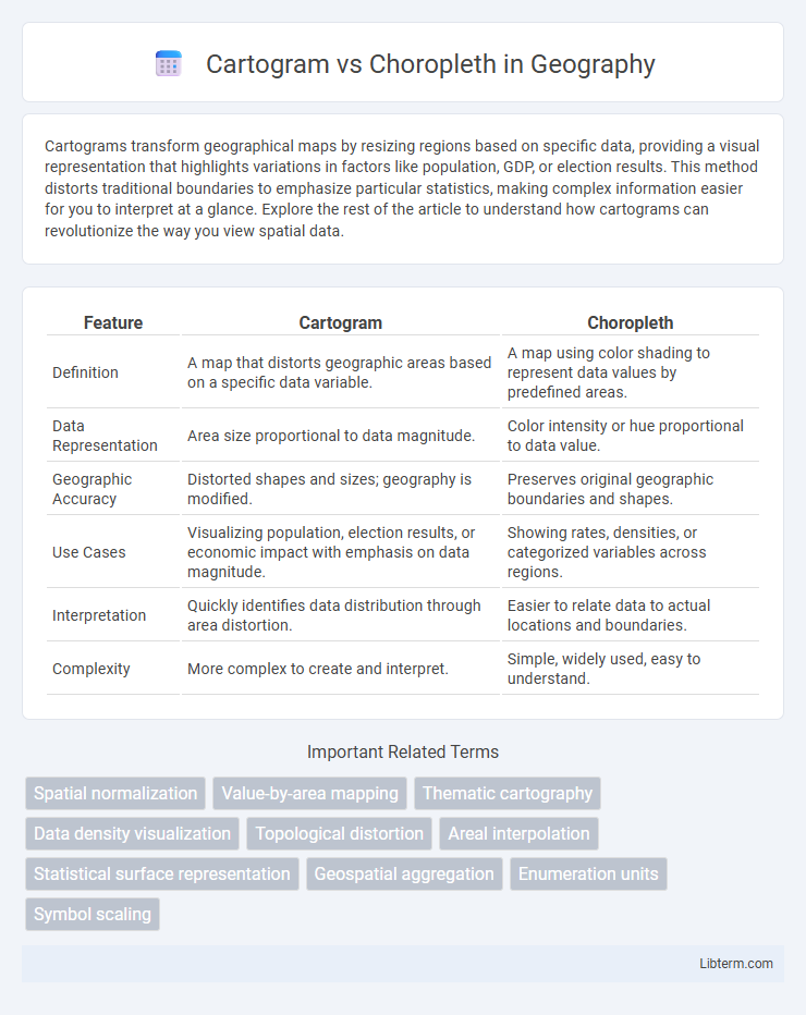
Table of Comparison
| Feature | Cartogram | Choropleth |
|---|---|---|
| Definition | A map that distorts geographic areas based on a specific data variable. | A map using color shading to represent data values by predefined areas. |
| Data Representation | Area size proportional to data magnitude. | Color intensity or hue proportional to data value. |
| Geographic Accuracy | Distorted shapes and sizes; geography is modified. | Preserves original geographic boundaries and shapes. |
| Use Cases | Visualizing population, election results, or economic impact with emphasis on data magnitude. | Showing rates, densities, or categorized variables across regions. |
| Interpretation | Quickly identifies data distribution through area distortion. | Easier to relate data to actual locations and boundaries. |
| Complexity | More complex to create and interpret. | Simple, widely used, easy to understand. |
Introduction to Cartograms and Choropleth Maps
Cartograms distort geographic regions to represent data values proportional to a specific variable, emphasizing the magnitude of data over spatial accuracy. Choropleth maps color regions based on data classification, maintaining geographic boundaries while highlighting variations in data intensity. Both visualization techniques transform raw data into spatial representations, optimizing interpretability for demographic, economic, or epidemiological patterns.
Understanding Cartograms: Definition and Uses
Cartograms are specialized maps where geographic areas are resized based on a specific data variable, such as population or GDP, to visually emphasize the metric's importance over physical land size. They are widely used in demographic studies and electoral analysis to represent data like population density or voting distribution more intuitively. Unlike choropleth maps, which color regions according to data ranges while keeping geography intact, cartograms distort map shapes to highlight data-driven spatial relationships.
What is a Choropleth Map? Core Concepts
A choropleth map visualizes data by shading geographic regions based on statistical variables, allowing viewers to quickly identify spatial patterns and intensity levels within defined areas. It uses color gradients or distinct hues to represent values, facilitating comparisons across regions such as states, counties, or countries. Key concepts include regional boundaries, data normalization to prevent misleading interpretations, and the importance of choosing appropriate color scales to convey accurate and clear information.
Key Differences Between Cartograms and Choropleths
Cartograms distort geographic boundaries to represent data values proportionally, emphasizing quantity over actual location, while choropleth maps use color gradients within fixed boundaries to display data intensity or density. Cartograms are effective for visualizing variables like population size or electoral votes by resizing areas, whereas choropleths excel in showing rates or percentages across predefined regions. The key difference lies in cartograms' spatial distortion for data representation versus choropleths' reliance on color variation within accurate geographic shapes.
Advantages of Using Cartogram Maps
Cartogram maps provide a powerful advantage by resizing geographic regions based on data values, enabling clear visualization of relative quantities such as population or economic output. This technique highlights patterns and disparities that traditional choropleth maps may obscure due to uniform area representations. Cartograms enhance interpretability in demographic studies, political analysis, and resource allocation by prioritizing data-driven spatial distortion over fixed geographic boundaries.
Strengths and Limitations of Choropleth Maps
Choropleth maps effectively visualize data distribution across predefined geographic areas using color gradients, which make patterns and regional differences intuitive for users. Their strength lies in clearly representing normalized data, such as rates or densities, while maintaining recognizable geographic boundaries. Limitations include potential misinterpretation when areas vary drastically in size, causing visual distortion, and difficulty accurately displaying raw counts or data that do not normalize well by area.
Data Representation and Visual Impact
Cartograms distort geographic boundaries to represent data values, enhancing visual emphasis on significant metrics by resizing regions proportionally, which effectively highlights disparities in data such as population or economic output. Choropleth maps use color gradients within fixed geographic boundaries to depict data density or intensity, offering a clear visual differentiation of data distribution across regions without altering their shapes. The choice between cartograms and choropleth maps depends on whether the priority is spatial accuracy or impactful data representation, with cartograms excelling in visual impact and choropleths providing intuitive spatial context.
Best Practices for Choosing the Right Map Type
Choosing between cartogram and choropleth maps depends on the data emphasis: cartograms distort geographic areas to represent variables such as population size, while choropleth maps use color gradients to depict data density within predefined boundaries. Best practices include selecting cartograms for visualizing proportional relationships where spatial size is less critical, and opting for choropleth maps when maintaining geographic fidelity is important for interpreting regional patterns. Consider data type, audience familiarity, and the necessity of accurate spatial context to ensure clarity and effective communication.
Real-World Examples: Cartogram vs Choropleth
Cartograms reshape geographic areas according to data values, such as the 2004 U.S. presidential election cartogram where states are resized by electoral votes, highlighting political weight over physical size. Choropleth maps use color gradients to represent data intensity within fixed boundaries, exemplified by COVID-19 infection rate maps that color-code regions by case density. Real-world applications reveal cartograms' strength in visualizing weighted data distribution, while choropleths excel in showing spatial variation within natural geographic limits.
Conclusion: Selecting the Optimal Spatial Visualization
Cartograms emphasize spatial relationships by resizing regions based on data values, enhancing the perception of magnitude but sometimes distorting geographic accuracy. Choropleth maps preserve geographic boundaries and use color gradients to represent data density, making them ideal for identifying regional patterns. Choosing between cartograms and choropleth maps depends on whether the priority is to highlight data-driven area importance or maintain true spatial context for clearer geographic interpretation.
Cartogram Infographic