Proportional symbols visually represent data values through varying symbol sizes, making complex information easier to interpret on maps and charts. These symbols help you quickly compare quantities and identify patterns in datasets without overwhelming detail. Explore the rest of this article to learn how to effectively use proportional symbols in your data presentations.
Table of Comparison
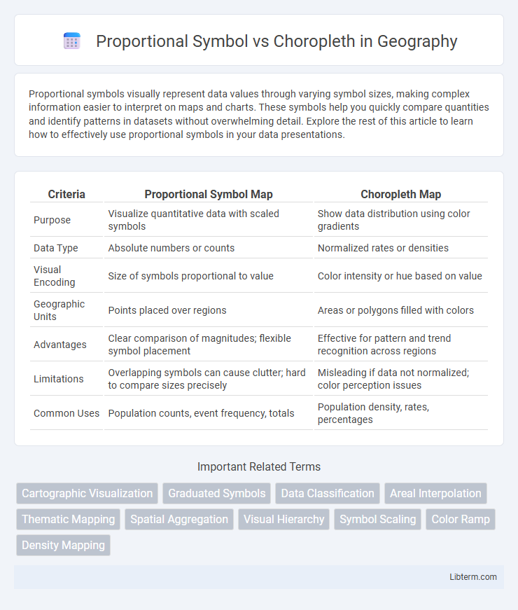
| Criteria | Proportional Symbol Map | Choropleth Map |
|---|---|---|
| Purpose | Visualize quantitative data with scaled symbols | Show data distribution using color gradients |
| Data Type | Absolute numbers or counts | Normalized rates or densities |
| Visual Encoding | Size of symbols proportional to value | Color intensity or hue based on value |
| Geographic Units | Points placed over regions | Areas or polygons filled with colors |
| Advantages | Clear comparison of magnitudes; flexible symbol placement | Effective for pattern and trend recognition across regions |
| Limitations | Overlapping symbols can cause clutter; hard to compare sizes precisely | Misleading if data not normalized; color perception issues |
| Common Uses | Population counts, event frequency, totals | Population density, rates, percentages |
Introduction to Thematic Mapping
Proportional symbol maps display data using symbols of varying sizes to represent quantitative values at specific locations, allowing precise comparison of numerical information. Choropleth maps use different shades or colors within predefined areas, such as states or counties, to depict data density or rates, making spatial patterns and regional trends visually clear. Both techniques are fundamental in thematic mapping for effectively conveying spatial variations in geographic data.
What Are Proportional Symbol Maps?
Proportional symbol maps use symbols of varying sizes to represent data values at specific geographic locations, making it easy to compare quantities visually across regions. These maps are ideal for displaying data such as population, sales, or resource distribution, where the size of each symbol corresponds directly to the magnitude of the data point. Unlike choropleth maps, which use color shading to represent data density within predefined areas, proportional symbol maps emphasize individual data points, enhancing clarity in spatial data representation.
Understanding Choropleth Maps
Choropleth maps represent data through varying shades or colors within predefined geographic areas, effectively illustrating regional patterns and distributions. These maps are ideal for displaying normalized data such as population density, income levels, or election results, allowing easy comparison between regions. Proper classification methods and color schemes are crucial for accurate interpretation and avoiding misleading conclusions in choropleth visualizations.
Data Suitability for Each Method
Proportional symbol maps excel at representing absolute data values, making them ideal for showcasing quantitative information such as population size or sales volume at specific locations. Choropleth maps are best suited for normalized data, like rates, ratios, or percentages, because they display variations within predefined regions, emphasizing relative differences rather than totals. Selection between these methods depends on data type and spatial aggregation: absolute counts favor proportional symbols, while relative metrics align with choropleth visualization.
Visual Communication: Symbols vs. Colors
Proportional symbol maps use varying symbol sizes to represent quantitative data, enhancing visual communication by allowing immediate perception of magnitude differences. Choropleth maps employ color gradients to convey data intensity across predefined areas, facilitating quick comparisons of regional patterns. Both methods optimize data interpretation, with symbols emphasizing precise values and colors highlighting spatial distribution trends.
Advantages of Proportional Symbol Maps
Proportional symbol maps offer clear advantages by accurately representing quantitative data through varying symbol sizes, allowing for easy comparison of values across geographic areas without distortion from varying area sizes. These maps maintain location precision since symbols are placed at exact coordinates, enhancing spatial accuracy compared to choropleth maps, which aggregate data into predefined regions. Furthermore, proportional symbol maps effectively display multiple data sets simultaneously by using different symbol shapes or colors, facilitating multifaceted spatial analysis.
Advantages of Choropleth Maps
Choropleth maps provide clear visual differentiation of geographic regions based on data intensity by using varying shades or colors, making them ideal for illustrating population density, election results, or income distribution. Their ability to convey spatial patterns at a glance enhances data comprehension across large areas, supporting decision-making in urban planning, public health, and resource allocation. Choropleth maps also facilitate easy comparison between regions due to their standardized color gradients and are particularly effective for representing normalized data such as rates or percentages.
Common Pitfalls and Misinterpretations
Proportional symbol maps often suffer from misinterpretations due to overlapping symbols and difficulty in accurately comparing sizes, leading to skewed perceptions of data magnitude. Choropleth maps can cause errors by implying uniform data distribution within geographic boundaries, ignoring internal variations and population density differences. Both methods risk misleading viewers if classification schemes or scaling are poorly chosen, resulting in visual bias or overgeneralization of spatial patterns.
When to Use Proportional Symbol or Choropleth
Proportional symbol maps are ideal for visualizing discrete data points where the magnitude varies significantly, such as population counts or sales figures, allowing users to compare quantities precisely at specific locations. Choropleth maps are best suited for representing normalized data over predefined regions, like population density or unemployment rates, enabling easy interpretation of spatial patterns and gradients. Choose proportional symbol maps when absolute values are paramount and spatial distribution pinpointing is required, whereas choropleth maps excel in displaying relative metrics or rates across contiguous areas.
Summary: Choosing the Right Map Type
Proportional symbol maps excel at visualizing exact data values with symbols sized according to quantitative variables, making them ideal for showing discrete data points and comparisons. Choropleth maps display data aggregated by geographic areas through color gradients, effectively highlighting spatial patterns and regional differences across continuous data. Selecting the right type depends on whether the goal is to emphasize precise data magnitude (proportional symbols) or spatial distribution and density (choropleth).
Proportional Symbol Infographic