Elevation-relief diagrams visually represent the variations in terrain height and shape using shaded relief or contour lines to highlight mountains, valleys, and plains. They are essential tools in geography and cartography for understanding the physical landscape and planning activities such as hiking or construction. Explore the rest of the article to learn how elevation-relief diagrams can enhance your spatial awareness and map interpretation skills.
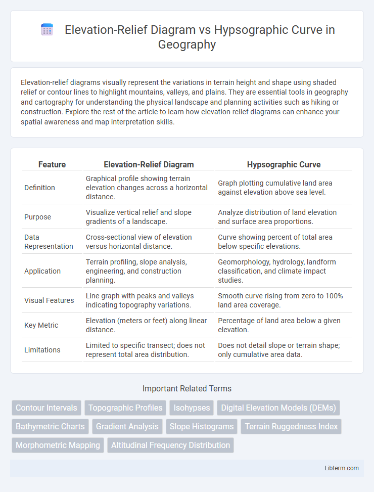
Table of Comparison
| Feature | Elevation-Relief Diagram | Hypsographic Curve |
|---|---|---|
| Definition | Graphical profile showing terrain elevation changes across a horizontal distance. | Graph plotting cumulative land area against elevation above sea level. |
| Purpose | Visualize vertical relief and slope gradients of a landscape. | Analyze distribution of land elevation and surface area proportions. |
| Data Representation | Cross-sectional view of elevation versus horizontal distance. | Curve showing percent of total area below specific elevations. |
| Application | Terrain profiling, slope analysis, engineering, and construction planning. | Geomorphology, hydrology, landform classification, and climate impact studies. |
| Visual Features | Line graph with peaks and valleys indicating topography variations. | Smooth curve rising from zero to 100% land area coverage. |
| Key Metric | Elevation (meters or feet) along linear distance. | Percentage of land area below a given elevation. |
| Limitations | Limited to specific transect; does not represent total area distribution. | Does not detail slope or terrain shape; only cumulative area data. |
Introduction to Elevation-Relief Diagrams and Hypsographic Curves
Elevation-Relief Diagrams visually represent the varied terrain heights across a region, emphasizing the contrast between mountains, valleys, and plains through color gradients or shading. Hypsographic Curves graphically display the proportion of land area at different elevations, illustrating the distribution of Earth's surfaces from sea level to the highest peaks. Both tools are essential in physical geography and environmental studies for analyzing topography and understanding elevation patterns.
Defining Elevation-Relief Diagrams
Elevation-Relief Diagrams visually represent terrain features by illustrating variations in elevation and surface roughness, emphasizing topographic relief through color gradients and contouring. These diagrams provide a three-dimensional perspective of landforms, aiding in understanding slope steepness, elevation changes, and landscape complexity more intuitively than flat maps. Unlike hypsographic curves, which quantify area distribution at specific elevation intervals, elevation-relief diagrams focus on spatial relationships and visual emphasis of elevation differences and terrain relief.
Understanding Hypsographic Curves
Hypsographic curves graphically represent the distribution of Earth's surface elevations relative to sea level, illustrating the proportion of land area at various altitudes. These curves provide critical insight into the overall topographic profile by showing cumulative percentages of land above specific elevation thresholds, aiding in geomorphological and climatic studies. Understanding hypsographic curves enables better analysis of terrain characteristics compared to elevation-relief diagrams, which primarily highlight spatial variation in elevation within a region.
Historical Development of Both Visualization Methods
Elevation-relief diagrams emerged in the 19th century as cartographers sought more intuitive ways to represent terrain by simulating shadows and texture to indicate altitude variations, enhancing map readability and topographic understanding. Hypsographic curves originated in the early 20th century as a graphical method to display cumulative land elevation distribution, providing a quantitative approach to analyze Earth's surface elevations and bathymetry. Both visualization methods evolved through advances in surveying, geodesy, and printing techniques, fundamentally transforming cartographic representation and geomorphological analysis over time.
Key Differences Between Elevation-Relief Diagrams and Hypsographic Curves
Elevation-relief diagrams visually represent the three-dimensional terrain by using color gradients and contour lines to show elevation changes and landscape features, emphasizing spatial variations and topographic patterns. Hypsographic curves graphically depict the proportion of Earth's surface at different elevations through a cumulative distribution function, focusing primarily on statistical elevation data rather than spatial distribution. Key differences include the elevation-relief diagram's emphasis on geographic visualization versus the hypsographic curve's focus on quantitative elevation distribution, making each suited for different analytical purposes in geomorphology and earth sciences.
Use Cases in Geography and Cartography
Elevation-relief diagrams visually represent terrain shape by illustrating variations in elevation, often used in topographic mapping and landscape analysis to identify landforms such as mountains and valleys. Hypsographic curves depict the distribution of land area across different elevation bands, aiding geomorphologists and geographers in interpreting elevation-area relationships and assessing watershed characteristics. Both tools support geographic information systems (GIS) by enhancing spatial analysis, with elevation-relief diagrams facilitating terrain visualization and hypsographic curves guiding environmental planning and land management decisions.
Advantages of Elevation-Relief Diagrams
Elevation-relief diagrams effectively visualize terrain by combining color shading and contour lines, enhancing the interpretation of landforms and elevation changes. They provide an intuitive, three-dimensional perspective that helps in identifying slopes, hills, and valleys more clearly than hypsographic curves. These diagrams facilitate better spatial understanding for applications in geography, urban planning, and environmental studies.
Benefits of Hypsographic Curves
Hypsographic curves provide a clear visual representation of the distribution of Earth's surface elevations, enabling better analysis of landform patterns and sea-level relationships. These curves facilitate accurate assessment of terrain volume and area at various elevations, supporting geological and environmental studies. Their ability to integrate elevation data into a cumulative distribution format offers practical benefits for watershed management, climate impact research, and land-use planning.
Challenges and Limitations of Each Method
Elevation-Relief Diagrams often face challenges related to scale distortion and visual clutter when representing complex terrains, limiting their effectiveness for detailed analysis. Hypsographic Curves can be limited by their reliance on accurate and comprehensive elevation data, and they may obscure spatial variability by reducing three-dimensional terrain information to a simple area-versus-elevation graph. Both methods struggle with accurately conveying micro-topographic features and often require complementary use for a holistic understanding of landscape elevation characteristics.
Summary: Choosing the Right Visualization Tool for Elevation Data
Elevation-Relief Diagrams provide a detailed three-dimensional perspective of terrain by visually representing slopes and elevations through shaded relief, making them ideal for detailed topographic analysis and landscape interpretation. Hypsographic Curves offer a concise statistical overview of land elevation distribution by plotting cumulative area against altitude, which is essential for understanding overall elevation trends and geomorphological patterns. Selecting the appropriate visualization depends on whether the focus is on spatial terrain complexity (Elevation-Relief Diagram) or quantitative elevation distribution (Hypsographic Curve) to effectively support geographic and environmental analysis.
Elevation-Relief Diagram Infographic