A cartogram transforms geographic data by resizing regions according to a specific variable, such as population or economic activity, rather than actual land area. This technique highlights spatial patterns and relationships that traditional maps might obscure, offering insightful visualizations for better understanding complex data. Explore the rest of the article to discover how cartograms can enhance your data analysis and storytelling.
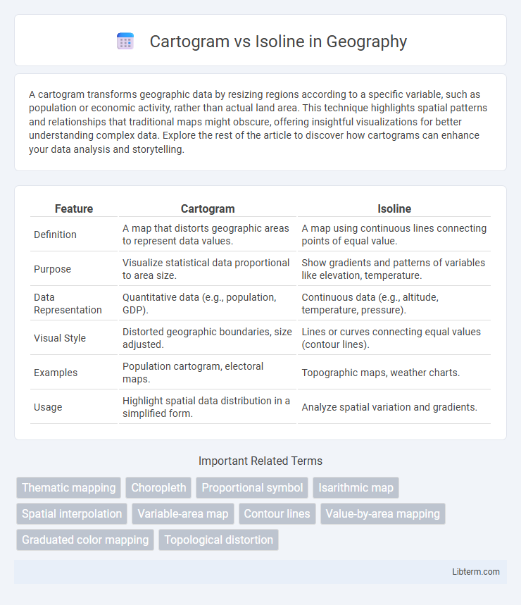
Table of Comparison
| Feature | Cartogram | Isoline |
|---|---|---|
| Definition | A map that distorts geographic areas to represent data values. | A map using continuous lines connecting points of equal value. |
| Purpose | Visualize statistical data proportional to area size. | Show gradients and patterns of variables like elevation, temperature. |
| Data Representation | Quantitative data (e.g., population, GDP). | Continuous data (e.g., altitude, temperature, pressure). |
| Visual Style | Distorted geographic boundaries, size adjusted. | Lines or curves connecting equal values (contour lines). |
| Examples | Population cartogram, electoral maps. | Topographic maps, weather charts. |
| Usage | Highlight spatial data distribution in a simplified form. | Analyze spatial variation and gradients. |
Introduction to Cartogram and Isoline Maps
Cartogram maps distort geographic areas based on a specific data variable, such as population or GDP, to visually emphasize spatial data variations. Isoline maps use continuous lines to connect points of equal value, such as elevation or temperature, providing a clear representation of gradual changes across a region. Both map types enhance spatial data interpretation but serve different analytical purposes: cartograms highlight data magnitude through area distortion, while isolines reveal gradients and patterns by linking equal-value points.
Defining Cartograms: Concept and Types
Cartograms transform geographic regions based on data variables, resizing areas to reflect statistical values such as population or economic indicators rather than physical land area. Common types include contiguous cartograms, which distort shapes but maintain adjacency, and non-contiguous cartograms, where regions vary in size independently without preserving geographic connections. This method enhances visual understanding of spatial distributions and relationships within complex datasets.
Understanding Isoline Maps: Purpose and Variations
Isoline maps, also known as contour maps, use continuous lines to represent equal values of a particular variable, such as elevation, temperature, or pressure, facilitating the visualization of spatial gradients. Variations include isotherms for temperature, isobars for pressure, and contour lines for elevation, each serving distinct scientific and geographic purposes in fields like meteorology and topography. Understanding the purpose of isoline maps is essential for interpreting spatial data patterns, making them invaluable tools in environmental monitoring and geographic analysis.
Key Differences Between Cartogram and Isoline
Cartograms distort geographic areas based on a specific data variable, such as population size, to emphasize quantity rather than physical space, while isolines represent continuous data values across a geographic area by connecting points of equal value, commonly used in weather and elevation maps. Cartograms prioritize thematic representation, often sacrificing geographic accuracy, whereas isolines maintain geographic consistency but visualize gradients or patterns like temperature or pressure. The key difference lies in cartograms' focus on proportional data visualization at the expense of spatial accuracy, contrasted with isolines' precise spatial representation of continuous numerical data.
Visual Representation and Data Communication
Cartograms transform geographical areas by resizing regions proportional to a specific data variable, enhancing visual impact for demographic or economic statistics. Isolines connect points of equal value using continuous lines, effectively illustrating gradients and patterns in phenomena like temperature or elevation. Cartograms prioritize area distortion to emphasize data magnitude, while isolines maintain geographic accuracy to communicate spatial variation clearly.
Common Applications of Cartograms
Cartograms are widely used in visualizing demographic data, such as population distribution and election results, by resizing geographic regions based on specific variables. They effectively communicate social and economic patterns in public health, urban planning, and market analysis. Unlike isolines, which represent continuous data gradients like elevation or temperature, cartograms emphasize relative magnitude through area distortion.
Typical Uses of Isoline Maps
Isoline maps efficiently represent continuous data such as elevation, temperature, or air pressure by connecting points of equal value with contour lines, making them essential in meteorology and topography. These maps enable quick identification of gradients and patterns across geographic regions, aiding in weather forecasting and environmental studies. Typical uses include displaying temperature distributions, rainfall intensity, and topographic elevation changes to support data analysis and decision-making.
Advantages and Limitations of Cartograms
Cartograms visually represent data by resizing geographic regions based on statistical values, enhancing the understanding of spatial distribution disparities. Their advantages include clearly highlighting quantitative differences and making complex data patterns accessible to a broad audience. However, cartograms can distort geographic shapes and spatial relationships, potentially confusing viewers unfamiliar with the altered map layouts.
Pros and Cons of Isoline Mapping
Isoline mapping excels in visually representing continuous data such as temperature, elevation, or pollution levels by connecting points of equal value, which enhances spatial pattern recognition and gradient understanding. However, isoline maps can become cluttered and hard to interpret in areas with rapid changes or sparse data points, leading to potential inaccuracies or oversimplifications. The method requires dense, evenly distributed data for optimal clarity, and its abstraction may not convey precise exact values to all users effectively.
Choosing the Right Map Type for Your Data
Selecting the right map type hinges on the nature of your data: cartograms distort geographic areas to emphasize variable magnitudes like population or economic indicators, making them ideal for visualizing proportional differences across regions. Isoline maps represent continuous data through contour lines, effectively showcasing gradients such as elevation, temperature, or pressure over a geographic area. Understanding whether your data benefits more from spatial distortion or gradient representation ensures a clear, impactful visualization tailored to your analytical goals.
Cartogram Infographic