Choropleth maps use varying shades or colors to represent data values across geographic areas, making it easier to identify regional patterns and trends. These maps are widely used in fields like demographics, economics, and public health to visually communicate statistical information effectively. Explore this article to learn how choropleth maps can enhance your data visualization skills.
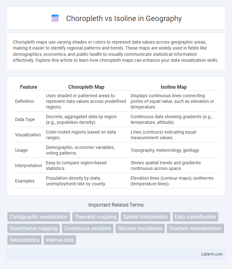
Table of Comparison
| Feature | Choropleth Map | Isoline Map |
|---|---|---|
| Definition | Uses shaded or patterned areas to represent data values across predefined regions. | Displays continuous lines connecting points of equal value, such as elevation or temperature. |
| Data Type | Discrete, aggregated data by region (e.g., population density). | Continuous data showing gradients (e.g., temperature, altitude). |
| Visualization | Color-coded regions based on data ranges. | Lines (contours) indicating equal measurement values. |
| Usage | Demographic, economic variables, voting patterns. | Topography, meteorology, geology. |
| Interpretation | Easy to compare region-based statistics. | Shows spatial trends and gradients continuous across space. |
| Examples | Population density by state, unemployment rate by county. | Elevation lines (contour maps), isotherms (temperature lines). |
Introduction to Choropleth and Isoline Maps
Choropleth maps represent data through varying shades or colors within predefined geographic areas, making them ideal for visualizing statistical variables like population density or election results. Isoline maps use continuous lines to connect points of equal value, commonly employed for illustrating gradients such as temperature, elevation, or atmospheric pressure. Both mapping techniques enhance spatial data interpretation by emphasizing different aspects: choropleth maps highlight area-based data distribution while isoline maps reveal smooth transitions across geographic space.
Defining Choropleth Maps
Choropleth maps represent data through varying shades or colors in predefined geographic areas, such as countries, states, or counties, to visualize statistical variables like population density or election results. These maps aggregate data to specific regions, providing an intuitive, location-based comparison of values across the map. This contrasts with isoline maps, which use continuous lines to connect points of equal value, emphasizing gradual spatial change rather than discrete regional differences.
Understanding Isoline Maps
Isoline maps use continuous lines to represent constant values across a geographic area, making them ideal for visualizing gradients such as temperature, elevation, or air pressure. Unlike choropleth maps, which rely on color shading within predefined boundaries, isoline maps reveal subtle variations by connecting points of equal value and highlighting spatial trends. This method enhances the interpretation of phenomena where data changes smoothly over space, providing clearer insights for meteorology, geology, and environmental studies.
Key Differences Between Choropleth and Isoline Maps
Choropleth maps display data by shading predefined areas, such as states or counties, making them ideal for visualizing aggregated statistics like population density or election results. Isoline maps use continuous lines to connect points of equal value, effectively illustrating gradients in variables like elevation, temperature, or rainfall. The key difference lies in representation: choropleth maps emphasize area-based data with distinct boundaries, while isoline maps highlight spatial trends through contour lines across continuous surfaces.
Data Representation: Quantitative vs. Continuous
Choropleth maps represent quantitative data by shading predefined areas such as states or counties, making them ideal for illustrating aggregated statistics like population density or election results. Isoline maps display continuous data through lines connecting points of equal value, effectively visualizing gradients in phenomena such as temperature, elevation, or atmospheric pressure. These differing data representations enable choropleth maps to simplify spatial comparisons of discrete regions, while isoline maps highlight subtle variations within continuously changing datasets.
Advantages of Choropleth Maps
Choropleth maps effectively visualize data distributions by assigning color gradients to predefined geographic areas, enabling quick identification of spatial patterns and regional variations. They provide intuitive comparisons between regions using clearly defined boundaries, making them ideal for demographic, economic, or election data analysis. Their ability to display aggregated data at varying geographic scales enhances interpretability for policy-making and strategic planning.
Advantages of Isoline Maps
Isoline maps excel in visualizing continuous data through smooth, flowing lines that represent equal values, making them ideal for illustrating gradients like temperature, elevation, or pressure. These maps provide precise spatial relationships and patterns without the abrupt boundaries found in choropleth maps, enhancing interpretability for natural phenomena. Isoline maps also avoid the potential misinterpretation caused by arbitrary administrative borders, offering a more accurate depiction of geographic trends.
Common Applications and Use Cases
Choropleth maps effectively display statistical data such as population density or election results by shading predefined areas like states or counties, making them ideal for demographic and socio-economic analysis. Isoline maps represent continuous data like temperature, elevation, or atmospheric pressure by drawing contour lines, widely used in meteorology, geography, and environmental science. Both map types enable visual interpretation of spatial patterns but serve distinct applications: choropleth excels in aggregating discrete data across regions, while isoline excels in illustrating gradual variations across geographical spaces.
Visual Interpretation and User Experience
Choropleth maps use color shades to represent data values within predefined geographic areas, making it easier for users to quickly identify regional patterns but potentially obscuring variations within boundaries. Isoline maps display continuous lines connecting points of equal value, offering a more precise visualization of data gradients and subtle transitions, which enhances detailed spatial analysis but may be less intuitive for casual users. User experience depends on the map's purpose: choropleths excel in communicating broad trends, while isolines provide nuanced, high-resolution insights.
Choosing the Right Map Type for Your Data
Choropleth maps display data by shading predefined areas, making them ideal for visualizing aggregated statistics like population density or election results across regions. Isoline maps represent continuous data through contour lines, effectively illustrating gradients such as temperature, elevation, or precipitation levels. Selecting the right map type depends on whether your data is area-based or continuous, with choropleth enhancing categorical or regional patterns and isoline emphasizing gradual changes over space.
Choropleth Infographic