A cartogram is a map in which geographic regions are resized according to a specific statistical value, such as population or economic output, rather than their actual land area. This visualization technique helps highlight spatial patterns and relationships that traditional maps might obscure. Explore the rest of the article to discover how cartograms can transform your understanding of geographic data.
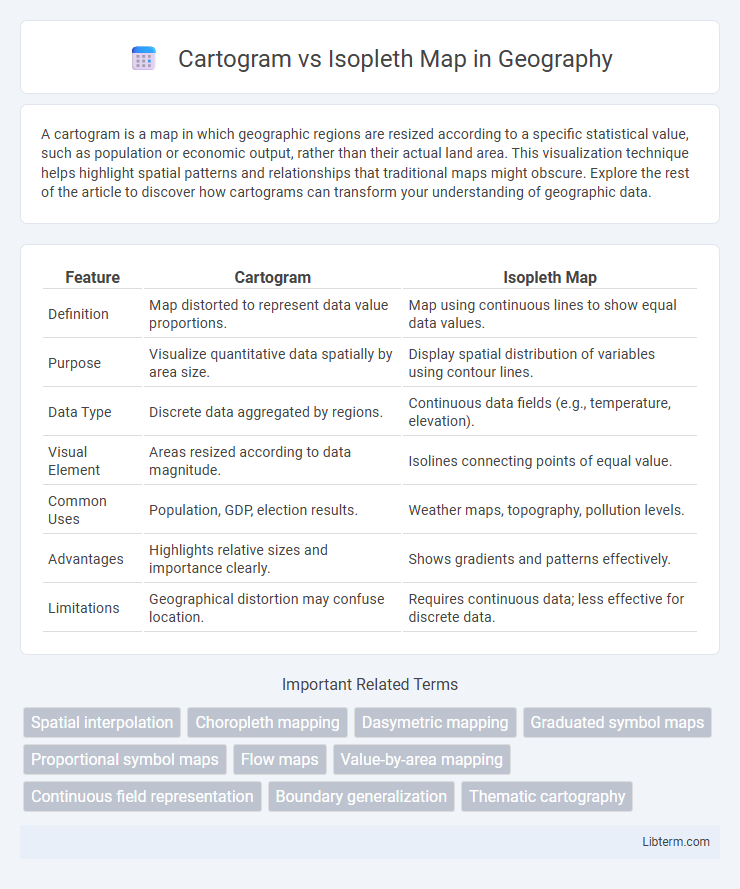
Table of Comparison
| Feature | Cartogram | Isopleth Map |
|---|---|---|
| Definition | Map distorted to represent data value proportions. | Map using continuous lines to show equal data values. |
| Purpose | Visualize quantitative data spatially by area size. | Display spatial distribution of variables using contour lines. |
| Data Type | Discrete data aggregated by regions. | Continuous data fields (e.g., temperature, elevation). |
| Visual Element | Areas resized according to data magnitude. | Isolines connecting points of equal value. |
| Common Uses | Population, GDP, election results. | Weather maps, topography, pollution levels. |
| Advantages | Highlights relative sizes and importance clearly. | Shows gradients and patterns effectively. |
| Limitations | Geographical distortion may confuse location. | Requires continuous data; less effective for discrete data. |
Introduction to Cartograms and Isopleth Maps
Cartograms distort geographic areas to represent data values, emphasizing statistical information over precise location, commonly used to visualize demographic, economic, or electoral data. Isopleth maps display continuous data through contour lines or color gradients, ideal for representing variables like temperature, precipitation, or elevation across spatial regions. Both map types serve distinct purposes: cartograms highlight quantitative differences by resizing regions, while isopleth maps illustrate spatial gradients and patterns in environmental or physical phenomena.
Definition and Core Concepts
A cartogram is a map in which geographic regions are resized according to a specific data variable, such as population or economic metrics, distorting traditional shapes to emphasize data representation. An isopleth map uses continuous lines or color gradients to represent spatial variations of a phenomenon, such as temperature or elevation, across a geographic area without altering the underlying geography. While cartograms prioritize data proportionality by reshaping regions, isopleth maps focus on illustrating gradual spatial changes and patterns through isolines or shaded areas.
Data Representation Techniques
Cartograms distort geographic areas to proportionally represent a specific data variable, emphasizing quantitative differences by resizing regions based on data values. Isopleth maps use continuous lines to connect points of equal value, effectively visualizing spatial gradients and patterns such as temperature or precipitation. Both techniques enhance data interpretation but differ in visual approach: cartograms alter shape and area, while isopleth maps maintain geographic accuracy with contour lines.
Visual Differences and Map Appearance
Cartograms distort geographic areas to represent data proportions, making regions with higher values appear larger while shrinking those with lower values, creating a visually stretched or compressed map. Isopleth maps use continuous lines or color gradients to show spatial variations of data, maintaining geographic shapes but emphasizing data density or intensity through smooth transitions. The visual difference lies in cartograms prioritizing data-driven area distortion, whereas isopleth maps preserve geography while illustrating data gradients.
Types of Cartograms and Their Uses
Cartograms transform geographic areas based on data variables to emphasize information like population or economic output, with common types including contiguous, non-contiguous, and Dorling cartograms. Contiguous cartograms maintain area connections but distort shapes, ideal for visualizing demographic density, while non-contiguous types adjust size independently for clear comparison of regional statistics. Dorling cartograms replace regions with proportional circles, simplifying spatial distribution analysis of variables such as election results or disease spread.
Types of Isopleth Maps and Their Applications
Isopleth maps display continuous data using lines or color gradients to represent variables such as temperature, rainfall, or elevation, with common types including contour maps, choropleth maps, and dot density maps. Contour maps effectively illustrate elevation or atmospheric pressure, choropleth maps visualize demographic or statistical data by regions, and dot density maps represent distribution patterns of phenomena like population or disease incidence. These isopleth map types find applications in meteorology, geography, urban planning, and public health for detailed spatial analysis and decision-making.
Strengths of Cartograms
Cartograms excel in visually representing data by resizing geographic regions according to specific variables, such as population or economic indicators, enhancing the immediate perception of spatial distribution and magnitude. Their ability to distort geographic shapes while maintaining the relative position of areas allows for a clearer comparison of data density or importance across regions, which traditional isopleth maps might obscure by focusing solely on continuous data gradients. This makes cartograms particularly powerful for highlighting disparities and emphasizing proportional relationships in demographic, economic, or political datasets.
Advantages of Isopleth Maps
Isopleth maps provide a continuous representation of spatial data, allowing for clear visualization of gradients and patterns across geographic regions. They are particularly effective for displaying variables like temperature, precipitation, or pollution concentrations, where values change smoothly over space. This makes isopleth maps advantageous for identifying trends and making spatial predictions compared to cartograms, which distort areas and can obscure precise data relationships.
Limitations and Challenges
Cartograms often face limitations in preserving geographic shapes and sizes, leading to potential distortion that can confuse interpretation. Isopleth maps struggle with data smoothing and the subjective placement of isolines, which may result in misleading representations of spatial patterns. Both types of maps present challenges in balancing accuracy, legibility, and the effective communication of spatial data.
Choosing the Right Map for Your Data
Cartograms distort geographic areas based on data values, making them ideal for emphasizing relative magnitude in population or economic statistics, while isopleth maps use continuous color gradients or contour lines to represent spatial variations in data such as temperature, elevation, or pollution levels. Selecting the right map depends on whether the goal is to highlight proportional differences (cartogram) or to visualize smooth spatial patterns and transitions (isopleth). Consider the nature of your dataset--discrete categories or continuous measurements--and the message you want to convey when choosing between these visualization techniques.
Cartogram Infographic