A dot distribution map visually represents the spatial distribution of a specific phenomenon by placing dots over a geographic area, where each dot corresponds to a certain quantity or occurrence. This type of map is highly effective for identifying patterns, clusters, and trends within data, providing clear insights into population density, resource allocation, or event occurrences. Explore the rest of the article to learn how you can create and interpret dot distribution maps for your data analysis needs.
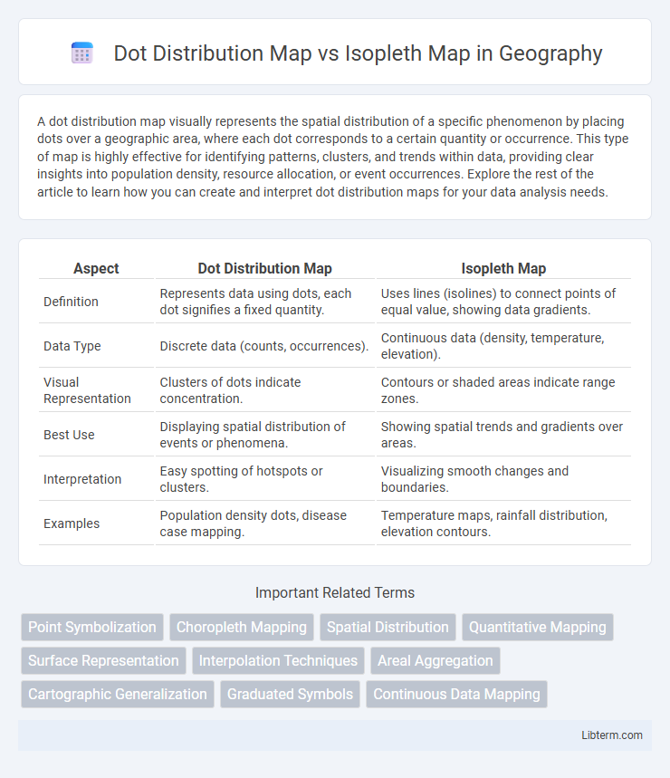
Table of Comparison
| Aspect | Dot Distribution Map | Isopleth Map |
|---|---|---|
| Definition | Represents data using dots, each dot signifies a fixed quantity. | Uses lines (isolines) to connect points of equal value, showing data gradients. |
| Data Type | Discrete data (counts, occurrences). | Continuous data (density, temperature, elevation). |
| Visual Representation | Clusters of dots indicate concentration. | Contours or shaded areas indicate range zones. |
| Best Use | Displaying spatial distribution of events or phenomena. | Showing spatial trends and gradients over areas. |
| Interpretation | Easy spotting of hotspots or clusters. | Visualizing smooth changes and boundaries. |
| Examples | Population density dots, disease case mapping. | Temperature maps, rainfall distribution, elevation contours. |
Introduction to Dot Distribution Maps and Isopleth Maps
Dot distribution maps represent data by placing dots in specific geographic locations, each dot corresponding to a set quantity of the mapped variable, making it ideal for visualizing spatial patterns and distribution density. Isopleth maps use continuous lines, or isopleths, to connect points of equal value, effectively illustrating gradients and variations in data such as temperature, elevation, or population density. Both mapping techniques provide distinct visual insights, with dot distribution maps emphasizing discrete occurrences and isopleth maps highlighting continuous spatial trends.
Definition and Key Features of Dot Distribution Maps
Dot distribution maps represent spatial data by placing dots within geographic units, with each dot corresponding to a specified quantity of the phenomenon being mapped, such as population or incidents. Key features of dot distribution maps include precise visualization of data density, clear identification of clusters and patterns, and the ability to convey quantitative information at a granular level. Unlike isopleth maps that use continuous lines to depict data gradients, dot distribution maps emphasize discrete occurrences, making them ideal for illustrating distribution and concentration across areas.
Definition and Key Features of Isopleth Maps
Isopleth maps are thematic maps that use continuous lines called isopleths or contour lines to represent areas of equal value, such as temperature, elevation, or precipitation. They effectively depict spatial gradations and patterns by connecting points of identical measurement, enabling easy visualization of variations across a geographic area. Unlike dot distribution maps, which represent discrete quantities with dots, isopleth maps provide a smooth, continuous representation of data intensity or magnitude.
Data Representation Techniques in Both Map Types
Dot distribution maps represent data by placing dots at exact or approximate locations, with each dot symbolizing a specific quantity or occurrence, making them ideal for visualizing discrete spatial patterns. Isopleth maps use continuous lines, or isopleths, to connect points of equal value, effectively illustrating gradients and variations in phenomena like temperature or elevation across a region. Both techniques offer unique strengths: dot distribution maps emphasize individual data points and distribution density, while isopleth maps highlight smooth transitions and overall trends in spatial data.
Suitable Data Types for Dot Distribution and Isopleth Maps
Dot distribution maps effectively visualize discrete data points such as population locations, crime incidents, or disease cases by representing each occurrence with dots, making them ideal for showing exact spatial distributions and densities. Isopleth maps are best suited for continuous data fields like temperature gradients, rainfall levels, or elevation, using contour lines or color shading to represent values that change smoothly over geographic space. Choosing between these map types depends on whether the data is point-based and discrete or continuous and smoothly varying across regions.
Visual Interpretation and Clarity: A Comparative Analysis
Dot distribution maps use individual dots to represent data occurrences, allowing for precise location visualization and clear identification of spatial patterns, especially in densely populated regions. Isopleth maps employ continuous lines to connect areas of equal value, which effectively illustrate gradual changes across space but may obscure exact point data distribution. Visual clarity in dot maps depends on dot size and density, while isopleth maps rely on smooth gradients and contour intervals to enhance interpretability of spatial variations.
Advantages of Dot Distribution Maps
Dot distribution maps provide precise spatial representation by placing individual dots to represent occurrences, offering clear visualization of population density and distribution patterns. These maps enable easy identification of clusters and rare events in granular detail, which is less apparent in isopleth maps that smooth data into continuous surfaces. Dot distribution maps also avoid the assumptions of uniform distribution within boundaries, improving accuracy in representing heterogeneous data.
Advantages of Isopleth Maps
Isopleth maps excel in representing continuous data such as temperature, elevation, or pollution levels by using smooth gradient lines that indicate equal values, enabling easy visualization of spatial trends and patterns. Their ability to interpolate between data points provides a clearer understanding of gradual changes across geographic areas, which is difficult to achieve with dot distribution maps that depict discrete data points. This makes isopleth maps particularly advantageous for environmental monitoring, meteorology, and resource management where precise gradient visualization is critical.
Limitations and Common Pitfalls of Each Map Type
Dot distribution maps often suffer from overplotting in areas with high data density, making it challenging to discern individual data points and potentially obscuring spatial patterns. Isopleth maps face limitations due to their reliance on interpolation, which can introduce inaccuracies when data points are sparse or unevenly distributed, leading to misleading gradient representations. Both map types may misrepresent spatial variability if not carefully designed, highlighting the importance of appropriate data resolution and symbolization in thematic mapping.
Choosing the Right Map: Use Case Scenarios
Dot distribution maps are ideal for visualizing the precise locations and densities of discrete phenomena such as population clusters or disease outbreaks, offering granular spatial detail. Isopleth maps excel in illustrating continuous data patterns like temperature gradients, rainfall distribution, or elevation by connecting points of equal value with smooth contour lines. Selecting between these maps depends on the use case: dot maps for pinpointing exact occurrences and isopleth maps for interpreting spatial trends and gradients in environmental or demographic variables.
Dot Distribution Map Infographic