Complementary colors are pairs of hues positioned directly opposite each other on the color wheel, such as red and green or blue and orange, creating a striking visual contrast when used together. These color combinations enhance vibrancy and balance in design, making elements stand out and appear more dynamic. Discover how leveraging complementary colors can transform your projects by exploring the insights in the rest of the article.
Table of Comparison
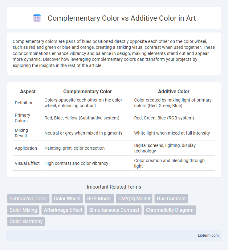
| Aspect | Complementary Color | Additive Color |
|---|---|---|
| Definition | Colors opposite each other on the color wheel, enhancing contrast | Color created by mixing light of primary colors (Red, Green, Blue) |
| Primary Colors | Red, Blue, Yellow (Subtractive system) | Red, Green, Blue (RGB system) |
| Mixing Result | Neutral or gray when mixed in pigments | White light when mixed at full intensity |
| Application | Painting, print, color correction | Digital screens, lighting, display technology |
| Visual Effect | High contrast and color vibrancy | Color creation and blending through light |
Introduction to Color Theory
Complementary color refers to pairs of hues positioned opposite each other on the color wheel, such as red and green or blue and orange, which create high contrast and visual balance when combined. Additive color involves the mixing of light colors, primarily red, green, and blue (RGB), to produce a spectrum of colors and white when all three are combined at full intensity. Understanding the distinction between complementary color in subtractive color models and additive color in light-based systems is fundamental to mastering color theory in design and art.
What Are Complementary Colors?
Complementary colors are pairs of hues located opposite each other on the color wheel, such as red and green or blue and orange, which create strong contrast when placed side by side. These colors, found in the subtractive color model used in painting and printing, blend to produce neutral tones like gray or brown when mixed together. The concept of complementary colors plays a crucial role in color theory, enhancing visual interest and balance in design and art through their contrasting relationships.
Understanding Additive Color Mixing
Additive color mixing involves combining red, green, and blue light to create a wide spectrum of colors, with the combination of all three producing white light. This process is fundamental in digital displays, where varying intensities of RGB LEDs or pixels blend to form the perceived color. Understanding additive color mixing is essential for applications in lighting design, screen technology, and visual effects to achieve accurate color representation.
Key Differences Between Complementary and Additive Colors
Complementary colors are pairs of hues located opposite each other on the color wheel, creating high contrast and visual balance, commonly used in art and design for color harmony. Additive colors involve light colors--red, green, and blue--that combine to form white light when mixed, fundamental to digital screens and lighting. The key difference lies in complementary colors being pigments that neutralize each other, while additive colors blend light sources to produce new colors through light intensity.
The Science Behind Color Perception
Complementary color theory explains how pairs of colors opposite each other on the color wheel, such as red and green, create high contrast and visual harmony by canceling each other out in additive color mixing. Additive color involves light, where combining red, green, and blue (RGB) wavelengths produces white light, demonstrating human vision's reliance on cone cells sensitive to these primary colors. The science behind color perception relies on how photoreceptors in the retina process different wavelengths, with additive color mixing occurring in emitted light sources and complementary color effects dominating pigment-based subtractive mixing.
Practical Applications in Art and Design
Complementary colors, positioned opposite each other on the color wheel, enhance visual contrast and balance in art and design, creating dynamic compositions and focal points. Additive color theory, based on red, green, and blue light, is essential in digital media and screen displays, enabling vibrant and precise color blending through light emission. Practically, artists use complementary colors to evoke emotion and depth in painting, while designers rely on additive color principles for accurate color rendering in web design and multimedia presentations.
Digital Media: Additive Color in Action
Additive color in digital media relies on combining red, green, and blue light to create a wide spectrum of colors on screens such as monitors, TVs, and smartphones. Each pixel uses varying intensities of these primary colors to produce vivid images, with white achieved by mixing all three colors at full intensity. This process contrasts with complementary color theory in print, which uses subtractive colors to absorb light rather than emit it.
Printing and Painting: The Role of Complementary Colors
Complementary colors play a crucial role in both printing and painting by enhancing visual contrast and color harmony, using subtractive color mixing with cyan, magenta, and yellow inks in printing to absorb and reflect light. In painting, complementary colors opposite each other on the color wheel, such as red and green, intensify each other's vibrancy when placed side by side, creating dynamic visual effects. Understanding the difference between additive color mixing, used in digital displays with red, green, and blue light, and subtractive mixing in printing and painting is essential for accurate color reproduction and artistic expression.
Common Misconceptions About Color Mixing
Common misconceptions about color mixing often confuse complementary color theory with additive color mixing principles. Complementary colors, found on opposite sides of the color wheel, produce neutral tones like gray or brown when combined in pigments, emphasizing subtractive color mixing used in painting and printing. Additive color mixing, relevant to light sources such as screens, involves red, green, and blue light combining to create white, revealing distinct physics between pigment blending and light emission.
Conclusion: Choosing the Right Color Approach
Choosing the right color approach depends on the medium and desired visual effect: complementary colors enhance contrast and harmony in subtractive color models used in painting and printing, while additive colors blend light sources in digital screens to create vibrant displays. Understanding the principles of complementary color pairs and additive color mixing ensures accurate color reproduction and impactful design outcomes. Aligning the color strategy with the project's technical and artistic requirements maximizes visual clarity and audience engagement.
Complementary Color Infographic