Negative space enhances design by creating balance and emphasizing the primary subject through the intentional use of empty or unoccupied areas. Skilled designers use negative space to guide the viewer's eye and improve visual clarity, making compositions more engaging and easier to interpret. Explore the rest of the article to discover practical techniques for effectively incorporating negative space into your own designs.
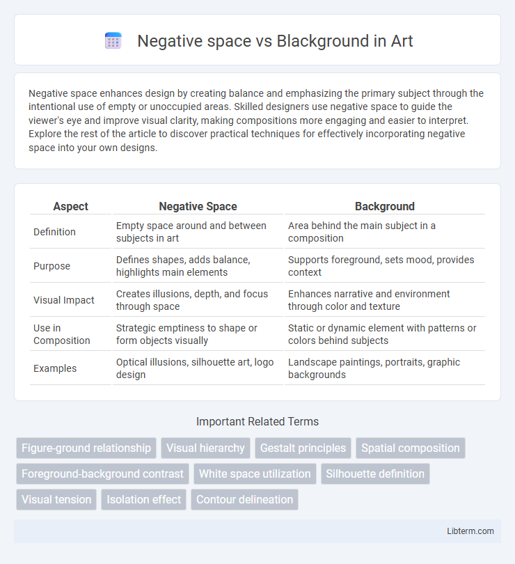
Table of Comparison
| Aspect | Negative Space | Background |
|---|---|---|
| Definition | Empty space around and between subjects in art | Area behind the main subject in a composition |
| Purpose | Defines shapes, adds balance, highlights main elements | Supports foreground, sets mood, provides context |
| Visual Impact | Creates illusions, depth, and focus through space | Enhances narrative and environment through color and texture |
| Use in Composition | Strategic emptiness to shape or form objects visually | Static or dynamic element with patterns or colors behind subjects |
| Examples | Optical illusions, silhouette art, logo design | Landscape paintings, portraits, graphic backgrounds |
Understanding Negative Space and Background
Negative space refers to the empty or unoccupied areas around and between the main subjects of an image, enhancing composition by creating balance and emphasizing the focal point. The background is the part of the image behind the main subject, providing context or setting without necessarily influencing the spatial relationship. Understanding the distinction helps designers use negative space intentionally to improve visual clarity and guide the viewer's attention, while the background serves as a supportive element in the overall design.
Key Differences between Negative Space and Background
Negative space refers to the empty or unoccupied areas surrounding the main subject in a design, enhancing visual clarity and focus by creating contrast. Background is the overall surface or environment behind the subject, providing context and setting but not necessarily influencing visual perception as directly as negative space. Key differences lie in function: negative space actively shapes composition and guides attention, while background serves as a backdrop without engaging the viewer's focus as intentionally.
The Role of Negative Space in Design
Negative space, also known as white space, refers to the empty or unoccupied areas surrounding the main subject in a design, playing a crucial role in enhancing visual clarity and balance. Unlike the background, which serves as the backdrop or surface on which elements are placed, negative space actively shapes the viewer's perception by creating contrast and emphasizing key design elements. Effective use of negative space improves readability, directs attention, and contributes to a clean, organized aesthetic in graphic layouts and user interfaces.
Backgrounds: Definition and Purpose
Backgrounds refer to the area behind the main subject in a composition, serving as a foundational element that supports and enhances the overall visual context. They provide depth, set the tone, and influence the viewer's perception by creating a suitable environment for the primary focal point. Unlike negative space, which is the empty or unused space around a subject, backgrounds actively contribute to the design by incorporating colors, textures, and imagery that complement the main elements.
Visual Impact: Negative Space vs Background
Negative space enhances visual impact by creating contrast that draws attention to the subject, allowing the design to breathe and improving overall clarity. Backgrounds can either support or overwhelm the main elements, depending on their complexity and color choice, influencing the viewer's focus and perception. Effective use of negative space results in a balanced composition that emphasizes key visuals, while a poorly managed background may distract or clutter the design.
Common Misconceptions about Negative Space
Negative space is the area surrounding the main subject in a design or artwork, often mistaken as merely the "background," which can lead to underappreciation of its role in composition. Unlike the background, negative space actively shapes the perception by creating balance and enhancing visual interest through intentional emptiness. Common misconceptions include viewing negative space as unimportant or empty, when it actually defines boundaries and contributes to the overall aesthetic impact.
Techniques for Using Negative Space Effectively
Techniques for using negative space effectively include balancing positive and negative elements to create visual harmony and guiding the viewer's eye toward key focal points. Employing contrast, such as pairing bold shapes with ample empty space, enhances clarity and emphasizes important design components. Strategic use of negative space also improves legibility in typography and adds sophistication by preventing clutter.
Choosing the Right Background for Your Composition
Choosing the right background for your composition significantly influences the visual impact and clarity of the design. Negative space, the intentional empty area around subjects, enhances focus and balance by allowing elements to breathe, while a blackground, or solid black background, creates strong contrast and highlights foreground details with dramatic effect. Understanding the purpose of your composition guides whether a minimal negative space or a bold blackground will best support your visual message and viewer engagement.
Case Studies: Design Examples Comparing Both
Case studies reveal negative space as an intentional use of empty areas to create shape and emphasis, contrasting with blackground, which functions as a solid-colored or patterned backdrop. In logos like FedEx, negative space cleverly forms an arrow between letters, enhancing brand symbolism without adding clutter. Conversely, brands employing blackground, such as Apple's minimalist ads, rely on strong color fields to direct viewer attention and establish mood.
Tips for Balancing Negative Space and Background
Balancing negative space and background requires careful adjustment of contrast, ensuring that the negative space enhances the main subject without overwhelming the background. Use consistent color palettes and textures to create harmony, allowing the negative space to provide breathing room and highlight focal elements effectively. Prioritize simplicity in the background to prevent visual clutter, making negative space a strategic tool for improved composition and viewer focus.
Negative space Infographic