Italic text adds emphasis and style to your writing, enhancing readability and drawing attention to key points. It is commonly used for titles, foreign words, or to highlight specific phrases within a paragraph. Explore this article to discover practical tips on when and how to use italics effectively in your content.
Table of Comparison
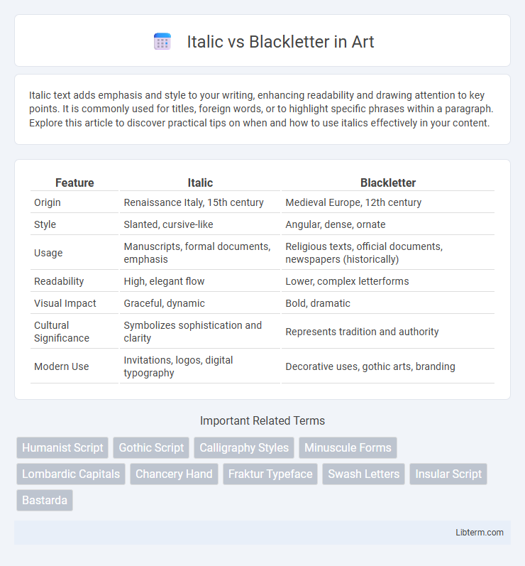
| Feature | Italic | Blackletter |
|---|---|---|
| Origin | Renaissance Italy, 15th century | Medieval Europe, 12th century |
| Style | Slanted, cursive-like | Angular, dense, ornate |
| Usage | Manuscripts, formal documents, emphasis | Religious texts, official documents, newspapers (historically) |
| Readability | High, elegant flow | Lower, complex letterforms |
| Visual Impact | Graceful, dynamic | Bold, dramatic |
| Cultural Significance | Symbolizes sophistication and clarity | Represents tradition and authority |
| Modern Use | Invitations, logos, digital typography | Decorative uses, gothic arts, branding |
Overview: Italic vs Blackletter
Italic typefaces feature a slanted, fluid design originating from the Renaissance, emphasizing readability and elegance in italicized texts. Blackletter fonts, characterized by dense, angular shapes, emerged in medieval Europe for manuscript writing and convey a historic, gothic aesthetic. The distinct visual styles address different design needs: Italic enhances emphasis within roman type, while Blackletter serves decorative or traditional contexts.
Historical Origins and Evolution
Italic script originated in Renaissance Italy during the early 16th century as a humanist cursive style designed for faster handwriting, evolving from the Carolingian minuscule and influenced by ancient Roman script forms. Blackletter, also known as Gothic script, emerged in Western Europe around the 12th century, characterized by its dense, angular letterforms developed from Carolingian minuscule to accommodate the increasing volume of manuscript production. The evolution of Italic emphasized readability and elegance suitable for personal correspondence and printing, while Blackletter maintained its dominance in religious texts and official documents until the gradual rise of Roman typefaces in the 17th century.
Key Visual Characteristics
Italic typefaces feature slanted, cursive-like letterforms with sharp, flowing strokes and an emphasis on readability and elegance in body text. Blackletter typefaces display dense, angular characters with thick vertical lines and intricate, decorative serifs reminiscent of medieval manuscripts. The contrast lies in Italic's smooth, dynamic shapes versus Blackletter's rigid, ornate structure, which affects visual tone and historical association.
Cultural Context and Influence
Italic script originated during the Italian Renaissance, symbolizing humanist ideals and intellectual clarity, while Blackletter, rooted in medieval Europe, conveyed authority and tradition through its dense, ornate style. Italic's flowing, readable forms influenced modern typography and the spread of classical literature, whereas Blackletter's distinct, Gothic appearance became synonymous with Germanic culture and historical manuscripts. The contrasting cultural contexts shaped their use: Italic embraced innovation and accessibility, Blackletter emphasized heritage and solemnity.
Usage in Modern Typography
Italic typefaces are widely used in modern typography to emphasize text and convey elegance or softness, frequently appearing in books, advertisements, and digital interfaces. Blackletter, characterized by its ornate and historical appearance, is primarily reserved for specific cultural contexts, logos, or headlines to evoke tradition and formality. Contemporary design incorporates Italic for readability and subtle emphasis, while Blackletter serves as a decorative element reflecting medieval or Gothic aesthetics.
Readability and Legibility
Italic fonts enhance readability with their slanted, flowing forms that guide the eye smoothly across lines of text, making them ideal for emphasis in body copy. Blackletter typefaces feature dense, ornate characters with angular strokes, which can reduce legibility, especially at smaller sizes or digital displays. For optimal reading experiences, especially in long passages, Italic styles outperform Blackletter due to their clarity and easier character recognition.
Typical Applications and Industries
Italic typefaces are commonly used in publishing, advertising, and digital media for emphasis and stylistic contrast, enhancing readability in body text and enhancing the elegance of fashion brands and luxury goods. Blackletter fonts dominate in historical and cultural contexts, frequently employed in newspaper mastheads, certificates, and formal invitations, as well as in heavy metal music branding and tattoo art where a vintage or Gothic aesthetic is desired. Both type styles serve distinct markets, with Italic favored for modern, clean communication and Blackletter preferred for traditional, ornate design needs.
Notable Examples and Typefaces
Italic typefaces, such as Adobe Jenson Italic and Garamond Italic, are notable for their elegant, slanted letterforms originating in Renaissance Italy, widely used for emphasis in modern typography. Blackletter typefaces, including Fraktur, Textura, and Schwabacher, are distinguished by their dense, angular strokes and were prevalent in medieval manuscripts and early German printing. These typefaces serve distinct roles: Italic enhances readability and stylistic nuance in body text, while Blackletter conveys historical or Gothic aesthetics in headlines and decorative contexts.
Choosing Between Italic and Blackletter
Choosing between Italic and Blackletter fonts depends on the intended tone and readability of the text. Italic fonts offer a modern, elegant appearance suitable for emphasis and flowing content, enhancing readability and sophistication. Blackletter fonts evoke historical, gothic vibes ideal for formal, traditional, or decorative purposes but can reduce legibility in large blocks of text.
Future Trends in Type Design
Italic typefaces continue to evolve with variable fonts and responsive typography, enhancing legibility and adaptability across digital platforms. Blackletter sees renewed interest through experimental and hybrid designs, blending traditional Gothic aesthetics with contemporary minimalism. Advances in AI-driven type design accelerate the creation of customized, context-aware fonts, shaping future trends toward highly personalized and dynamic typographic experiences.
Italic Infographic