A monochromatic palette uses variations of a single color, creating a harmonious and cohesive visual effect that enhances design simplicity. This approach emphasizes lightness and saturation differences to add depth and interest without overwhelming the viewer. Explore the rest of the article to discover how your use of a monochromatic palette can transform any project.
Table of Comparison
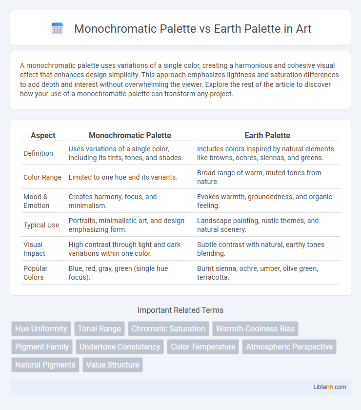
| Aspect | Monochromatic Palette | Earth Palette |
|---|---|---|
| Definition | Uses variations of a single color, including its tints, tones, and shades. | Includes colors inspired by natural elements like browns, ochres, siennas, and greens. |
| Color Range | Limited to one hue and its variants. | Broad range of warm, muted tones from nature. |
| Mood & Emotion | Creates harmony, focus, and minimalism. | Evokes warmth, groundedness, and organic feeling. |
| Typical Use | Portraits, minimalistic art, and design emphasizing form. | Landscape painting, rustic themes, and natural scenery. |
| Visual Impact | High contrast through light and dark variations within one color. | Subtle contrast with natural, earthy tones blending. |
| Popular Colors | Blue, red, gray, green (single hue focus). | Burnt sienna, ochre, umber, olive green, terracotta. |
Introduction to Color Palettes in Design
Monochromatic palettes consist of varying shades, tints, and tones of a single color, creating a cohesive and harmonious design that emphasizes simplicity and elegance. Earth palettes draw inspiration from natural elements, incorporating warm browns, muted greens, and soft beiges to evoke a grounded, organic feel in design projects. Understanding the emotional impact and versatility of these palettes allows designers to strategically enhance mood, focus, and visual consistency across various mediums.
What is a Monochromatic Palette?
A monochromatic palette consists of varying shades, tints, and tones of a single color, creating a cohesive and harmonious visual effect. This color scheme emphasizes uniformity and simplicity, often used to evoke a minimalist or elegant aesthetic. Designers favor monochromatic palettes for their ability to maintain visual interest while ensuring balance and unity across a design or artwork.
What is an Earth Palette?
An Earth palette consists of colors inspired by natural elements such as soil, rocks, plants, and clay, featuring warm browns, muted greens, soft beiges, and rusty reds. This color scheme evokes a sense of groundedness and organic warmth, making it ideal for designs aiming to reflect nature, sustainability, and comfort. In contrast to a monochromatic palette, which uses variations of a single hue, an earth palette combines multiple tones rooted in the natural environment to create a rich, harmonious visual experience.
Key Features of Monochromatic Palettes
Monochromatic palettes emphasize varying shades, tints, and tones of a single color, creating a cohesive and harmonious visual effect. This palette simplifies design by reducing color complexity while maintaining depth and interest through contrast in lightness and saturation. It enhances elegance and versatility, making it ideal for minimalist aesthetics and strong brand identity.
Characteristics of Earth Palettes
Earth palettes feature colors inspired by natural elements such as soil, clay, sand, and foliage, emphasizing warm, muted tones like browns, ochres, terracotta, and olive greens. These palettes evoke a sense of grounding, stability, and warmth, often used in designs that aim for a rustic, organic, or natural aesthetic. The versatility of earth palettes allows them to complement a wide range of styles while maintaining an understated, timeless appeal.
Visual Impact: Monochrome vs Earth Tones
Monochromatic palettes create a striking visual impact through uniformity and depth, enhancing focus and evoking a minimalist, modern aesthetic. Earth palettes, composed of natural browns, greens, and muted hues, produce a warm, grounded atmosphere that evokes comfort and organic harmony. The choice between monochrome and earth tones significantly influences mood and perception, with monochrome emphasizing sleek sophistication and earth tones fostering a serene, natural vibe.
Practical Applications: When to Use Monochromatic
Monochromatic palettes excel in design projects requiring a cohesive, harmonious look that emphasizes simplicity and unity, such as branding, minimalistic interiors, and fashion collections targeting elegance and sophistication. They streamline decision-making by limiting color choices, making them ideal for user interfaces and websites where clarity and user experience are paramount. Use monochromatic schemes when you want to create a calming visual effect or highlight textures and shapes without the distraction of multiple colors.
Practical Applications: When to Use Earth Palette
The Earth Palette excels in practical applications requiring warmth and harmony, such as interior design, fashion, and branding focused on natural, calming aesthetics. Its range of browns, ochres, and muted greens enhances spaces promoting relaxation and connection to nature. Use the Earth Palette when aiming to evoke stability, comfort, and organic authenticity in environments or visual identities.
Pros and Cons: Monochromatic Palette vs Earth Palette
A Monochromatic Palette offers simplicity and cohesiveness by utilizing variations of a single color, enhancing visual harmony and making design adjustments easier, but it may lack depth and vibrancy. The Earth Palette, composed of natural tones like browns, greens, and ochres, provides warmth and versatility, evoking a grounded and calming atmosphere; however, it risks appearing dull or overly muted if not balanced with contrasting elements. Choosing between the two depends on the desired emotional impact and functionality within the color scheme.
Choosing the Right Palette for Your Project
Selecting the right palette depends on your project's desired mood and context; a monochromatic palette leverages varying shades and tints of a single hue to create a sleek, cohesive look ideal for modern, minimalist designs. In contrast, an earth palette incorporates warm, natural tones like ochre, sienna, and olive green, evoking organic, grounded feelings suitable for environmental, rustic, or wellness-focused projects. Evaluate your target audience and brand personality to determine if the clean simplicity of monochromatic schemes or the comforting depth of earth tones better enhances your visual storytelling.
Monochromatic Palette Infographic