Arbitrary color refers to any hue chosen without restriction, allowing for maximum creativity and flexibility in design and art projects. Utilizing arbitrary colors can enhance visual appeal and evoke unique emotional responses tailored to your specific needs. Explore the rest of the article to discover how integrating arbitrary colors can transform your work.
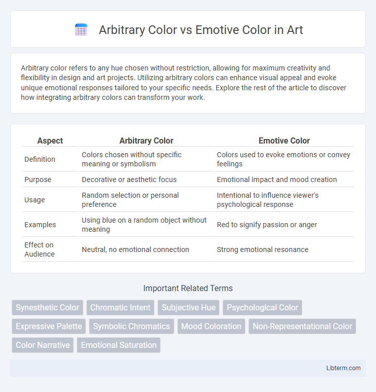
Table of Comparison
| Aspect | Arbitrary Color | Emotive Color |
|---|---|---|
| Definition | Colors chosen without specific meaning or symbolism | Colors used to evoke emotions or convey feelings |
| Purpose | Decorative or aesthetic focus | Emotional impact and mood creation |
| Usage | Random selection or personal preference | Intentional to influence viewer's psychological response |
| Examples | Using blue on a random object without meaning | Red to signify passion or anger |
| Effect on Audience | Neutral, no emotional connection | Strong emotional resonance |
Understanding Arbitrary Color in Art
Arbitrary color in art refers to the use of colors that do not correspond to the natural appearance of objects, allowing artists to prioritize expression over realistic representation. This approach enables artists to convey symbolic meanings, personal emotions, or conceptual ideas through unconventional color choices. Understanding arbitrary color involves recognizing its role in enhancing visual impact and communicating abstract themes beyond traditional color conventions.
Defining Emotive Color and Its Impact
Emotive color refers to hues that evoke specific emotional responses or moods in viewers, playing a crucial role in visual communication and art therapy. Unlike arbitrary colors chosen without psychological intent, emotive colors tap into cultural associations and innate human perceptions to influence feelings such as calmness through blue or excitement via red. The impact of emotive color extends to branding, marketing, and design, where strategic color use enhances engagement and conveys targeted emotional messages effectively.
Historical Evolution of Color Usage
Arbitrary color usage, originally seen in early art forms, lacked specific emotional meaning and was often chosen for decorative or symbolic purposes, while emotive color evolved to convey psychological and cultural significance. Historical analysis reveals that ancient civilizations like Egypt and Mesopotamia assigned colors arbitrary roles in rituals, but the shift during the Renaissance marked a deliberate use of emotive color to evoke mood and narrative depth. Contemporary color theory emphasizes this evolution, highlighting the transition from arbitrary to emotive applications in visual storytelling and design.
Key Differences Between Arbitrary and Emotive Color
Arbitrary color refers to hues chosen without a cultural or psychological basis, often used for aesthetic or symbolic purposes unrelated to inherent meanings. Emotive color, in contrast, is selected based on the emotions or reactions it evokes, such as red symbolizing passion or blue conveying calmness. The key difference lies in arbitrary colors lacking intrinsic emotional impact, while emotive colors are deliberately employed to influence feelings and perceptions.
Psychological Effects of Emotive Color
Emotive color triggers specific psychological responses by evoking emotions such as calmness, excitement, or urgency, which influence consumer behavior and decision-making. Unlike arbitrary color, which lacks inherent meaning, emotive color leverages cultural and psychological associations to enhance communication effectiveness in branding and design. Studies show that colors like blue promote trust and serenity, while red increases energy and urgency, demonstrating the powerful impact of emotive color on mental states and perceptions.
Arbitrary Color in Modern Art Movements
Arbitrary color in modern art movements, particularly within Fauvism and Expressionism, defies naturalistic representation to emphasize emotional impact and individual expression. Artists like Henri Matisse used bold, non-representational color schemes to evoke mood rather than replicate reality, challenging traditional color theory. This strategic use of arbitrary color contributed significantly to the evolution of abstract art by prioritizing subjective experience over objective depiction.
How Artists Use Emotive Color to Convey Feelings
Artists use emotive color strategically to evoke specific emotions and moods within their work, utilizing hues such as red to symbolize passion or anger and blue to instill calmness or sadness. This deliberate application contrasts with arbitrary color choices, which lack emotional intent and serve more decorative or representational purposes. By harnessing the psychological associations of colors, artists deepen viewer engagement and communicate complex feelings beyond literal representation.
Case Studies: Masterpieces Featuring Arbitrary Color
Masterpieces featuring arbitrary color often challenge traditional color theory by employing hues that diverge from naturalistic representation, as seen in Henri Matisse's "The Joy of Life," where vibrant, non-representational colors evoke emotional intensity. Wassily Kandinsky's "Composition VII" utilizes arbitrary colors to create dynamic visual rhythms, emphasizing the emotive power of color detached from physical accuracy. These case studies demonstrate how arbitrary color transforms perception, enabling artists to communicate abstract emotions and ideas beyond conventional color symbolism.
Techniques for Integrating Both Color Approaches
Techniques for integrating Arbitrary and Emotive Color approaches involve balancing subjective emotional impact with non-representational hues to convey layered meanings. Utilizing color theory principles, artists combine arbitrary palette choices with emotionally resonant tones to enhance narrative depth and viewer engagement. Strategic layering and contrast between emotive and arbitrary colors create dynamic visual experiences that evoke psychological responses while maintaining aesthetic freedom.
Choosing Between Arbitrary and Emotive Color in Your Work
Choosing between arbitrary and emotive color in your work depends on the desired impact and context; arbitrary colors are often selected based on personal preference or design constraints without inherent meaning, while emotive colors convey specific feelings and psychological responses, enhancing audience connection. Emotive color choices can amplify storytelling by triggering emotional reactions aligned with the message, whereas arbitrary colors might be used for neutrality or stylistic purposes. Balancing these approaches ensures that color use supports both aesthetic goals and effective communication in design projects.
Arbitrary Color Infographic