Complementary palettes enhance visual contrast by pairing colors opposite each other on the color wheel, creating vibrant and dynamic designs. Using this technique in your artwork or branding can draw attention and evoke strong emotional responses. Discover how to effectively apply complementary palettes to elevate your creative projects in the rest of this article.
Table of Comparison
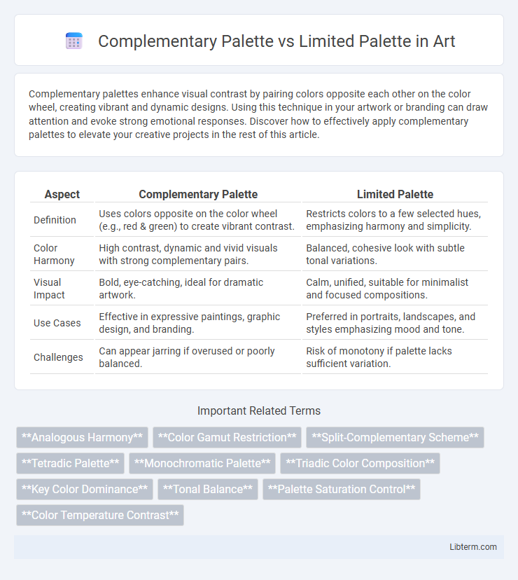
| Aspect | Complementary Palette | Limited Palette |
|---|---|---|
| Definition | Uses colors opposite on the color wheel (e.g., red & green) to create vibrant contrast. | Restricts colors to a few selected hues, emphasizing harmony and simplicity. |
| Color Harmony | High contrast, dynamic and vivid visuals with strong complementary pairs. | Balanced, cohesive look with subtle tonal variations. |
| Visual Impact | Bold, eye-catching, ideal for dramatic artwork. | Calm, unified, suitable for minimalist and focused compositions. |
| Use Cases | Effective in expressive paintings, graphic design, and branding. | Preferred in portraits, landscapes, and styles emphasizing mood and tone. |
| Challenges | Can appear jarring if overused or poorly balanced. | Risk of monotony if palette lacks sufficient variation. |
Introduction to Color Palettes
Complementary palettes combine colors opposite each other on the color wheel, creating vibrant contrast and dynamic visual effects ideal for attention-grabbing designs. Limited palettes use a restricted selection of colors, often focusing on hues close to each other or within a narrow range to achieve cohesion and simplicity in artwork. These palettes influence mood and balance, with complementary choices energizing compositions and limited palettes promoting harmony and subtlety.
Defining Complementary Palette
A complementary palette consists of colors directly opposite each other on the color wheel, such as blue and orange or red and green, creating high contrast and vibrant visuals. This palette enhances visual interest and balance by leveraging the natural tension between contrasting hues. In contrast, a limited palette restricts the colors used, often focusing on a small range for cohesion and simplicity rather than dynamic contrast.
Understanding Limited Palette
A limited palette consists of a small selection of colors chosen to create cohesive and harmonious artwork, often restricting the artist to primary colors or a few carefully selected hues. This approach encourages mastery of color mixing and value control while providing visual unity and simplicity in design. Unlike a complementary palette, which relies on opposing colors on the color wheel for contrast, a limited palette emphasizes balance and subtlety through fewer, often related, colors.
Key Differences Between Complementary and Limited Palettes
Complementary palettes use colors opposite each other on the color wheel, such as blue and orange, to create high contrast and vibrant visual impact ideal for dynamic designs. Limited palettes consist of a small selection of colors, often monochromatic or analogous, promoting harmony and simplicity in composition by restricting color variety. The key difference lies in complementary palettes emphasizing contrast and energy, while limited palettes focus on cohesion and minimalism.
Advantages of Using a Complementary Palette
Using a complementary palette enhances visual contrast, making designs more dynamic and eye-catching by pairing colors opposite each other on the color wheel. This approach improves color harmony and balance, ensuring elements stand out without overwhelming the viewer. The complementary palette also aids in evoking emotional responses and guiding user attention effectively in branding and digital interfaces.
Benefits of a Limited Palette Approach
A limited palette streamlines the creative process by simplifying color choices, making it easier to maintain color harmony and unity in design. It encourages deeper exploration of color relationships and texture, leading to more cohesive and visually impactful artwork. Reduced decision fatigue and increased focus on composition result in efficient and purposeful color application.
Common Applications in Art and Design
Complementary palettes, featuring colors opposite each other on the color wheel, are commonly used in art and design to create high contrast and vibrant visuals, enhancing focal points and visual interest. Limited palettes, consisting of a restricted range of colors, promote harmony and cohesion, often employed in minimalist designs, branding, and mood-driven artworks to unify the overall composition. Both palettes serve distinct purposes, with complementary sets intensifying emotional impact and limited palettes supporting simplicity and clarity in visual communication.
Tips for Choosing the Right Palette
Choosing the right palette depends on the mood and complexity of your design; complementary palettes offer vibrant contrast ideal for dynamic visuals, while limited palettes create harmonious, minimalistic looks by restricting hues. Prioritize understanding your project's purpose and audience to select colors that evoke the desired emotional response and maintain visual balance. Experiment with color proportions and test accessibility to ensure your palette enhances readability and aesthetic appeal effectively.
Potential Challenges and Solutions
Complementary palettes, combining colors opposite on the color wheel, may create high visual contrast that risks overwhelming viewers or causing color clashes, demanding careful balance and moderation. Limited palettes streamline the color selection, reducing the chance of discordant hues but potentially limiting creative expression and visual interest. Employing color theory principles, such as adjusting saturation and brightness, alongside digital tools like color harmony analyzers, can mitigate challenges by enhancing cohesion and maintaining aesthetic appeal.
Conclusion: Choosing the Best Palette for Your Project
Selecting between a complementary palette and a limited palette depends on your project's desired visual impact and complexity. Complementary palettes offer high contrast and vibrant energy, ideal for attention-grabbing designs, while limited palettes provide cohesion and simplicity, fostering a minimalist and harmonious aesthetic. Evaluate your goals, audience, and context to choose the palette that enhances your message and achieves balance in color dynamics.
Complementary Palette Infographic