Expressive color enhances visual storytelling by evoking emotions and creating atmosphere through bold and thoughtful palette choices. Techniques in using vibrant or muted tones can significantly impact your design's mood and message. Discover how to harness the power of expressive color in your projects by exploring the insights in this article.
Table of Comparison
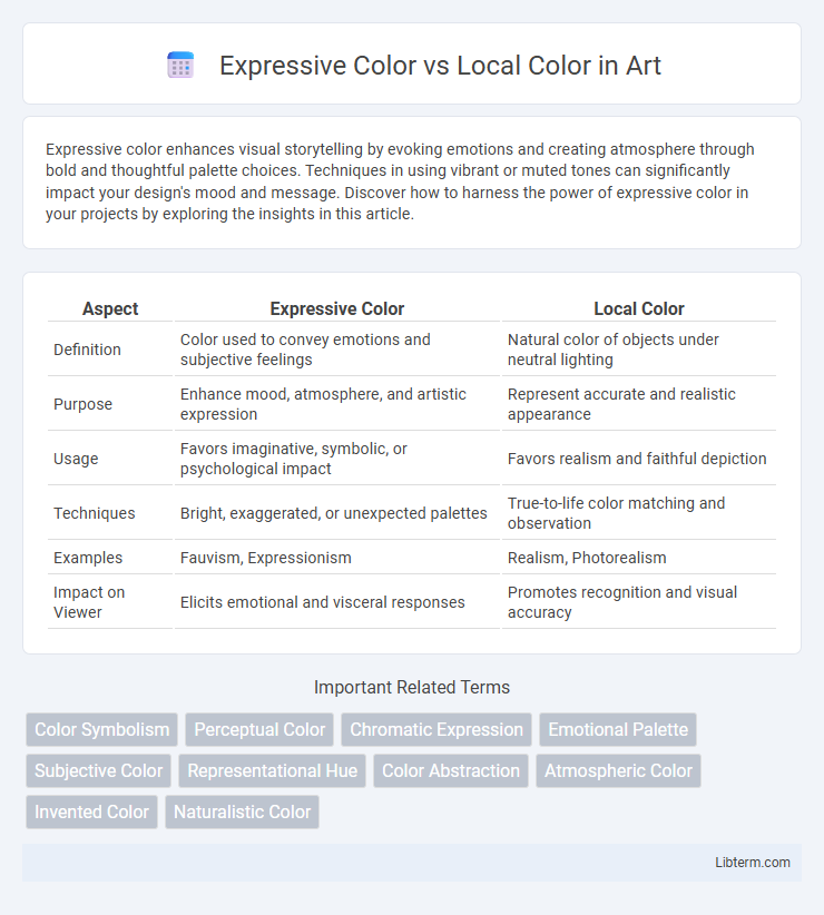
| Aspect | Expressive Color | Local Color |
|---|---|---|
| Definition | Color used to convey emotions and subjective feelings | Natural color of objects under neutral lighting |
| Purpose | Enhance mood, atmosphere, and artistic expression | Represent accurate and realistic appearance |
| Usage | Favors imaginative, symbolic, or psychological impact | Favors realism and faithful depiction |
| Techniques | Bright, exaggerated, or unexpected palettes | True-to-life color matching and observation |
| Examples | Fauvism, Expressionism | Realism, Photorealism |
| Impact on Viewer | Elicits emotional and visceral responses | Promotes recognition and visual accuracy |
Understanding Expressive Color: Definition and Purpose
Expressive color refers to the use of hues intentionally chosen to evoke emotions or convey symbolic meaning, transcending naturalistic representation in art and design. This approach prioritizes emotional impact over accurate depiction, allowing artists to communicate moods, atmospheres, or abstract ideas through vibrant or unconventional color choices. Understanding expressive color involves recognizing how color psychology and cultural associations influence viewer perception beyond realistic color palettes.
Local Color: What It Means in Art
Local color in art refers to the natural, inherent color of an object or scene as observed under neutral lighting conditions, independent of the influence of shading or light effects. Artists use local color to depict the object's basic hue, providing a foundation for realism and aiding viewers in recognizing familiar subjects. Understanding local color is essential for accurately capturing the true appearance of objects and helps balance the artist's expressive color choices in a composition.
Historical Context: Expressive vs Local Color
Expressive color emerged prominently in the early 20th century as artists sought to convey emotional intensity and subjective experiences through vivid, non-naturalistic hues, often linked to movements like Fauvism and Expressionism. Local color, rooted in realism and Impressionism of the 19th century, emphasizes accurate, true-to-life color representation based on the actual appearance of objects under specific lighting conditions. The historical shift from local to expressive color reflects a broader transformation in art, moving from objective observation toward personal expression and psychological depth.
Emotional Impact of Expressive Colors
Expressive color uses hues and tones to evoke strong emotional responses, influencing mood and perception beyond the natural appearance of objects, whereas local color represents the true color of an object under neutral lighting. The emotional impact of expressive colors can intensify feelings of warmth, tension, calmness, or excitement, allowing artists to communicate psychological depth and narrative emphasis. By manipulating color saturation, contrast, and hue, expressive color transcends realism to engage viewers on a visceral, emotional level.
Realism Achieved Through Local Color
Local color contributes to realism by depicting objects with their actual, natural hues under normal lighting, enhancing authenticity in visual representation. By accurately rendering colors true to life, artists communicate the inherent properties of subjects, fostering an immersive and believable scene. Expressive color, in contrast, prioritizes emotional impact or symbolic meaning over realistic portrayal, often deviating from natural tones to convey mood or atmosphere.
Techniques for Using Expressive Color
Expressive color techniques involve using hues, saturation, and contrast to evoke emotions rather than depict realistic scenes, contrasting with local color's focus on accurate, natural tones specific to objects. Artists employ methods such as exaggerated color schemes, bold brushstrokes, and non-representational palettes to intensify mood and convey subjective experiences. Techniques like glazing with vibrant pigments, using complementary colors to create dynamic tension, and manipulating light and shadow enhance the emotional impact of expressive color in artworks.
When to Choose Local Color in Artwork
Local color is best chosen in artwork when aiming to depict objects or scenes with realistic and natural hues to convey authenticity and accuracy. It enhances visual recognition by representing colors as they appear under neutral lighting, making it essential for detailed studies or representational art. Selecting local color supports clarity in communicating the object's environment and material properties without emotional distortion.
Famous Artists and Their Color Choices
Famous artists like Vincent van Gogh used expressive color to evoke emotion through vivid, non-naturalistic hues, contrasting with local color adherents such as Claude Monet, who depicted objects in their true-to-life shades. Pablo Picasso's Blue Period exemplifies expressive use of monochromatic blue tones to convey melancholy, while Johannes Vermeer's works emphasize local color realism through meticulous lighting and natural pigments. Both approaches showcase how color choices define artistic intention and viewer interpretation.
Expressive Color and Visual Storytelling
Expressive color enhances visual storytelling by conveying emotions, mood, and atmosphere beyond naturalistic representation, intensifying audience engagement. It manipulates hue, saturation, and contrast to evoke psychological responses, making narratives more dynamic and memorable. Unlike local color, which depicts objects in their realistic shades, expressive color prioritizes subjective interpretation to deepen thematic impact.
Balancing Expressive and Local Colors in Composition
Balancing expressive color and local color in composition enhances visual impact by merging emotional resonance with realistic representation. Expressive colors convey mood and atmosphere through exaggerated or symbolic hues, while local colors depict objects in their true-to-life shades to maintain clarity and context. Strategic juxtaposition allows artists to guide viewer focus, create depth, and enrich narrative without compromising spatial coherence or naturalism.
Expressive Color Infographic