Chiaroscuro is a powerful artistic technique that emphasizes the contrast between light and shadow to create depth and volume in paintings or drawings. This method enhances the three-dimensionality of subjects, making compositions appear more dramatic and realistic. Explore how chiaroscuro can transform your appreciation of visual art in the rest of this article.
Table of Comparison
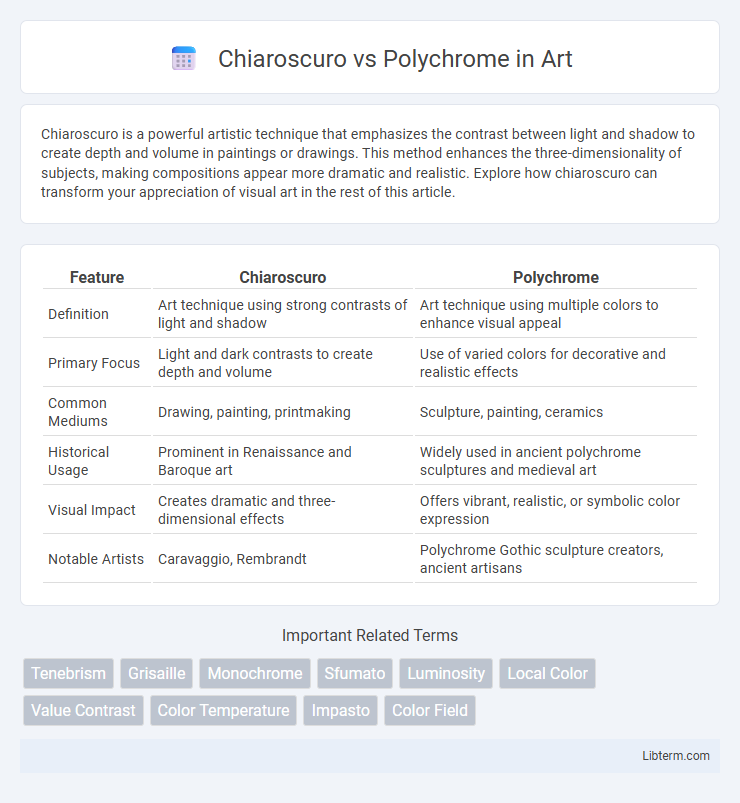
| Feature | Chiaroscuro | Polychrome |
|---|---|---|
| Definition | Art technique using strong contrasts of light and shadow | Art technique using multiple colors to enhance visual appeal |
| Primary Focus | Light and dark contrasts to create depth and volume | Use of varied colors for decorative and realistic effects |
| Common Mediums | Drawing, painting, printmaking | Sculpture, painting, ceramics |
| Historical Usage | Prominent in Renaissance and Baroque art | Widely used in ancient polychrome sculptures and medieval art |
| Visual Impact | Creates dramatic and three-dimensional effects | Offers vibrant, realistic, or symbolic color expression |
| Notable Artists | Caravaggio, Rembrandt | Polychrome Gothic sculpture creators, ancient artisans |
Introduction to Chiaroscuro and Polychrome
Chiaroscuro is an artistic technique that emphasizes the contrast between light and dark to create a sense of volume and three-dimensionality in paintings, sculptures, and drawings. Polychrome refers to artworks that employ multiple colors, often vividly, to enhance visual richness and detail, commonly seen in ancient sculptures and architectural decorations. Both techniques serve distinct purposes: Chiaroscuro enhances depth and realism through shading, while Polychrome accentuates vibrancy and ornamental qualities through the use of varied hues.
Historical Origins of Chiaroscuro
Chiaroscuro, originating during the Italian Renaissance in the early 15th century, is a technique that emphasizes the strong contrast between light and dark to create the illusion of volume and three-dimensionality in painting and drawing. Artists like Leonardo da Vinci and Caravaggio pioneered this method to enhance the dramatic effect and realism in their artworks. In contrast, polychrome refers to the practice of decorating sculptures or architectural elements with multiple colors, a tradition dating back to ancient civilizations such as the Egyptians and Greeks.
Development of Polychrome Art
Polychrome art evolved through the increasing use of multiple pigments to create vibrant, realistic depictions, contrasting with the single-light-source emphasis in chiaroscuro. The Renaissance period marked a significant development as artists like Titian and El Greco expanded color palettes, enhancing emotional expression and depth. Advances in pigment technology and trade facilitated broader access to diverse hues, accelerating polychrome artistry's complexity and richness.
Key Techniques of Chiaroscuro
Chiaroscuro employs the key technique of contrasting light and shadow to create depth and volume within a two-dimensional artwork, emphasizing dramatic effect and three-dimensionality. Artists use gradual shading transitions and strong directional lighting to model forms realistically, enhancing contours and textures. This technique differs significantly from polychrome, which relies on multiple colors to convey detail and vibrancy rather than spatial depth through light manipulation.
Methods and Materials in Polychrome
Polychrome techniques involve applying multiple layers of pigments, often combined with binders such as egg tempera, oil, or wax, to create vibrant, multi-colored surfaces on sculptures or architectural elements. Artists use fine brushes to build color depth and texture, enhancing realism and emotional expression, with materials like gesso preparing the surface for optimal pigment adhesion. The method contrasts with chiaroscuro, which emphasizes light and shadow effects through monochromatic shading rather than layering diverse pigments.
Visual Impact: Light and Shadow vs. Color
Chiaroscuro emphasizes the dramatic interplay of light and shadow to create depth and volume, enhancing three-dimensionality and emotional intensity in visual art. Polychrome relies on the vivid use of multiple colors to evoke mood, symbolize meaning, and attract attention through vibrant contrasts. The visual impact of chiaroscuro lies in tonal gradation and contrast, while polychrome's power emerges from rich color palettes and saturation.
Chiaroscuro and Polychrome in Renaissance Art
Chiaroscuro in Renaissance art emphasizes the dramatic contrast between light and shadow, enhancing the three-dimensionality and depth of figures, as seen in works by Leonardo da Vinci and Caravaggio. Polychrome, characterized by the use of multiple vibrant colors, was employed primarily in sculptures and altarpieces to add realism and emotional impact, notably in the works of polychromatic woodcarvers like those in Northern Europe. The interplay of chiaroscuro and polychrome techniques during the Renaissance advanced naturalism and expressive storytelling in both painting and sculpture.
Famous Artists and Masterpieces
Chiaroscuro, exemplified by artists like Caravaggio and Rembrandt, uses strong contrasts between light and dark to create dramatic intensity in masterpieces such as Caravaggio's "The Calling of St Matthew" and Rembrandt's "The Night Watch." Polychrome, characterized by multiple vibrant colors, is prominently seen in works by artists like Peter Paul Rubens and Diego Velazquez, who utilized rich palettes in Rubens' "The Elevation of the Cross" and Velazquez's "Las Meninas." These techniques highlight different artistic approaches to color and light, shaping the emotional impact and visual depth of their iconic paintings.
Contemporary Applications and Trends
Chiaroscuro techniques, emphasizing strong contrasts between light and shadow, are widely utilized in contemporary digital art and film to create dramatic depth and realism. Polychrome approaches, characterized by vivid, multi-colored palettes, dominate modern sculpture and installation art to evoke emotional vibrancy and cultural diversity. Emerging trends blend chiaroscuro's tonal depth with polychrome's color dynamics, producing multidimensional works that enhance visual storytelling in augmented reality and virtual reality experiences.
Choosing Between Chiaroscuro and Polychrome
Choosing between chiaroscuro and polychrome depends on the desired visual impact and artistic intent; chiaroscuro emphasizes dramatic contrasts of light and shadow to create depth and volume, ideal for evoking emotion and realism. Polychrome employs multiple colors, enhancing vibrancy and decorative appeal, suitable for conveying rich narratives and cultural symbolism. Consider the medium, context, and thematic goals to select the technique that best complements the artwork's message and aesthetic.
Chiaroscuro Infographic