Vermeer's mastery of yellow hues reveals his deep understanding of light and pigment properties, creating warmth and vibrancy in his masterpieces. The careful application of yellow in his paintings highlights textures and enhances the overall realism that defines his work. Explore the article to discover the secrets behind Vermeer's iconic yellows and how they influence your perception of his art.
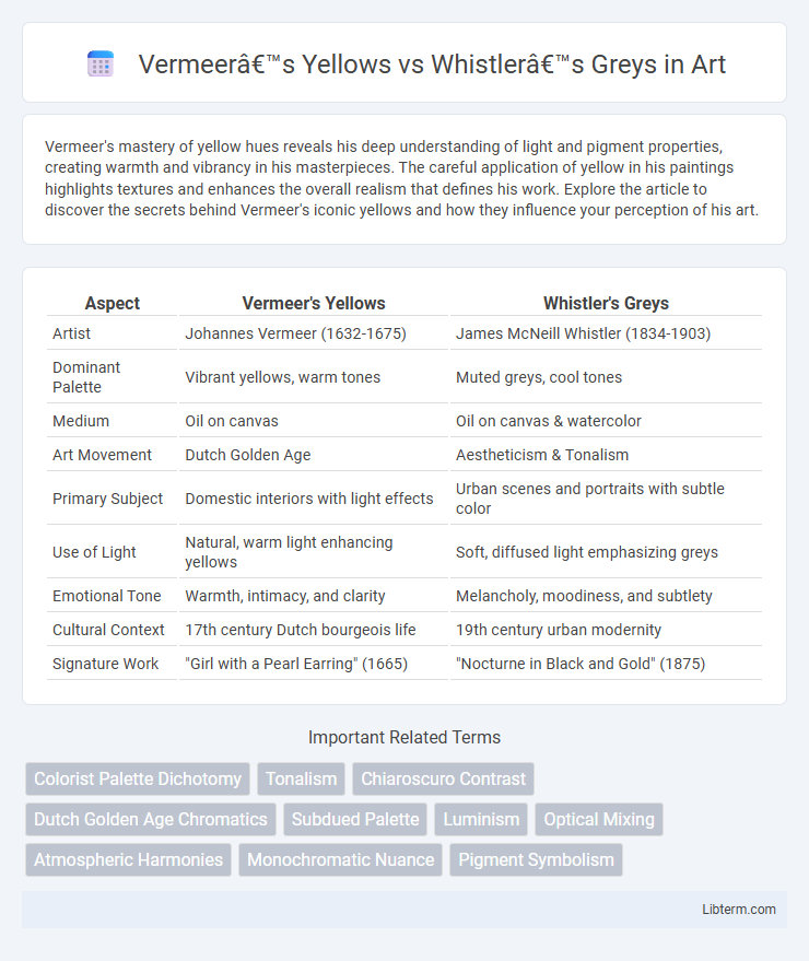
Table of Comparison
| Aspect | Vermeer's Yellows | Whistler's Greys |
|---|---|---|
| Artist | Johannes Vermeer (1632-1675) | James McNeill Whistler (1834-1903) |
| Dominant Palette | Vibrant yellows, warm tones | Muted greys, cool tones |
| Medium | Oil on canvas | Oil on canvas & watercolor |
| Art Movement | Dutch Golden Age | Aestheticism & Tonalism |
| Primary Subject | Domestic interiors with light effects | Urban scenes and portraits with subtle color |
| Use of Light | Natural, warm light enhancing yellows | Soft, diffused light emphasizing greys |
| Emotional Tone | Warmth, intimacy, and clarity | Melancholy, moodiness, and subtlety |
| Cultural Context | 17th century Dutch bourgeois life | 19th century urban modernity |
| Signature Work | "Girl with a Pearl Earring" (1665) | "Nocturne in Black and Gold" (1875) |
Introduction: Contrasting Palettes—Vermeer Meets Whistler
Vermeer's yellows showcase luminous, warm tones crafted from natural pigments such as lead-tin yellow and Indian yellow, radiating vibrant light and depth. Whistler's greys, composed of subtle mixtures of blue, black, and white pigments, emphasize mood and atmosphere through muted, harmonious shades. This contrast between Vermeer's rich, glowing yellows and Whistler's restrained greys highlights their distinct artistic approaches to color and emotional expression.
Historical Context: Dutch Golden Age vs Victorian Aestheticism
Vermeer's yellows exemplify the Dutch Golden Age's emphasis on naturalism and mastery of light, reflecting 17th-century Holland's economic prosperity and cultural refinement. His use of pigment such as lead-tin yellow highlights a dedication to capturing domestic tranquility and everyday life with luminous authenticity. In contrast, Whistler's greys embody Victorian Aestheticism's pursuit of beauty over narrative, using muted tones like lead white and ivory black to evoke mood and atmosphere, reflecting late 19th-century Britain's emphasis on artistic harmony and decorative elegance.
Color Philosophy: The Symbolism of Yellow and Grey
Vermeer's yellows evoke warmth, light, and divine presence, symbolizing optimism and enlightenment in his masterpieces like "Woman with a Water Jug." Whistler's greys, in contrast, embody subtlety, introspection, and modern urbanity, reflecting the nuanced emotions and atmospheric depth found in his "Whistler's Mother." The philosophical contrast between yellow's vibrancy and grey's restraint reveals distinct approaches to color as a narrative and symbolic tool in art history.
Technique: Layering and Pigment Choices
Vermeer's yellows are characterized by his masterful layering technique, utilizing translucent glazes of lead-tin yellow and earthy ochres to create luminous, warm tones that capture natural light with remarkable depth. Whistler's greys, by contrast, employ a more muted palette featuring subtle mixtures of bone black, white lead, and blue pigments, applied in delicate, thin washes that emphasize tonal harmony and atmospheric effects. The distinct pigment choices and layering methods reveal Vermeer's focus on radiance and clarity, while Whistler prioritizes mood and tonal subtlety through restrained coloration and soft transitions.
Light and Mood: Vermeer’s Luminescence vs Whistler’s Subtlety
Vermeer's yellows produce a radiant luminescence that captures and reflects natural light, creating a warm, inviting atmosphere filled with clarity and vibrancy. Whistler's greys, in contrast, evoke subtlety through muted tones and gentle shading that foster introspection and quietude, emphasizing mood over direct illumination. The interplay of light in Vermeer's works highlights precision and brilliance, while Whistler's approach emphasizes nuance and understated emotional depth.
Psychological Impact: Warmth vs Detachment
Vermeer's yellows evoke psychological warmth, creating an inviting and intimate atmosphere through luminous, sunlit tones that stimulate feelings of comfort and optimism. Whistler's greys generate psychological detachment, employing muted, subdued shades to convey calmness, mystery, and emotional distance. The contrast between Vermeer's vivid yellows and Whistler's cool greys highlights divergent emotional effects, with warmth fostering connection and greys emphasizing introspection and subtlety.
Iconic Works: Case Studies in Color Mastery
Vermeer's use of vibrant yellows in iconic works like "The Milkmaid" exemplifies his mastery of natural light and luminous pigment application, creating warmth and depth. In contrast, Whistler's subtle greys in pieces such as "Nocturne in Grey and Gold" demonstrate a sophisticated tonal harmony that evokes mood and atmosphere through muted palettes. These case studies highlight the artists' distinct approaches to color, reflecting their respective eras' aesthetic values and technical innovations.
Material Science: Pigment Sources and Preservation
Vermeer's yellows primarily derive from lead-tin yellow and natural earth pigments, which offer strong opacity and vibrant hue but are prone to darkening due to lead oxidation. Whistler's greys are typically created using mixtures of black carbon-based pigments, such as bone char or lampblack, combined with lead white for translucency and tonal variation, exhibiting greater resistance to chemical alteration over time. Preservation challenges vary significantly; Vermeer's yellows require controlled humidity and minimal light exposure to prevent pigment degradation, whereas Whistler's greys benefit from stable environmental conditions to avoid pigment flaking and surface chalking.
Legacy and Influence: Shaping Modern Color Theory
Vermeer's yellows, characterized by their luminous warmth and naturalistic glow, fundamentally influenced the use of yellow pigments in modern color theory, inspiring studies on light reflection and pigment layering. Whistler's greys, known for their sophisticated tonal harmony and subtle gradations, advanced the understanding of achromatic colors and nuanced value scales, shaping contemporary approaches to monochromatic compositions. Together, these distinct palettes contributed to the evolution of color theory by emphasizing both chromatic richness and tonal complexity in modern art and design.
Conclusion: The Dialogue Between Color Worlds
Vermeer's yellows evoke warmth and luminous vibrancy through rich, golden hues that capture natural light, fostering a sense of intimacy and realism. Whistler's greys channel subtlety and atmospheric depth, employing nuanced tonal variations to convey mood and abstraction within his compositions. The dialogue between these color worlds reveals a contrasting exploration of emotional resonance, where Vermeer's vibrant palettes emphasize clarity and immediacy, while Whistler's muted greys invite contemplation and ambiguity.
Vermeer’s Yellows Infographic