Choropleth maps use varying shades or colors to represent data values across specific geographic areas, making complex information visually accessible and easy to interpret. These maps effectively highlight regional patterns, trends, and disparities, providing valuable insights for decision-making in fields like demographics, economics, and public health. Explore the rest of the article to learn how to create and utilize choropleth maps to enhance your data visualization skills.
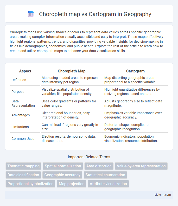
Table of Comparison
| Aspect | Choropleth Map | Cartogram |
|---|---|---|
| Definition | Map using shaded areas to represent data intensity per region. | Map distorting geographic areas proportional to a specific variable. |
| Purpose | Visualize spatial distribution of variables, like population density. | Highlight quantitative differences by resizing regions based on data. |
| Data Representation | Uses color gradients or patterns for value ranges. | Adjusts geography size to reflect data magnitude. |
| Advantages | Clear regional boundaries, easy interpretation of density. | Emphasizes variable importance over geographic accuracy. |
| Limitations | Can mislead if regions vary greatly in size. | Distorted shapes complicate geographic recognition. |
| Common Uses | Election results, demographic data, disease rates. | Economic indicators, population visualization, resource distribution. |
Introduction to Choropleth Maps and Cartograms
Choropleth maps visualize data by shading predefined geographic areas, such as states or counties, based on statistical values, making spatial patterns easy to identify. Cartograms distort the size or shape of these areas proportionally to a specific variable, emphasizing quantitative differences over geographic accuracy. Both map types effectively communicate spatial data but serve distinct purposes in representing geographic information and data distribution.
Defining Choropleth Maps: Overview and Purpose
Choropleth maps visualize data by shading geographic regions with varying colors or patterns proportional to a statistical variable, enabling easy comparison across areas. They are commonly used to represent population density, election results, or economic indicators within predefined boundaries like states or counties. The primary purpose is to reveal spatial patterns and trends in quantitative data, helping users quickly interpret regional differences.
Understanding Cartograms: Types and Uses
Cartograms distort geographic regions to represent data values, allowing visual emphasis on statistical information rather than precise location. Types include contiguous cartograms, which maintain shared boundaries but alter shapes, and non-contiguous cartograms that resize regions independently, enhancing data readability. Widely used in social sciences and public health, cartograms effectively display population density, electoral results, and economic data by visually balancing data representation with geographic context.
Data Representation Differences
Choropleth maps use varying shades or colors within predefined geographic boundaries to represent statistical data, typically normalized per unit area, allowing easy comparison across regions. Cartograms distort the size and shape of geographic areas according to the data values, emphasizing quantitative differences by resizing regions proportionally rather than using color intensity. While choropleth maps prioritize spatial accuracy with color gradients, cartograms sacrifice geographic fidelity to visually amplify data magnitude differences.
Visual Appeal and Readability
Choropleth maps enhance readability by using color gradients to represent data values within clearly defined geographic boundaries, making it easy to compare regions at a glance. Cartograms distort geographic areas based on data magnitude, boosting visual appeal through dramatic size changes but potentially sacrificing spatial accuracy and interpretability. For complex datasets requiring geographic context, choropleth maps maintain clarity, while cartograms excel in highlighting data distribution intensity despite reduced geographic fidelity.
Best Use Cases for Choropleth Maps
Choropleth maps are best suited for visualizing statistical data aggregated by geographic regions, such as population density, election results, or economic indicators, where variations across predefined areas are key. These maps use color gradients to represent data intensity, making them ideal for highlighting spatial patterns and regional disparities. Unlike cartograms, which distort geographic size to reflect data values, choropleth maps maintain geographic boundaries, providing clearer spatial context for comparative analysis.
Ideal Scenarios for Cartograms
Cartograms excel in representing data where geographic areas need to be resized according to a specific variable, such as population or election results, making them ideal for visualizing proportional distributions. These maps effectively highlight spatial patterns when precise geographic shape is less critical than the relative magnitude of data values. Cartograms are particularly useful in scenarios where emphasizing disparities in demographic or economic indicators across regions provides clearer insights than traditional maps.
Advantages and Limitations of Choropleth Maps
Choropleth maps effectively visualize data distributions across predefined regions, making patterns like population density or election results easily interpretable. Their advantage lies in simplicity and straightforward representation of statistical data, but they often suffer from limitations such as misleading interpretations in areas with varying region sizes and the inability to display precise data values within boundaries. These maps assume uniform data distribution within each area, which can obscure local variations and lead to oversimplified conclusions compared to cartograms that adjust regions based on data magnitude.
Pros and Cons of Cartograms
Cartograms visually distort geographic areas based on a specific data variable, effectively highlighting variations such as population or economic output, which enhances data comprehension in spatial analysis. However, their distorted shapes can reduce geographic recognizability, making it challenging for users to interpret precise locations compared to traditional maps. Cartograms are particularly useful for emphasizing data magnitude over geographic accuracy but may require supplementary reference maps to ensure spatial context is maintained.
Choosing Between Choropleth Maps and Cartograms
Choosing between choropleth maps and cartograms depends on the data representation goals: choropleth maps effectively visualize statistical values tied to predefined geographic areas through color gradients, supporting easy comparison across regions. Cartograms distort the geographic size of regions proportionally to a specific variable, emphasizing data magnitude but potentially sacrificing spatial accuracy. Decision-making should consider whether precise location integrity (favoring choropleth) or proportional data emphasis (favoring cartogram) is more critical for the analysis context.
Choropleth map Infographic