A flow map visually organizes information by illustrating connections between ideas or steps in a process, enhancing comprehension and memory retention. It uses arrows to show the direction of flow, making complex information easier to follow and understand. Explore the rest of the article to discover how creating a flow map can improve your learning and project planning skills.
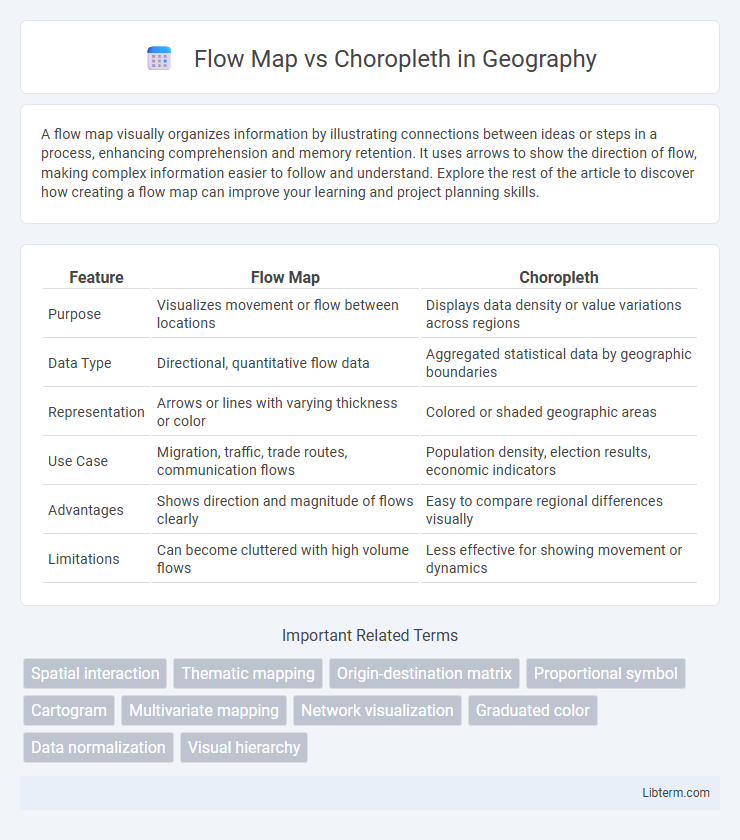
Table of Comparison
| Feature | Flow Map | Choropleth |
|---|---|---|
| Purpose | Visualizes movement or flow between locations | Displays data density or value variations across regions |
| Data Type | Directional, quantitative flow data | Aggregated statistical data by geographic boundaries |
| Representation | Arrows or lines with varying thickness or color | Colored or shaded geographic areas |
| Use Case | Migration, traffic, trade routes, communication flows | Population density, election results, economic indicators |
| Advantages | Shows direction and magnitude of flows clearly | Easy to compare regional differences visually |
| Limitations | Can become cluttered with high volume flows | Less effective for showing movement or dynamics |
Introduction to Flow Maps and Choropleth Maps
Flow maps visualize movement or migration between locations using lines or arrows scaled by volume, effectively illustrating patterns such as trade routes or traffic flow. Choropleth maps represent data through varying shades or colors within predefined geographic boundaries, highlighting regional differences like population density or election results. Both map types communicate spatial information but emphasize dynamic flows versus static distributions, respectively.
Defining Flow Maps: Features and Applications
Flow maps visually represent movement between locations using lines or arrows, with line thickness indicating volume or intensity, making them ideal for illustrating migration patterns, trade routes, or traffic flow. These maps emphasize direction and quantity of flows, providing insights into spatial interaction and connectivity. Common applications include urban planning, logistics optimization, and resource allocation where understanding dynamic spatial relationships is crucial.
Understanding Choropleth Maps: Purpose and Usage
Choropleth maps visually represent data through varying shades or colors applied to geographic regions, effectively highlighting spatial patterns and regional differences. They are commonly used to display demographic information, election results, or economic indicators, enabling quick interpretation of area-specific values. Understanding the purpose of choropleth maps is essential for accurately conveying statistical data and avoiding misinterpretation caused by varying region sizes or data classification methods.
Key Differences Between Flow Maps and Choropleth Maps
Flow maps visualize movement or migration patterns by using lines or arrows to represent routes and volume between locations, while choropleth maps depict data intensity or density using color shading within defined geographic areas. Flow maps emphasize directionality and connectivity, highlighting flows such as trade, traffic, or migration, whereas choropleth maps focus on area-based statistical variables like population density or election results. The key difference lies in flow maps representing dynamic spatial interactions, contrasting with choropleth maps showcasing static spatial distributions.
Data Types Best Suited for Flow Maps
Flow maps are ideal for representing movement-based data such as migration patterns, trade routes, and traffic flows, where direction and volume between locations are essential. They effectively visualize origin-destination relationships, highlighting the intensity and direction of flows. Unlike choropleth maps, which display spatial data aggregated by regions using color gradients to represent density or magnitude, flow maps emphasize connectivity and dynamic interactions between geographic points.
Ideal Scenarios for Using Choropleth Maps
Choropleth maps are ideal for visualizing regional data where variations in intensity, such as population density, election results, or economic indicators, need clear, intuitive representation across defined geographic boundaries. These maps effectively communicate relative differences between areas, making patterns and trends easy to identify for demographic analysis or resource allocation. They perform best when the data is aggregated to consistent spatial units, ensuring accurate and meaningful comparisons across regions.
Visual Representation: Comparing Flow vs Choropleth
Flow maps visualize movement or migration between locations using arrows or lines varying in width to represent volume, emphasizing direction and quantity. Choropleth maps depict statistical data through color gradients within predefined geographic boundaries, highlighting density or intensity in specific regions. The dynamic lines of flow maps contrast with the area-focused color shading of choropleth maps, catering to different analytical purposes in spatial data visualization.
Advantages and Limitations of Flow Maps
Flow maps visualize movement patterns between locations, effectively displaying traffic, migration, or trade flows with directional arrows scaled by magnitude. Their main advantage is the clear representation of spatial relationships and dynamic changes over geography, enhancing understanding of connectivity and intensity. Limitations include potential clutter in dense networks, difficulty in accurately comparing flow magnitudes, and the challenge of representing flows over irregular or overlapping regions.
Pros and Cons of Choropleth Maps
Choropleth maps excel in visualizing spatial data variations by using color gradients to represent different values across predefined regions, making them ideal for demographic or election data analysis. However, they can be misleading when regions vary significantly in size or population, potentially obscuring true spatial patterns. Their reliance on aggregated data may also mask local variations, limiting detailed insights in heterogeneous areas.
Choosing the Right Map: Flow Map vs Choropleth
Choosing the right map hinges on the data's nature: flow maps excel in visualizing movement between locations, such as migration or trade routes, emphasizing direction and volume. Choropleth maps effectively display statistical data distributed across geographic areas, like population density or election results, using color gradients to represent values. Selecting between flow maps and choropleth maps depends on whether the analysis prioritizes connections across space or the spatial variation within regions.
Flow Map Infographic