Dot distribution maps visualize the spatial pattern of data by representing individual occurrences with dots, providing clear insights into how phenomena are spread across a geographic area. This method highlights clusters, concentrations, and patterns that might be overlooked with other mapping techniques, making it invaluable for demographic studies, resource allocation, and environmental analysis. Explore the rest of the article to understand how dot distribution maps can transform your data visualization and decision-making process.
Table of Comparison
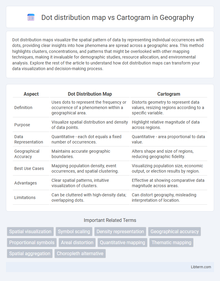
| Aspect | Dot Distribution Map | Cartogram |
|---|---|---|
| Definition | Uses dots to represent the frequency or occurrence of a phenomenon within a geographical area. | Distorts geometry to represent data values, resizing regions according to a specific variable. |
| Purpose | Visualize spatial distribution and density of data points. | Highlight relative magnitude of data across regions. |
| Data Representation | Quantitative - each dot equals a fixed number of occurrences. | Quantitative - area proportional to data value. |
| Geographical Accuracy | Maintains accurate geographic boundaries. | Alters shape and size of regions, reducing geographic fidelity. |
| Best Use Cases | Mapping population density, event occurrences, and spatial clustering. | Visualizing population size, economic output, or election results by region. |
| Advantages | Clear spatial patterns, intuitive visualization of clusters. | Effective at showing comparative data magnitude across areas. |
| Limitations | Can be cluttered with high-density data; overlapping dots. | Can distort geography, misleading interpretation of location. |
Introduction to Dot Distribution Maps and Cartograms
Dot distribution maps represent spatial data by placing dots proportionally to the quantity of a variable in specific locations, effectively visualizing distribution patterns and density. Cartograms distort geographic areas based on data values, emphasizing thematic information such as population size or economic activity rather than precise geographic scale. Both mapping techniques enhance spatial analysis by translating quantitative data into visually intuitive formats, aiding in geographic and statistical interpretation.
Definition and Key Features of Dot Distribution Maps
Dot distribution maps use dots to represent the presence, quantity, or value of a phenomenon in specific geographic locations, allowing for precise visualization of spatial patterns and density. Each dot symbolizes a fixed quantity of data, making it easy to identify clusters, gaps, and variations within the mapped area. Unlike cartograms that distort geographic size to reflect data values, dot distribution maps maintain accurate spatial relationships and boundaries for clear geographic context.
Definition and Key Features of Cartograms
Cartograms are maps in which geographic regions are resized according to a specific data variable, such as population or economic output, rather than their true land area, allowing for visual emphasis on the data's spatial distribution. Key features of cartograms include the distortion of geographic boundaries to reflect data magnitude, facilitating immediate comparison of regional values and highlighting patterns that may be obscured in traditional maps. Unlike dot distribution maps that use dots to represent data points with fixed geographic boundaries, cartograms reshape the map to prioritize data representation over spatial accuracy.
Types of Dot Distribution Maps
Dot distribution maps represent spatial data by placing dots where occurrences happen, allowing clear visualization of distribution patterns. Types of dot distribution maps include nominal dot maps, where each dot signifies a countable event or feature; dot density maps, which show the concentration of phenomena in an area; and value-by-area dot maps, where dot sizes vary to represent different amounts or intensities. Cartograms, by contrast, distort geographic areas proportionally to a variable, emphasizing quantitative data over precise locations, making them ideal for thematic comparisons but less effective for exact spatial patterns.
Types of Cartograms
Dot distribution maps represent data by placing dots proportional to the frequency of a variable across geographic areas, effectively showing spatial density patterns. Cartograms transform geographic regions based on a specific data variable, with major types including contiguous cartograms, which maintain region adjacency by distorting area size, and non-contiguous cartograms, which resize regions independently without preserving adjacency. Dorling cartograms, another popular type, replace regions with proportional circles positioned roughly in their original locations to emphasize data distribution while simplifying shapes.
Visual Representation and Data Interpretation
Dot distribution maps use individual dots to represent the presence or frequency of a phenomenon in specific locations, providing precise spatial patterns and density insights. Cartograms distort geographic areas based on data values, emphasizing the relative magnitude of variables rather than exact locations, which aids in comparing data scale across regions. Visual representation in dot maps highlights distribution and clustering, while cartograms facilitate comprehension of proportional relationships despite altering geographic accuracy.
Advantages of Dot Distribution Maps
Dot distribution maps offer precise geographic localization of data points, allowing clear visualization of spatial patterns and concentrations. They effectively represent distribution density, making it easier to identify hotspots without distorting spatial relationships. This map type maintains true geographic scale, preserving accurate distances and areas for intuitive interpretation compared to cartograms.
Advantages of Cartograms
Cartograms visually emphasize data by resizing geographic regions according to specific values, making patterns and relationships easier to interpret compared to dot distribution maps. They effectively highlight proportional differences and trends, aiding in clearer communication of complex data like population density or economic metrics. This method reduces the visual clutter found in dot maps, enhancing readability and immediate insight into spatial disparities.
Limitations and Challenges of Each Map Type
Dot distribution maps face limitations in representing data density when dots overlap excessively, leading to visual clutter and reduced interpretability in densely populated areas. Cartograms often challenge readability by distorting geographic shapes and spatial relationships, making it difficult for users to recognize familiar regions or landmarks accurately. Both map types require careful consideration of scale and data aggregation to avoid misrepresentation, but dot distribution maps struggle with precision in sparse datasets while cartograms can distort proportions beyond user comprehension.
Choosing Between Dot Distribution Maps and Cartograms
Dot distribution maps excel at visualizing the precise spatial distribution of individual data points, making them ideal for representing exact locations or counts. Cartograms effectively display data by resizing geographic regions according to a specific variable like population or economic output, emphasizing proportional relationships. Choosing between dot distribution maps and cartograms depends on whether the goal is to highlight exact spatial patterns or to emphasize relative magnitudes and comparisons across regions.
Dot distribution map Infographic