Proportional symbol maps use symbols of varying sizes to represent data values, allowing for an intuitive visualization of quantitative information across geographic areas. These maps help you quickly compare magnitudes and identify patterns or trends related to spatial distribution. Explore the rest of this article to understand how to create effective proportional symbol maps and apply them to your projects.
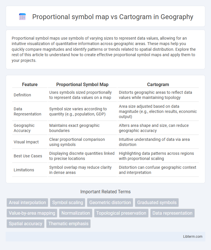
Table of Comparison
| Feature | Proportional Symbol Map | Cartogram |
|---|---|---|
| Definition | Uses symbols sized proportionally to represent data values on a map | Distorts geographic areas to reflect data values while maintaining topology |
| Data Representation | Symbol size varies according to quantity (e.g., population, GDP) | Area size adjusted based on data magnitude (e.g., election results, economic output) |
| Geographic Accuracy | Maintains exact geographic boundaries | Alters area shape and size, can reduce geographic accuracy |
| Visual Impact | Clear proportional comparison using symbols | Intuitive understanding of data via area distortion |
| Best Use Cases | Displaying discrete quantities linked to precise locations | Highlighting data patterns across regions with proportional scaling |
| Limitations | Symbol overlap may reduce clarity in dense areas | Distortion can confuse geographic context and interpretation |
Introduction to Thematic Mapping Techniques
Proportional symbol maps visually represent data by varying the size of symbols according to quantitative values, effectively highlighting spatial distribution and magnitude at specific locations. Cartograms distort geographic shapes and areas to reflect thematic data proportions, emphasizing relative significance over precise geography. These fundamental thematic mapping techniques enhance spatial data interpretation by balancing accuracy and visual impact.
Overview of Proportional Symbol Maps
Proportional symbol maps use symbols of varying sizes to represent quantitative data at specific geographic locations, allowing easy comparison of values across regions. These maps emphasize the proportional relationship between symbol size and data magnitude, facilitating intuitive visual analysis without distorting geographic boundaries. Proportional symbol maps effectively communicate spatial distribution while maintaining accurate geographic context, unlike cartograms which alter map shapes to reflect data values.
Understanding Cartograms
Cartograms distort geographical areas based on a variable, such as population or economic data, providing a visual representation of data intensity rather than actual land size. Understanding cartograms requires recognizing how they balance spatial relationships with statistical emphasis to highlight patterns or disparities effectively. This approach contrasts with proportional symbol maps, which overlay symbols on accurate geographical locations without altering the map's shape.
Key Differences Between Proportional Symbol Maps and Cartograms
Proportional symbol maps use symbols of varying sizes to represent data values at specific geographic locations, preserving the actual geographical position but not altering the area of the regions. Cartograms distort the shape and size of geographic areas according to the data variable, often sacrificing spatial accuracy to highlight thematic patterns. The key difference lies in proportional symbol maps maintaining geographic integrity with variable-sized symbols, whereas cartograms modify the underlying map geometry to emphasize data distribution.
Data Representation and Accuracy
Proportional symbol maps represent data by varying the size of symbols directly proportional to the attribute value, preserving geographic locations for spatial context and allowing straightforward interpretation of magnitude differences. Cartograms distort geographic areas to reflect data values, enhancing visual emphasis on data distribution but potentially compromising geographic accuracy and spatial reference. Proportional symbol maps maintain precise spatial accuracy, whereas cartograms optimize data representation at the expense of geographic fidelity.
Advantages of Proportional Symbol Maps
Proportional symbol maps effectively represent quantitative data by varying the size of symbols, allowing for intuitive visual comparisons across geographic regions without distorting the underlying map. They maintain geographic accuracy, preserving recognizable shapes and locations, which helps users easily interpret spatial relationships. The clear, scalable symbols enhance data visualization for complex datasets, making trends and outliers more accessible than cartograms, which often alter map geometry.
Advantages of Cartograms
Cartograms excel in visualizing quantitative data by distorting geographic areas proportional to the variable, enabling immediate recognition of spatial patterns and magnitudes. This method improves comparability across regions by emphasizing data significance over geographic size, making it particularly effective for population, election results, or economic statistics. Cartograms enhance the interpretation of complex datasets by integrating statistical information with spatial context, providing a clearer and more impactful visual summary than proportional symbol maps.
Common Use Cases and Applications
Proportional symbol maps are commonly used for visualizing discrete data points where the size of symbols directly represents quantitative values, such as population distribution in cities or locations of incidents like crime rates. Cartograms distort geographic areas to represent data values, making them ideal for displaying phenomena like election results or economic indicators where area is proportional to the variable of interest. Both techniques enhance spatial data interpretation but serve different analytical purposes depending on the emphasis on location accuracy versus value representation.
Challenges and Limitations
Proportional symbol maps face challenges with symbol overlap and visual clutter when representing densely located data points, reducing readability and accuracy. Cartograms often distort geographic shapes and boundaries, which can confuse spatial understanding and geographic context. Both methods struggle with maintaining a balance between accurate data representation and clear, intuitive map interpretation.
Choosing the Right Mapping Method
Choosing the right mapping method depends on the data's representation needs and spatial accuracy. Proportional symbol maps effectively visualize quantitative data with symbols sized proportionally to values while maintaining geographic locations, ideal for highlighting magnitude differences. Cartograms distort geographic areas based on data values, enhancing thematic emphasis on relative size but potentially confusing spatial context, making them suitable for emphasizing spatial distribution over precise location.
Proportional symbol map Infographic