A cartogram visually distorts geographic areas to represent data such as population or economic factors, emphasizing the variable's significance over actual land size. This technique helps you quickly grasp spatial patterns and trends that traditional maps may not reveal. Discover how cartograms transform complex data into intuitive visual stories by reading the full article.
Table of Comparison
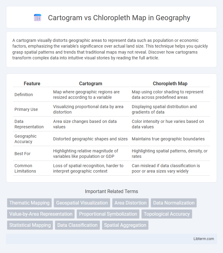
| Feature | Cartogram | Choropleth Map |
|---|---|---|
| Definition | Map where geographic regions are resized according to a variable | Map using color shading to represent data across predefined areas |
| Primary Use | Visualizing proportional data by area distortion | Displaying spatial distribution and gradients of data |
| Data Representation | Area size changes based on data values | Color intensity or hue varies based on data values |
| Geographic Accuracy | Distorted geographic shapes and sizes | Maintains true geographic boundaries |
| Best For | Highlighting relative magnitude of variables like population or GDP | Highlighting spatial patterns, density, or rates |
| Common Limitations | Loss of spatial recognition, harder to interpret geographic context | Can mislead if data classification is poor or area sizes vary widely |
Introduction to Thematic Mapping
Thematic mapping illustrates spatial patterns by emphasizing specific data themes across geographic areas. Cartograms distort geographic boundaries based on data values, visually representing variables like population or election results through size alterations. Chloropleth maps display data using color gradients within predefined regions, effectively conveying density or intensity variations such as income levels or disease prevalence.
Defining Cartograms
Cartograms redefine geographic regions by resizing areas based on a specific variable such as population or GDP, distorting shapes to emphasize data representation. Unlike chloropleth maps that use color gradients to show data density within fixed boundaries, cartograms visually prioritize regions according to data magnitude, making spatial patterns more intuitive. This approach enhances understanding of disparities and trends by combining geographic context with variable-driven scaling.
Understanding Choropleth Maps
Choropleth maps represent data through varying shades or colors within predefined geographic boundaries, allowing for quick visual comparison of statistical values like population density or election results. These maps rely on normalized data, such as rates or percentages, to accurately depict spatial distribution and avoid misleading interpretations caused by differences in area size. Understanding choropleth maps involves recognizing their strength in displaying thematic data and their limitation in distorting perception when underlying population or area size varies significantly.
Core Differences Between Cartograms and Choropleth Maps
Cartograms distort geographic areas based on a specific data variable, resizing regions to reflect values such as population or economic indicators, while choropleth maps use color shading within fixed geographic boundaries to represent data intensity. Cartograms prioritize proportional representation by altering map shapes, whereas choropleth maps maintain spatial accuracy but may mislead due to color gradient interpretation. The core difference lies in cartograms' spatial distortion for data emphasis versus choropleth maps' adherence to true geographic shapes with color-coded thematic visualization.
Pros and Cons of Cartograms
Cartograms effectively emphasize data proportions by resizing geographic regions according to statistical values, improving visual impact and highlighting patterns that traditional maps may obscure. However, their distorted shapes can reduce geographic accuracy and make spatial relationships harder to interpret, posing challenges for users unfamiliar with the area. Cartograms are best suited for thematic data representation where relative size matters more than precise location, contrasting with chloropleth maps that maintain geographic fidelity but may obscure data distribution nuances.
Advantages and Limitations of Choropleth Maps
Choropleth maps effectively display data by shading predefined geographic areas according to variable intensity, enhancing visual comprehension of patterns across regions. Their advantages include ease of interpretation and strong capacity to represent normalized data such as rates or percentages, making them valuable for demographic, socioeconomic, and epidemiological analysis. Limitations arise from their potential to mislead when representing raw counts, the risk of boundary bias due to varying area sizes, and reduced effectiveness in conveying spatial distribution when data heterogeneity within regions is high.
Use Cases: When to Choose Cartogram vs Choropleth
Choose a cartogram when visualizing data where geographic area distortion emphasizes statistical values, such as population or election results, to highlight differences more effectively. Opt for a choropleth map when precise geographic boundaries and regional comparisons of normalized data like unemployment rates or income levels are essential. Cartograms excel in revealing relative magnitude by altering map shape, while choropleth maps provide spatial distribution clarity with color gradients over standardized areas.
Visual Interpretation: Accuracy and Misconceptions
Cartograms distort geographic areas based on data values, enhancing the visual emphasis on quantitative differences but potentially compromising spatial accuracy and geographic context. Choropleth maps maintain geographic boundaries, coloring regions based on data intensity, which preserves spatial relationships but can mislead viewers by exaggerating the significance of large areas with low data values. Understanding these trade-offs is crucial to interpreting data correctly and avoiding misconceptions in geographic data visualization.
Tools and Software for Creating Cartograms and Choropleth Maps
QGIS and ArcGIS are powerful GIS software that support creating both cartograms and choropleth maps with extensive customization options. Specialized tools like ScapeToad and Cartogram Geoprocessing Tool excel in generating cartograms by distorting map regions based on data variables, while choropleth maps are commonly produced using statistical software such as R (with ggplot2 and tmap packages) and Python libraries including Folium and Geopandas. Online platforms like Datawrapper and Mapbox also provide user-friendly interfaces for designing visually appealing choropleth maps without requiring advanced coding skills.
Conclusion: Selecting the Right Map for Your Data
Choosing between a cartogram and a choropleth map depends on the specific data visualization goal and the nature of the dataset. Cartograms excel at representing data by resizing geographic regions according to a variable's magnitude, ideal for emphasizing relative values over geographic accuracy. Choropleth maps are better suited for displaying data with naturally defined geographic boundaries, offering clarity in spatial distribution through color gradients linked to data intensity.
Cartogram Infographic