Isoline maps use continuous lines to represent areas of equal value, such as elevation, temperature, or pressure, helping you visualize geographic variations clearly. These maps provide a detailed understanding of spatial patterns, making them essential tools in meteorology, geography, and environmental science. Explore the rest of the article to discover how isoline maps can enhance your interpretation of complex data.
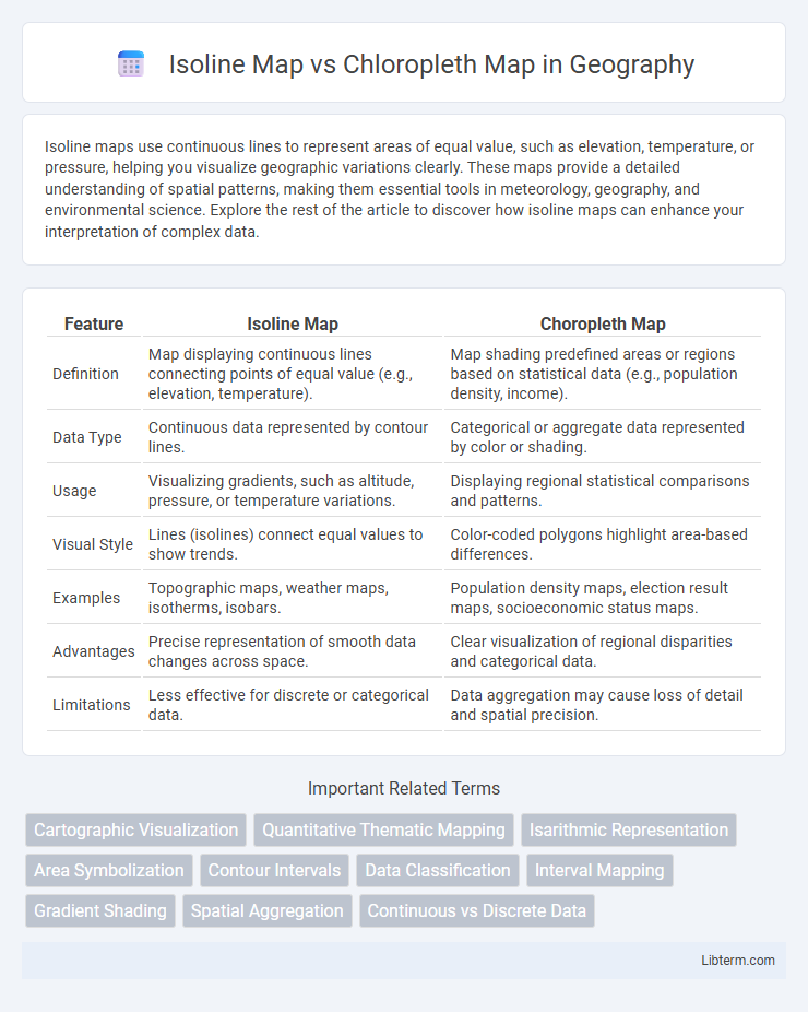
Table of Comparison
| Feature | Isoline Map | Choropleth Map |
|---|---|---|
| Definition | Map displaying continuous lines connecting points of equal value (e.g., elevation, temperature). | Map shading predefined areas or regions based on statistical data (e.g., population density, income). |
| Data Type | Continuous data represented by contour lines. | Categorical or aggregate data represented by color or shading. |
| Usage | Visualizing gradients, such as altitude, pressure, or temperature variations. | Displaying regional statistical comparisons and patterns. |
| Visual Style | Lines (isolines) connect equal values to show trends. | Color-coded polygons highlight area-based differences. |
| Examples | Topographic maps, weather maps, isotherms, isobars. | Population density maps, election result maps, socioeconomic status maps. |
| Advantages | Precise representation of smooth data changes across space. | Clear visualization of regional disparities and categorical data. |
| Limitations | Less effective for discrete or categorical data. | Data aggregation may cause loss of detail and spatial precision. |
Introduction to Isoline and Choropleth Maps
Isoline maps use continuous lines to represent equal values of a variable, such as temperature or elevation, across a geographic area, enabling precise visualization of gradients and variations. Choropleth maps display data by shading or coloring predefined regions like states or counties based on statistical values, making them effective for comparing discrete areas in demographics or election results. Both map types serve distinct purposes in spatial analysis, with isoline maps highlighting smooth transitions and choropleth maps emphasizing regional differences.
Understanding Isoline Maps
Isoline maps use continuous lines to represent equal values of a variable, such as elevation or temperature, allowing precise interpretation of gradual changes across a geographic area. Common types include contour lines for elevation and isobars for atmospheric pressure, which visually emphasize patterns and gradients. Understanding isoline maps enhances spatial analysis by highlighting subtle variations, making them ideal for meteorology, topography, and environmental studies.
Understanding Choropleth Maps
Choropleth maps display data by shading geographic areas such as counties or states based on variable intensity, enabling clear visualization of regional patterns and distributions. These maps are effective for representing demographic data like population density, election results, or income levels, using color gradients to indicate differences across regions. Understanding choropleth maps involves recognizing their reliance on predefined boundaries and aggregated data, which can sometimes obscure local variations or create misleading impressions if not interpreted carefully.
Key Differences Between Isoline and Choropleth Maps
Isoline maps use continuous lines to represent data values across a geographic area, highlighting gradients such as temperature or elevation changes. Choropleth maps display data by shading or coloring predefined regions like countries or states based on statistical values, emphasizing categorical differences. The key difference lies in isoline maps depicting continuous variation while choropleth maps illustrate discrete or aggregated data within boundaries.
Data Representation Techniques
Isoline maps represent data through continuous lines connecting points of equal value, ideal for visualizing gradients in variables like temperature or elevation, enhancing the interpretation of spatial patterns. Choropleth maps display data by shading predefined geographic areas based on aggregated statistical values, such as population density or election results, offering clear regional comparisons. Each technique excels in distinct applications: isoline maps emphasize gradual transitions, while choropleth maps highlight discrete regional differences.
Advantages of Isoline Maps
Isoline maps offer advantages such as seamless representation of continuous data, making them ideal for illustrating variations in temperature, elevation, or atmospheric pressure. These maps enable precise interpolation of values between lines, providing more detailed spatial insights compared to choropleth maps' use of discrete color-coded regions. Isoline maps also minimize visual bias by avoiding arbitrary boundaries, enhancing accuracy in environmental and meteorological analyses.
Advantages of Choropleth Maps
Choropleth maps excel in visualizing statistical data across predefined regions, making patterns in demographics, election results, or economic indicators immediately apparent. They provide clear, color-coded distinctions that enhance interpretability for regional comparisons and trend analysis. Their simplicity and efficiency in displaying aggregated data support informed decision-making in fields like public health, urban planning, and market research.
Common Use Cases for Each Map Type
Isoline maps are commonly used for visualizing continuous data such as temperature, elevation, or atmospheric pressure across geographical areas, providing smooth gradients that highlight spatial trends and variations. Choropleth maps excel in representing discrete data, such as population density, election results, or income levels, by shading predefined regions like states, counties, or districts according to data values. Both map types support decision-making in fields like meteorology, urban planning, and epidemiology but differ in their approach to spatial data representation.
Limitations and Challenges
Isoline maps face challenges in accurately representing discrete data, often resulting in interpolation errors and difficulty in distinguishing sharp boundaries. Choropleth maps can mislead when uniform color shades imply equal values across regions, ignoring internal variability and creating visual bias. Both map types require careful consideration of data classification and scale to avoid misinterpretation and ensure effective spatial analysis.
Choosing Between Isoline and Choropleth Maps
Choosing between isoline and choropleth maps depends on the nature of the data and the analysis goals. Isoline maps are ideal for representing continuous data like temperature or elevation, using contour lines to depict gradients and smooth transitions. Choropleth maps are better suited for categorical or aggregated data distributed across defined regions, such as population density or election results, by shading areas with varying intensities to indicate value differences.
Isoline Map Infographic