Proportional symbol maps use symbols of varying sizes to represent data quantities, making geographic patterns and differences easily identifiable. This mapping technique is ideal for visualizing population, economic, or environmental data across regions, enhancing your ability to interpret spatial information quickly. Explore the rest of the article to learn how to create and effectively use proportional symbol maps for your data visualization needs.
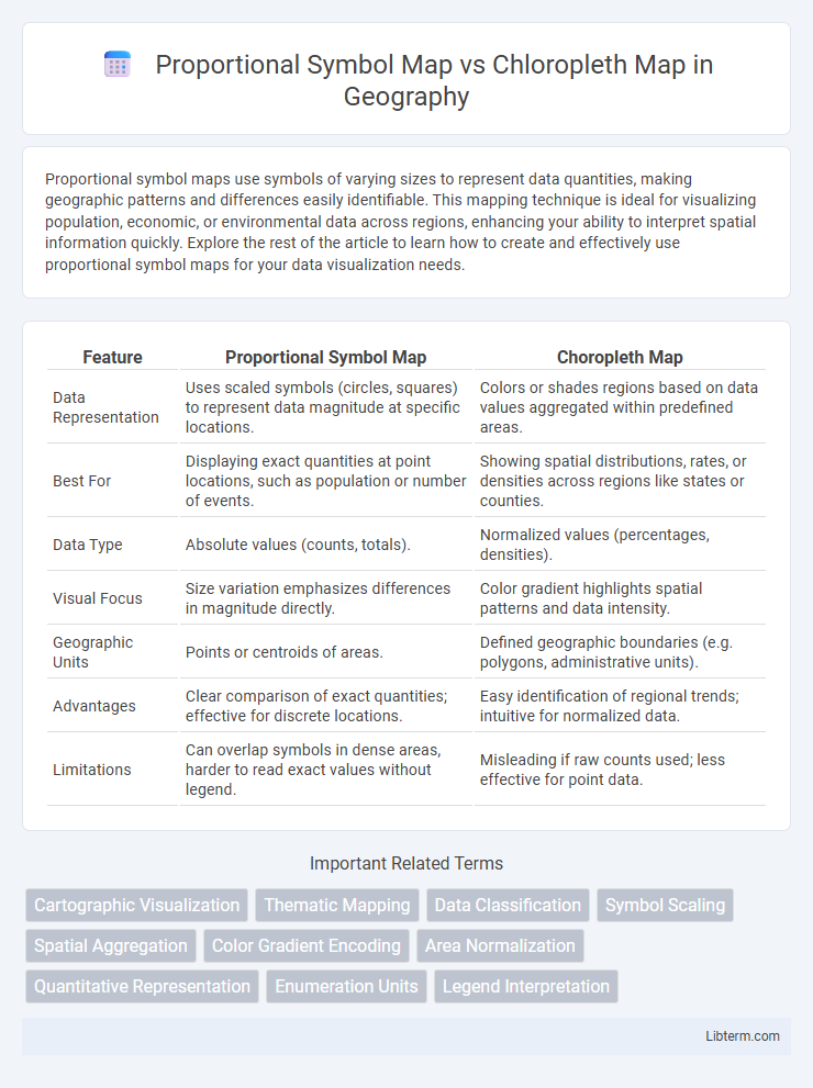
Table of Comparison
| Feature | Proportional Symbol Map | Choropleth Map |
|---|---|---|
| Data Representation | Uses scaled symbols (circles, squares) to represent data magnitude at specific locations. | Colors or shades regions based on data values aggregated within predefined areas. |
| Best For | Displaying exact quantities at point locations, such as population or number of events. | Showing spatial distributions, rates, or densities across regions like states or counties. |
| Data Type | Absolute values (counts, totals). | Normalized values (percentages, densities). |
| Visual Focus | Size variation emphasizes differences in magnitude directly. | Color gradient highlights spatial patterns and data intensity. |
| Geographic Units | Points or centroids of areas. | Defined geographic boundaries (e.g. polygons, administrative units). |
| Advantages | Clear comparison of exact quantities; effective for discrete locations. | Easy identification of regional trends; intuitive for normalized data. |
| Limitations | Can overlap symbols in dense areas, harder to read exact values without legend. | Misleading if raw counts used; less effective for point data. |
Introduction to Thematic Mapping
Proportional symbol maps represent data using symbols of varying sizes proportional to the data values at specific locations, making them ideal for visualizing quantitative differences across geographic points. Choropleth maps use color shading within predefined areas like counties or states to display data density or intensity, emphasizing regional patterns. Both are foundational in thematic mapping, aiding spatial data interpretation by highlighting distribution and magnitude across geographic areas.
Understanding Proportional Symbol Maps
Proportional symbol maps use varying symbol sizes to represent data values, allowing for clear visualization of quantitative differences across geographical locations. They are ideal for displaying exact data points, such as population size or event counts, making it easier to compare magnitude without color interpretation. Unlike choropleth maps, which fill predefined areas with color gradients based on data density, proportional symbol maps avoid data normalization issues and provide precise value representation at specific coordinates.
What Are Choropleth Maps?
Choropleth maps represent data through varying shades or colors within predefined areas such as counties or states, making it easy to visualize statistical variations across regions. They are ideal for displaying normalized data like population density or income levels, as the color gradient indicates intensity or concentration. These maps use geographic boundaries to communicate spatial patterns but can sometimes obscure variations within the areas.
Key Differences Between Proportional Symbol and Choropleth Maps
Proportional symbol maps use symbols of varying sizes to represent data values at specific locations, effectively displaying precise quantities, while choropleth maps color predefined areas based on data density or frequency, emphasizing spatial patterns over exact figures. Proportional symbol maps are ideal for illustrating discrete data points like population or sales volume, whereas choropleth maps excel in showing regional distributions such as unemployment rates or median income by area. The key difference lies in symbol size versus area color to depict data magnitude, impacting data interpretation and visual clarity depending on the dataset's nature and spatial resolution.
Data Types Suitable for Proportional Symbol Maps
Proportional symbol maps are ideal for representing quantitative data with absolute values, such as population counts, sales figures, or the number of occurrences within a geographic area. They visually emphasize magnitude by varying symbol size, making them suitable for data that can be aggregated at specific points or regions but require clear distinction in volume. Unlike chloropleth maps, which are best for normalized data like rates or densities, proportional symbol maps effectively display raw counts without necessitating area-based standardization.
When to Use Choropleth Maps
Choropleth maps are ideal for visualizing data that is normalized or expressed as rates, percentages, or densities, allowing for accurate comparisons across regions. Use these maps when you want to emphasize spatial patterns, trends, or distributions of variables like population density, election results, or disease incidence. They work best with data aggregated by predefined areas such as states, counties, or countries, where color shading effectively communicates variations in intensity.
Advantages of Proportional Symbol Maps
Proportional symbol maps visually represent data values through varying symbol sizes, enhancing intuitive comprehension of quantitative differences across locations without relying on arbitrary color gradients. These maps effectively display precise magnitude comparisons for discrete points, making them ideal for showing exact data values like population or sales figures. Proportional symbol maps reduce misinterpretation caused by color perception issues common in choropleth maps, improving accessibility and clarity for diverse audiences.
Strengths and Limitations of Choropleth Maps
Choropleth maps effectively visualize data distribution by coloring predefined geographic areas based on data values, making it easy to identify regional patterns and trends. Their strength lies in representing normalized data such as rates or densities, but they struggle with raw counts or data unevenly distributed across regions. A key limitation is that they can mislead interpretation in areas with large geographic sizes but low populations, potentially obscuring important data variations within regions.
Common Misinterpretations and Pitfalls
Proportional symbol maps often cause misinterpretations due to symbol overlap and difficulty in comparing sizes, leading to inaccurate perception of data magnitude. Choropleth maps risk misleading conclusions when normalized data is absent, as shading intensity can reflect area size rather than true values. Both map types require careful legend design and data normalization to minimize user confusion and ensure accurate spatial data representation.
Choosing the Best Map for Your Data
Proportional symbol maps excel in representing precise data values with varying symbol sizes, making them ideal for point data like population or sales figures at specific locations. Choropleth maps effectively display aggregated statistical data across predefined areas, such as unemployment rates or average income by county, utilizing color gradients to indicate data intensity. Selecting the best map depends on your data granularity and visual emphasis: use proportional symbol maps for direct value comparison at discrete points and choropleth maps for regional data distribution analysis.
Proportional Symbol Map Infographic