Dot distribution visually represents data points within a dataset, highlighting frequency and clustering patterns that reveal underlying trends and variations. Effective dot distribution aids in identifying outliers and groupings, making complex data more accessible and interpretable. Explore the rest of the article to understand how dot distribution can enhance your data analysis skills.
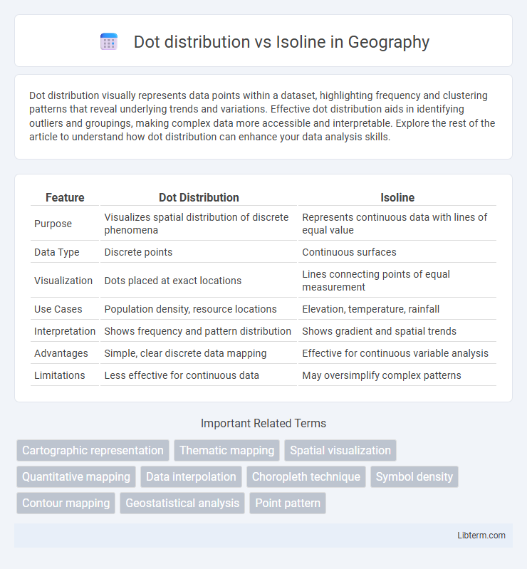
Table of Comparison
| Feature | Dot Distribution | Isoline |
|---|---|---|
| Purpose | Visualizes spatial distribution of discrete phenomena | Represents continuous data with lines of equal value |
| Data Type | Discrete points | Continuous surfaces |
| Visualization | Dots placed at exact locations | Lines connecting points of equal measurement |
| Use Cases | Population density, resource locations | Elevation, temperature, rainfall |
| Interpretation | Shows frequency and pattern distribution | Shows gradient and spatial trends |
| Advantages | Simple, clear discrete data mapping | Effective for continuous variable analysis |
| Limitations | Less effective for continuous data | May oversimplify complex patterns |
Introduction to Dot Distribution and Isoline Maps
Dot distribution maps represent data by placing dots in specific locations, each dot corresponding to a fixed quantity of a variable, effectively visualizing spatial patterns and density. Isoline maps use continuous lines to connect points of equal value, such as elevation or temperature, illustrating gradients and spatial trends across a region. Both map types serve distinct purposes: dot distribution maps emphasize discrete data points and frequency, while isoline maps highlight continuous surface variations.
Defining Dot Distribution Maps
Dot distribution maps represent spatial data by placing dots to indicate the presence or frequency of a feature within a geographic area, emphasizing discrete occurrences and precise locations. Each dot corresponds to a specified quantity or value, providing a clear visual representation of distribution patterns and density variations. This contrasts with isoline maps, which use continuous contour lines to connect points of equal value, illustrating gradient transitions rather than pinpointed data points.
Understanding Isoline Maps
Isoline maps represent continuous data by connecting points of equal value with lines, making them ideal for visualizing gradients such as elevation, temperature, or pressure. Unlike dot distribution maps that show frequency or occurrence through discrete dots, isoline maps provide a clear depiction of spatial patterns and trends in scalar fields. This method enhances comprehension of contours and variations, facilitating precise analysis of geographic or environmental data.
Key Differences Between Dot Distribution and Isoline
Dot distribution maps represent data using dots, where each dot corresponds to a specific quantity or occurrence, highlighting the spatial concentration of discrete phenomena. Isoline maps use continuous lines connecting points of equal value, effectively illustrating gradients and patterns across a geographic area, such as elevation or temperature. Unlike dot distribution maps, which emphasize individual occurrences, isolines provide a smooth visual representation of varying data intensities over space.
Advantages of Dot Distribution Maps
Dot distribution maps provide precise spatial representation of data by placing individual dots to signify occurrences, allowing clear visualization of density and distribution patterns. They effectively highlight clusters and gaps within geographic areas, offering detailed insights that aggregated data formats like isolines might obscure. This map type excels in revealing local variations and supports granular analysis for urban planning, environmental studies, and resource management.
Benefits of Isoline Mapping Techniques
Isoline mapping techniques provide clear visualization of continuous data, such as elevation or temperature gradients, by connecting points of equal value, enhancing pattern recognition and spatial analysis. This method reduces visual clutter compared to dot distribution maps, allowing for easier interpretation of gradual changes and trends across geographic areas. Isoline maps improve decision-making in fields like meteorology, geology, and environmental science by offering precise, intuitive representations of complex datasets.
Common Uses for Dot Distribution Maps
Dot distribution maps are commonly used to visualize the spatial density and patterns of phenomena like population, crime incidents, and disease outbreaks, making them ideal for identifying clusters or hotspots. Unlike isoline maps that depict continuous data through lines connecting equal values, dot distribution maps represent individual occurrences, enhancing clarity in showing precise locations and quantities. Their effectiveness in displaying discrete data points makes them essential tools for urban planning, public health analysis, and natural resource management.
Typical Applications of Isoline Maps
Isoline maps are primarily used in meteorology to represent continuous data such as temperature, pressure, and precipitation, enabling clear visualization of weather patterns. These maps are essential in fields like geography and environmental science for illustrating elevation, rainfall distribution, and pollution levels. Unlike dot distribution maps, isoline maps excel at showing gradients and variations in spatial data across a region.
Choosing the Right Map Type for Your Data
Dot distribution maps effectively visualize individual data points by showing exact locations and frequency, ideal for representing population or event occurrences. Isoline maps display continuous data fields, such as elevation or temperature gradients, through lines connecting equal values, making them best for trend and pattern recognition across regions. Choosing between these map types depends on whether precise point data or continuous spatial variation better suits your analytical goals.
Conclusion: Dot Distribution vs Isoline for Data Visualization
Dot distribution maps excel in representing the precise locations and quantities of discrete data points, making them ideal for visualizing population clusters or event occurrences with high spatial accuracy. Isoline maps, using continuous contour lines, effectively illustrate gradients and patterns in variables like temperature or elevation across a region, offering a smooth, interpretable visualization of data trends. For data visualization, choosing between dot distribution and isoline maps depends on whether the emphasis is on exact point data or on understanding spatial gradients and continuous phenomena.
Dot distribution Infographic