A choropleth map uses varying shades or colors to represent data values across geographic regions, enabling quick visual analysis of spatial patterns. It is particularly effective for illustrating demographic information, economic indicators, or election results by area. Explore the rest of this article to understand how to create and interpret choropleth maps for your data visualization needs.
Table of Comparison
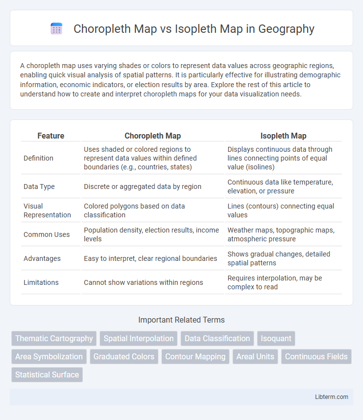
| Feature | Choropleth Map | Isopleth Map |
|---|---|---|
| Definition | Uses shaded or colored regions to represent data values within defined boundaries (e.g., countries, states) | Displays continuous data through lines connecting points of equal value (isolines) |
| Data Type | Discrete or aggregated data by region | Continuous data like temperature, elevation, or pressure |
| Visual Representation | Colored polygons based on data classification | Lines (contours) connecting equal values |
| Common Uses | Population density, election results, income levels | Weather maps, topographic maps, atmospheric pressure |
| Advantages | Easy to interpret, clear regional boundaries | Shows gradual changes, detailed spatial patterns |
| Limitations | Cannot show variations within regions | Requires interpolation, may be complex to read |
Introduction to Thematic Maps
Thematic maps visualize spatial data patterns by emphasizing specific geographic themes, with choropleth maps representing data through color shading of predefined areas such as counties or states. Isopleth maps use continuous lines or gradients to depict data values smoothly across space, ideal for illustrating variables like temperature or elevation. Both map types play crucial roles in geographic information systems (GIS) for analyzing and interpreting quantitative information tied to locations.
What is a Choropleth Map?
A choropleth map displays data through various shading or coloring patterns within predefined geographic boundaries, such as countries, states, or counties. This visualization technique emphasizes statistical variables like population density or election results by associating color gradients with quantifiable data values specific to each area. Choropleth maps are ideally suited for representing discrete spatial data aggregated by regions, making them essential tools in demographic and socioeconomic analysis.
How Isopleth Maps Work
Isopleth maps display continuous data by connecting points of equal value with smooth, curving lines called isopleths, enabling visualization of gradients such as temperature or rainfall. These maps interpolate data between measured points to create a seamless surface, effectively representing spatial variations without relying on predetermined geographic boundaries. By illustrating variations through color shading or contour lines, isopleth maps highlight patterns and trends in variables like population density or atmospheric pressure.
Key Differences between Choropleth and Isopleth Maps
Choropleth maps represent data through varying shades or colors within predefined administrative boundaries, making them ideal for displaying aggregated statistical data like population density or election results by region. In contrast, isopleth maps use continuous lines or color gradients to illustrate spatial data variations across a geographic area without relying on political boundaries, commonly applied to depict phenomena such as temperature, precipitation, or elevation. The key difference lies in choropleth maps using discrete zones based on existing boundaries while isopleth maps portray continuous data fields with interpolated values.
Data Representation: Choropleth vs Isopleth
Choropleth maps represent data using predefined geographic boundaries, such as states or counties, by shading each area based on aggregated values, which is ideal for categorical or discrete data representation. Isopleth maps display continuous data through contour lines or color gradients that interpolate values across space, enabling smooth transitions for variables like temperature or elevation. Choropleth focuses on summarizing data within regions, while isopleth emphasizes spatial variation without strict boundary constraints.
Advantages of Choropleth Maps
Choropleth maps excel in clearly representing aggregated data across predefined administrative boundaries, making it easier to identify regional patterns and trends. They provide a visually intuitive way to compare statistical values such as population density, election results, or economic metrics, enhancing immediate comprehension. Their reliance on distinct geographic units allows for straightforward integration with demographic and census data, improving analytical accuracy and decision-making.
Benefits and Limitations of Isopleth Maps
Isopleth maps excel in representing continuous data through smooth gradients, making them ideal for visualizing variables such as temperature, elevation, or pollution levels. Their ability to depict spatial distribution with interpolated lines enhances pattern recognition but can introduce inaccuracies in areas with sparse or uneven data points. Limitations include potential misinterpretation due to generalized contours and challenges in representing abrupt changes, which may reduce precision compared to discrete categorical data shown in choropleth maps.
Common Use Cases for Each Map Type
Choropleth maps are commonly used to represent aggregated data such as population density, election results, or average income by predefined geographic areas like counties or states. Isopleth maps are ideal for illustrating continuous data fields such as temperature gradients, rainfall distribution, or air pollution levels across a landscape. Each map type effectively communicates spatial patterns, with choropleth maps emphasizing regional boundaries and isopleth maps highlighting data variation through smooth contour lines.
Choosing the Right Map for Your Data
Choropleth maps display data aggregated by predefined geographic areas, making them ideal for visualizing statistical information such as population density or election results within regions. Isopleth maps use continuous lines to represent gradations of data values, perfect for illustrating phenomena like temperature or rainfall gradients that vary smoothly over space. Selecting the right map depends on whether your data is categorical and area-based or continuous and spatially interpolated, ensuring accurate representation and meaningful interpretation.
Conclusion: Choropleth or Isopleth?
Choropleth maps are ideal for representing aggregated statistical data within predefined geographic boundaries, offering clear visualization of categorical differences. Isopleth maps excel in depicting continuous data variations across space, such as temperature or elevation gradients, using smooth contour lines. Choosing between choropleth and isopleth maps depends on whether the data is discrete by region or continuous across geography, with choropleth suited for regional comparison and isopleth preferred for spatial gradients.
Choropleth Map Infographic