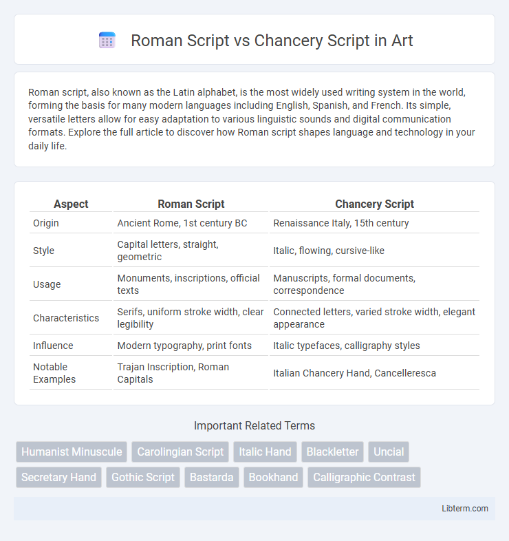
Roman script, also known as the Latin alphabet, is the most widely used writing system in the world, forming the basis for many modern languages including English, Spanish, and French. Its simple, versatile letters allow for easy adaptation to various linguistic sounds and digital communication formats. Explore the full article to discover how Roman script shapes language and technology in your daily life.
Table of Comparison
| Aspect | Roman Script | Chancery Script |
|---|---|---|
| Origin | Ancient Rome, 1st century BC | Renaissance Italy, 15th century |
| Style | Capital letters, straight, geometric | Italic, flowing, cursive-like |
| Usage | Monuments, inscriptions, official texts | Manuscripts, formal documents, correspondence |
| Characteristics | Serifs, uniform stroke width, clear legibility | Connected letters, varied stroke width, elegant appearance |
| Influence | Modern typography, print fonts | Italic typefaces, calligraphy styles |
| Notable Examples | Trajan Inscription, Roman Capitals | Italian Chancery Hand, Cancelleresca |
Introduction to Roman Script and Chancery Script
Roman Script, originating in ancient Rome, is characterized by its capital letters with clear, straight lines and balanced proportions, widely used in inscriptions and formal documents. Chancery Script, developed during the Renaissance, features fluid, cursive strokes that combine elegance with readability, primarily used for official correspondence and manuscripts. Both scripts significantly influenced Western typography, with Roman Script forming the basis for modern serif typefaces and Chancery Script inspiring italic styles.
Historical Origins and Development
Roman Script traces its origins to ancient Rome, evolving from Latin inscriptions carved on monuments and formal documents, characterized by clear, upright letterforms that influenced Western typography profoundly. Chancery Script emerged during the Italian Renaissance as a cursive style used by chancery clerks for administrative documents, blending legibility with fluidity to accommodate faster handwriting. While Roman Script established foundational letter shapes for printed texts, Chancery Script contributed significantly to the development of italic typefaces and handwritten Renaissance calligraphy.
Defining Characteristics of Roman Script
Roman Script features upright, evenly spaced letters with clear serifs, enhancing readability and formal appearance. It emphasizes uniform stroke thickness and balanced proportions, making it ideal for inscriptions and printed texts. Unlike the flowing, cursive nature of Chancery Script, Roman Script maintains strict geometric forms and structured lines.
Distinctive Features of Chancery Script
Chancery Script is characterized by its elegant, flowing cursive style with slanted, connected letters and prominent ascenders and descenders, differentiating it from the more formal and upright Roman Script. Its distinctive features include fluid strokes, rhythmic letterforms, and a clear emphasis on legibility combined with decorative flair, making it ideal for official and literary manuscripts during the Renaissance. Chancery Script's unique balance of readability and artistic expression set it apart as a hallmark of Renaissance calligraphy.
Influences on Art, Architecture, and Literature
Roman Script, characterized by its clear, capital letters and structured forms, heavily influenced Renaissance art and architecture by inspiring classical design elements like symmetry and proportion in frescoes and monuments. Chancery Script, with its elegant, flowing cursive style, shaped the development of Renaissance literature and manuscript illumination by enhancing readability and aesthetic appeal in handwritten texts. The interplay between Roman Script's formal geometry and Chancery Script's fluidity fostered a balanced visual language that permeated artistic and architectural works of the period.
Usage in Manuscripts and Printed Works
Roman Script, characterized by its clear, upright letterforms, was widely used in printed works during the Renaissance, facilitating readability in books and official documents. Chancery Script, known for its flowing, elegant cursive style, predominated in handwritten manuscripts and formal correspondence, particularly in chancery offices throughout Europe. The divergence in their usage reflects Roman Script's suitability for mass printing and Chancery Script's association with personal, legal, and administrative manuscripts.
Visual Differences: Serif vs. Cursive Styles
Roman Script features distinct, sharp serifs that create a structured, formal appearance while maintaining clear separation between letters. Chancery Script employs fluid, cursive strokes with varying thickness, mimicking handwritten calligraphy and offering a dynamic, elegant flow. The contrast between Roman's rigid serif forms and Chancery's smooth, connected letters highlights their unique visual identities in typography.
Cultural Significance and Legacy
Roman Script embodies classical antiquity's influence, symbolizing authority and permanence through its geometric precision in inscriptions, widely adopted in monumental architecture and official documents across Western civilization. Chancery Script reflects the Renaissance's humanist revival, emphasizing elegance and fluidity, shaping modern cursive handwriting and influencing Western calligraphy's aesthetic development. Both scripts underpin cultural identity and literacy evolution, with Roman Script reinforcing formal communication and Chancery Script advancing personal expression and artistic innovation.
Modern Applications of Roman and Chancery Scripts
Roman script remains a dominant choice in modern digital typography, widely used in branding, advertising, and web design for its clean and legible sans-serif and serif variations. Chancery script influences contemporary calligraphy, wedding invitations, and luxury packaging, where its elegant, flowing strokes convey sophistication and tradition. Both scripts integrate seamlessly into digital fonts, enabling versatile use across print and online media while preserving their historical essence.
Choosing Between Roman and Chancery Script
Choosing between Roman Script and Chancery Script depends largely on the intended purpose and aesthetic preference of the text. Roman Script, known for its clarity, geometric precision, and timeless appeal, is ideal for formal documents and modern designs requiring readability and elegance. Chancery Script, characterized by its flowing, cursive style and historical association with Renaissance chancery offices, suits artistic projects or invitations where a graceful, calligraphic touch is desired.
Roman Script Infographic

 libterm.com