A primary color palette consists of the foundational hues--red, blue, and yellow--that form the basis for all other colors in design and art. Understanding how to effectively use these colors can enhance your brand identity and create visual harmony in your projects. Explore the rest of the article to discover how to apply the primary color palette for maximum impact.
Table of Comparison
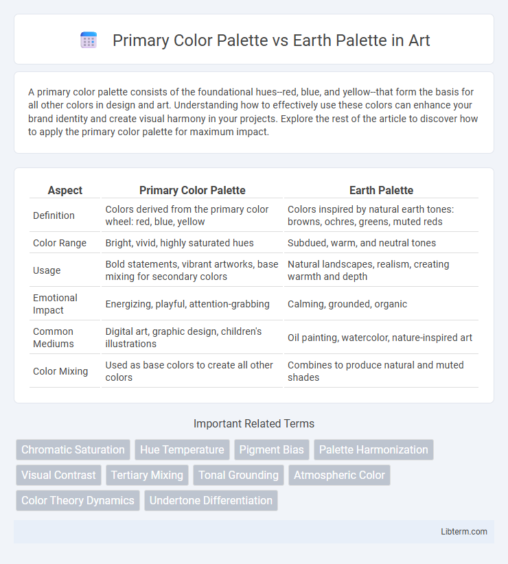
| Aspect | Primary Color Palette | Earth Palette |
|---|---|---|
| Definition | Colors derived from the primary color wheel: red, blue, yellow | Colors inspired by natural earth tones: browns, ochres, greens, muted reds |
| Color Range | Bright, vivid, highly saturated hues | Subdued, warm, and neutral tones |
| Usage | Bold statements, vibrant artworks, base mixing for secondary colors | Natural landscapes, realism, creating warmth and depth |
| Emotional Impact | Energizing, playful, attention-grabbing | Calming, grounded, organic |
| Common Mediums | Digital art, graphic design, children's illustrations | Oil painting, watercolor, nature-inspired art |
| Color Mixing | Used as base colors to create all other colors | Combines to produce natural and muted shades |
Understanding the Basics: Primary Colors and Earth Tones
Primary color palettes consist of red, blue, and yellow, which are the foundational hues used to create a wide spectrum of other colors through mixing. Earth palettes are characterized by muted, natural shades such as browns, ochres, and soft greens that derive from pigments found in soils and minerals. Understanding these basics helps designers and artists choose colors that evoke different emotional responses and harmonize within a composition.
Historical Origins of Primary and Earth Palettes
The primary color palette, rooted in the 17th-century theories of Sir Isaac Newton, is based on the three fundamental colors--red, blue, and yellow--that cannot be created by mixing other hues and serve as the foundation for all other colors. The earth palette draws its historical origins from natural pigments found in prehistoric cave paintings, utilizing muted browns, ochres, and siennas derived from iron oxides and organic materials. These palettes reflect distinct cultural and practical uses, with primary colors emphasizing scientific color theory and earth tones reflecting natural and traditional artistic materials.
Key Characteristics of Primary Color Palettes
Primary color palettes are defined by their use of bold, vibrant hues such as red, blue, and yellow, which are fundamental colors that cannot be created by mixing other colors. These palettes convey energy, clarity, and simplicity, making them ideal for designs needing strong visual impact and clear communication. The high saturation and brightness of primary colors ensure standout visibility in branding, art, and digital media applications.
Key Features of Earth Tone Palettes
Earth tone palettes feature muted, natural hues such as browns, greens, and warm grays that evoke a sense of calm and organic warmth. These colors are derived from natural elements like soil, foliage, and stone, providing a grounded and harmonious aesthetic ideal for creating cozy, inviting spaces. Earth tones offer versatility in design, complementing a wide range of materials and textures while promoting a soothing atmosphere.
Visual Impact: Vibrancy vs Subtlety
The Primary Color Palette delivers high visual impact with vibrant hues like red, blue, and yellow, which attract immediate attention and create energetic designs. In contrast, the Earth Palette features muted tones such as ochre, sienna, and olive green, offering subtlety that evokes a natural, grounded, and calming atmosphere. Choosing between these palettes depends on the desired emotional response and the context of the visual communication.
Application in Art and Design
Primary color palettes, consisting of red, blue, and yellow, serve as the foundation for creating vibrant and highly saturated artworks, enabling artists and designers to mix a wide range of hues and evoke strong emotional responses. Earth palettes, dominated by muted tones like ochre, sienna, and umber, are favored for conveying naturalism, warmth, and subtlety in compositions, making them ideal for landscapes, portraits, and rustic designs. The choice between primary and earth palettes significantly influences visual impact, mood, and thematic expression in art and design projects.
Psychological Effects of Primary vs Earth Colors
Primary color palettes, consisting of red, blue, and yellow, evoke strong emotions such as energy, excitement, and creativity, stimulating mental activity and attention. Earth palettes, featuring muted tones like browns, greens, and ochres, promote feelings of calm, stability, and comfort by mimicking natural environments. The psychological impact of primary colors drives action and alertness, while earth tones encourage relaxation and groundedness in design and interior spaces.
When to Use: Choosing the Right Palette
Primary Color Palettes suit energetic, vibrant designs that require high contrast and visual impact, making them ideal for branding and marketing aimed at capturing immediate attention. Earth Palettes excel in creating calm, natural, and grounded atmospheres, perfect for wellness, environmental, or lifestyle brands seeking warmth and authenticity. Selecting the right palette depends on the brand's message, target audience, and emotional tone desired in the visual communication.
Trends: Modern Uses in Digital Media
Primary color palettes--featuring bold reds, blues, and yellows--dominate digital media trends for vibrant, attention-grabbing designs that enhance user engagement and brand recognition. Earth palettes, composed of muted browns, greens, and beiges, are increasingly favored in modern digital interfaces to evoke sustainability, warmth, and organic aesthetics appealing to eco-conscious audiences. Both palettes serve distinct purposes in UI/UX design, with primary colors energizing interactive elements and earth tones supporting minimalist, nature-inspired visuals in apps and websites.
Conclusion: Finding Harmony Between Palettes
Balancing a Primary Color Palette with an Earth Palette creates a dynamic visual experience that combines vibrancy with natural tones. Incorporating bold reds, blues, and yellows alongside muted browns, greens, and beiges can enhance design versatility and emotional impact. Achieving harmony involves strategic color placement and contrast to maintain visual interest while promoting cohesion in branding or interior design.
Primary Color Palette Infographic