The split-complementary palette combines a base color with two colors adjacent to its complementary hue, creating vibrant yet balanced visuals. This color scheme enhances contrast while maintaining harmony, making it ideal for designs that need depth without overwhelming the viewer. Discover how to effectively apply a split-complementary palette in your projects by reading the rest of the article.
Table of Comparison
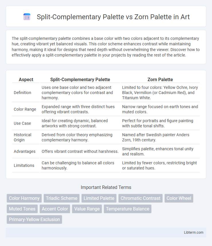
| Aspect | Split-Complementary Palette | Zorn Palette |
|---|---|---|
| Definition | Uses one base color and two adjacent complementary colors for contrast and harmony. | Limited to four colors: Yellow Ochre, Ivory Black, Vermilion (or Cadmium Red), and Titanium White. |
| Color Range | Expanded range with three distinct hues offering vibrant contrasts. | Narrow range focused on earth tones and muted colors. |
| Use Case | Ideal for creating dynamic, balanced artworks with strong contrast. | Perfect for portraits and figure painting with subtle tonal shifts. |
| Historical Origin | Derived from color theory emphasizing complementary harmony. | Named after Swedish painter Anders Zorn, 19th century. |
| Advantages | Offers vibrant contrast without harshness. | Simplifies palette, enhances tonal unity and realism. |
| Limitations | Can be challenging to balance all colors harmoniously. | Limited by fewer colors, restricting bright or saturated hues. |
Introduction to Color Palettes
Split-complementary palettes consist of a base color paired with two adjacent colors to its complement, offering vibrant contrast with less tension than direct complementary schemes. The Zorn palette, favored for its limited yet versatile selection, typically includes just four colors: white, black, yellow ochre, and vermilion or red, enabling artists to achieve a wide tonal range and natural skin tones. Both palettes serve distinct purposes in color harmony, with split-complementary emphasizing balanced contrast and the Zorn palette promoting simplicity and tonal unity.
What is a Split-Complementary Palette?
A Split-Complementary Palette uses one base color and the two colors adjacent to its complementary color, creating a balanced and visually appealing contrast without the intensity of a direct complementary scheme. This palette enhances harmony while providing variety and dynamic interplay between hues, making it ideal for versatile artistic and design applications. In contrast, the Zorn Palette typically consists of limited colors--yellow ochre, ivory black, white, and sometimes red--focusing on earthy tones and minimal contrast for muted, naturalistic effects.
What is the Zorn Palette?
The Zorn Palette is a limited color scheme primarily consisting of four colors: titanium white, ivory black, vermilion or cadmium red, and yellow ochre, named after the Swedish painter Anders Zorn who popularized its use. It emphasizes tonal harmony and subtle color mixing, enabling artists to achieve a wide range of naturalistic skin tones and muted landscapes. In contrast, the Split-Complementary Palette incorporates a base color and two adjacent complementary colors, offering more vibrant and diverse color contrasts.
Historical Context and Origins
The Split-Complementary Palette, rooted in classical color theory, gained prominence through artists seeking balance and contrast by selecting a base color and two adjacent complementary hues, tracing back to 18th-century studies in color harmony. The Zorn Palette, named after Swedish painter Anders Zorn, emerged in the late 19th century as a limited color scheme using primarily yellow ochre, ivory black, cadmium red, and white to achieve naturalistic skin tones and atmospheric effects. While the Split-Complementary Palette is grounded in traditional color wheel principles, the Zorn Palette reflects a practical, minimalist approach tailored to portraiture and plein air painting techniques.
Color Choices and Pigments
The Split-Complementary Palette utilizes a primary hue combined with two adjacent complementary colors, creating vibrant contrasts and balanced harmony through diverse pigments like cadmium red, ultramarine blue, and cadmium yellow. The Zorn Palette traditionally features a limited selection of pigments--specifically cadmium red, yellow ochre, ivory black, and titanium white--resulting in a muted yet realistic color scheme emphasizing subtle earth tones and skin tones. While the Split-Complementary Palette offers broader chromatic possibilities for dynamic compositions, the Zorn Palette excels in naturalistic rendering with minimal pigment variety.
Visual Impact and Aesthetic Differences
The Split-Complementary Palette enhances visual impact by combining a base color with two adjacent complementary hues, creating vibrant yet balanced contrasts that add depth and harmony to compositions. The Zorn Palette, limited to yellow ochre, ivory black, white, and vermilion, produces a more muted, earthy aesthetic characterized by subtle tonal variations and a unified warmth. Artists use the Split-Complementary Palette for dynamic color interplay and bold expression, while the Zorn Palette excels in capturing classic, restrained elegance with its limited but versatile color range.
Flexibility and Limitations
The Split-Complementary Palette offers greater flexibility by incorporating three colors that provide balance and contrast, enabling artists to create vibrant yet harmonious compositions suitable for a wide range of styles and moods. In contrast, the Zorn Palette, limited to four specific colors (usually titanium white, black, yellow ochre, and vermilion or cadmium red), restricts chromatic variety but excels in producing cohesive, subtle tonal variations and naturalistic skin tones. While the Split-Complementary Palette supports dynamic color interactions and diverse applications, the Zorn Palette's limitation fosters a focused and controlled approach ideal for traditional portraiture and monochromatic effects.
Practical Applications in Art
The Split-Complementary Palette provides artists with high contrast and vibrant color harmony, ideal for dynamic compositions and enhancing visual interest without overwhelming the viewer. The Zorn Palette, consisting of limited colors--typically yellow ochre, ivory black, vermilion, and white--offers subtle, muted tones perfect for portraiture and classical realism, enabling the creation of natural skin tones and earthy effects efficiently. Both palettes serve distinct practical applications: the Split-Complementary for bold, expressive art and the Zorn Palette for controlled, harmonious realism.
Famous Artists and Notable Works
The Split-Complementary palette, favored by artists like Vincent van Gogh, enhanced the vibrancy in works such as "Starry Night" by balancing a base color with two adjacent complements, creating dynamic contrasts without harshness. The Zorn Palette, named after Anders Zorn, utilizes a limited but powerful set of four colors--yellow ochre, ivory black, vermilion, and white--featured prominently in portraits like "Mrs. Zorn," showcasing its ability to produce realistic flesh tones and muted earth hues with remarkable subtlety. Both palettes reflect distinct approaches to color harmony and have influenced numerous painters seeking either vivid emotional impact or nuanced tonal control in their masterpieces.
Choosing the Right Palette for Your Project
Choosing the right palette for your project requires understanding the distinct advantages of the Split-Complementary Palette and the Zorn Palette. The Split-Complementary Palette offers vibrant contrast by combining a base color with two adjacent complementary colors, ideal for projects needing dynamic yet harmonious visuals. In contrast, the Zorn Palette, limited to white, black, yellow ochre, and vermilion, excels in creating subtle tonal variations and muted color schemes perfect for classic or minimalist artwork.
Split-Complementary Palette Infographic