Antiqua fonts evoke timeless elegance with their classic serif design, making them ideal for formal and traditional contexts. These typefaces enhance readability by featuring moderate contrast between thick and thin strokes, giving your text a refined and sophisticated appearance. Explore the rest of the article to uncover how Antiqua can elevate your design projects.
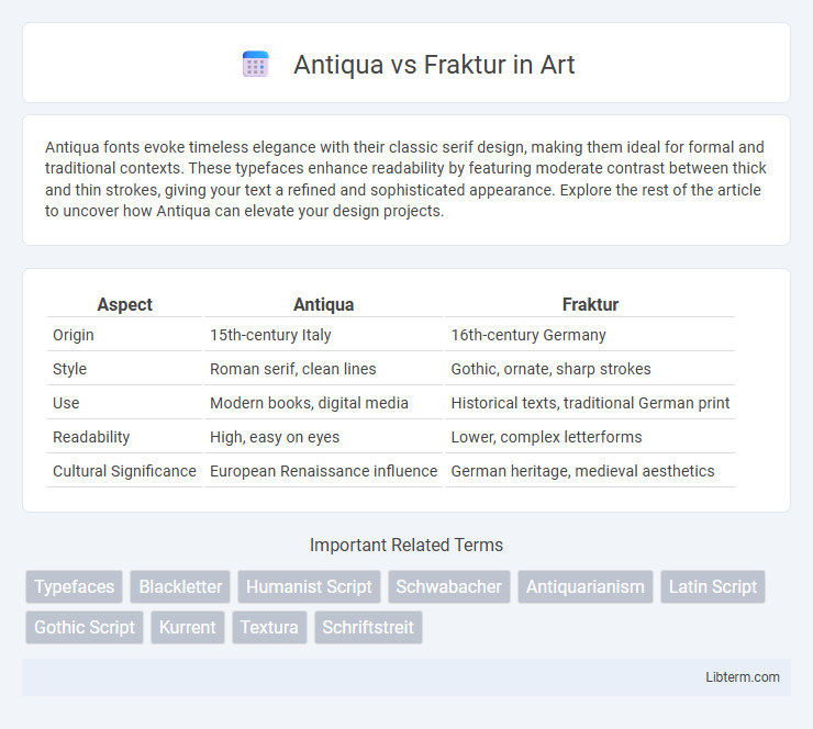
Table of Comparison
| Aspect | Antiqua | Fraktur |
|---|---|---|
| Origin | 15th-century Italy | 16th-century Germany |
| Style | Roman serif, clean lines | Gothic, ornate, sharp strokes |
| Use | Modern books, digital media | Historical texts, traditional German print |
| Readability | High, easy on eyes | Lower, complex letterforms |
| Cultural Significance | European Renaissance influence | German heritage, medieval aesthetics |
Introduction to Antiqua and Fraktur
Antiqua and Fraktur are two distinct typeface styles rooted in European typography, each representing different historical and cultural traditions. Antiqua, characterized by its Roman-inspired, serif letterforms, offers clarity and elegance, making it predominant in Western printing and digital typography. Fraktur, a blackletter script with intricate, angular strokes, reflects medieval Germanic influence and is often associated with traditional German texts and historical documents.
Historical Origins of Antiqua
Antiqua typefaces originated during the Renaissance in 15th-century Italy, inspired by classical Roman inscriptions and humanist handwriting, emphasizing elegance and readability. These fonts were developed to reflect the humanistic revival of classical antiquity, contrasting sharply with the Gothic complexity of Fraktur scripts used in German-speaking regions. Antiqua's clear and open letterforms contributed to its widespread adoption in printing, shaping modern Western typography.
Historical Development of Fraktur
Fraktur, emerging in early 16th-century Germany, evolved as a distinct blackletter typeface characterized by its sharp, angular strokes and elaborate ornamentation, differing from the more rounded and humanist Antiqua style. It gained prominence through its use in German printing presses, particularly for religious texts and official documents, cementing its association with German cultural identity. The historical development of Fraktur reflects the broader tension between traditional Gothic script styles and the Renaissance-inspired Antiqua, which emphasized clarity and classical proportions.
Key Visual Differences between Antiqua and Fraktur
Antiqua and Fraktur exhibit distinct key visual differences primarily in their letterforms and stroke styles. Antiqua features smooth, rounded shapes with clear, open counters and a more humanist, Roman influence, while Fraktur is characterized by sharp, angular strokes, elaborate swashes, and dense, broken texture with blackletter aesthetics. The contrast in Antiqua is generally moderate and consistent, whereas Fraktur displays high contrast with ornate, decorative elements that give it a Gothic, medieval appearance.
Cultural Significance in Europe
Antiqua and Fraktur typefaces hold deep cultural significance in Europe, reflecting historical identities and regional heritage. Antiqua, with its classical Roman roots, symbolizes the Renaissance humanist tradition and Western European scholarly communication, particularly in Italy and France. Fraktur, characterized by its Gothic script style, is strongly associated with German-speaking countries, embodying national pride and historical resistance to cultural homogenization during the early modern period.
Use in Print: Antiqua vs Fraktur
Antiqua typefaces dominate modern print due to their clear readability and widespread adoption in books, newspapers, and digital media, making them ideal for body text and formal documents. Fraktur, a blackletter style, was historically prominent in German-speaking countries but has limited use today, primarily appearing in decorative contexts, headlines, or cultural publications to evoke historical or traditional German aesthetics. The shift from Fraktur to Antiqua in print reflects evolving preferences for legibility and international standardization in typography.
Antiqua and Fraktur in the Digital Age
Antiqua and Fraktur represent two distinct typographic styles, with Antiqua characterized by its clean, humanist serif design, while Fraktur features elaborate, blackletter shapes rooted in Gothic script traditions. In the Digital Age, Antiqua fonts dominate online readability and digital interfaces due to their clarity and legibility across various screen resolutions and devices. Fraktur, although less common digitally, maintains cultural and historical significance in digital publishing and specialized typography projects, supported by Unicode standards and advanced font rendering technologies.
Political and Social Impact of the Antiqua-Fraktur Dispute
The Antiqua-Fraktur dispute symbolized deep cultural and political divisions in Germany, with Fraktur representing traditional German identity and Antiqua associated with modernity and internationalism. The Nazi regime initially promoted Fraktur as a marker of Aryan heritage before abruptly banning it in 1941 to facilitate communication across occupied Europe, reflecting shifting political priorities. This typographic conflict influenced social identity, educational policies, and nationalistic sentiments during the early 20th century, shaping German cultural discourse.
Modern Applications and Popularity
Antiqua typefaces dominate modern digital and print media due to their clean, legible serif design, making them popular for books, websites, and corporate branding. Fraktur, with its intricate blackletter style, remains prevalent in cultural contexts such as German heritage events, tattoos, and niche design projects seeking a historic or gothic aesthetic. While Antiqua enjoys widespread adoption across global typography, Fraktur's usage is more specialized, preserving traditional Germanic identity and artistic expression.
Conclusion: Enduring Legacies
Antiqua and Fraktur each embody distinct typographic traditions, with Antiqua representing the humanist Roman style and Fraktur reflecting Gothic blackletter design. Their enduring legacies persist in cultural identity and modern typography, as Antiqua dominates global print and digital media while Fraktur remains a symbol of German heritage and artisanal craftsmanship. The ongoing use of both scripts highlights their historical significance and influence on contemporary type design.
Antiqua Infographic