Gothic architecture is characterized by its pointed arches, ribbed vaults, and flying buttresses, creating awe-inspiring structures filled with light and intricate details. This style flourished in medieval Europe, influencing cathedrals, churches, and castles with its emphasis on verticality and ornate decoration. Discover how Gothic architecture shapes our historical and cultural heritage by exploring the rest of the article.
Table of Comparison
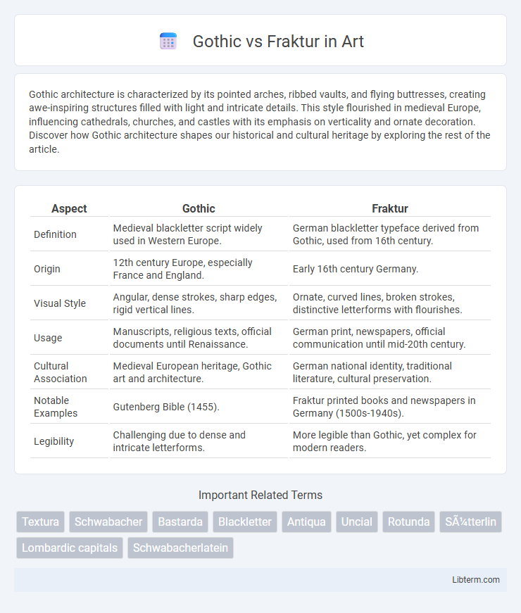
| Aspect | Gothic | Fraktur |
|---|---|---|
| Definition | Medieval blackletter script widely used in Western Europe. | German blackletter typeface derived from Gothic, used from 16th century. |
| Origin | 12th century Europe, especially France and England. | Early 16th century Germany. |
| Visual Style | Angular, dense strokes, sharp edges, rigid vertical lines. | Ornate, curved lines, broken strokes, distinctive letterforms with flourishes. |
| Usage | Manuscripts, religious texts, official documents until Renaissance. | German print, newspapers, official communication until mid-20th century. |
| Cultural Association | Medieval European heritage, Gothic art and architecture. | German national identity, traditional literature, cultural preservation. |
| Notable Examples | Gutenberg Bible (1455). | Fraktur printed books and newspapers in Germany (1500s-1940s). |
| Legibility | Challenging due to dense and intricate letterforms. | More legible than Gothic, yet complex for modern readers. |
Understanding Gothic and Fraktur: An Introduction
Gothic and Fraktur are distinct styles of blackletter typefaces originating in medieval Europe, with Gothic characterized by its dense and angular strokes, while Fraktur exhibits more elaborate and ornamental curves. Fraktur emerged in the early 16th century, becoming the predominant typeface in German-speaking regions and is noted for its broken, fractured appearance distinct from the more uniform and rigid Gothic scripts. Understanding the historical context and visual nuances of Gothic and Fraktur enhances appreciation of their cultural significance and typographic evolution.
Historical Origins of Gothic Script
Gothic script, originating in the 12th century during the High Middle Ages, evolved from Carolingian minuscule to meet the demands of increased manuscript production in Europe. This style is characterized by its dense, angular letterforms which facilitated faster writing and compact text layout, essential for copying religious and scholarly texts. Fraktur, a later development in the 16th century, adapted Gothic script with more elaborate and broken strokes, becoming the dominant typeface for German printing until the 20th century.
The Development and Evolution of Fraktur
Fraktur emerged in the early 16th century as a distinctive blackletter typeface designed to improve legibility and aesthetics compared to earlier Gothic scripts, featuring broken and curved strokes. Its evolution was marked by increased ornamentation and adaptability, which made it the predominant script in German-speaking regions for centuries, especially in printed texts such as books and official documents. The typeface's development was influenced by the Renaissance's emphasis on humanism, leading to a balance between tradition and readability that defined Fraktur's unique identity within the Gothic typographic family.
Key Visual Differences: Gothic vs Fraktur
Gothic typefaces feature uniform, block-like letterforms with simple strokes and minimal ornamentation, emphasizing readability and boldness. Fraktur typefaces exhibit intricate, broken strokes with sharp angles and decorative flourishes, especially in capital letters, creating a more ornate and textured appearance. The key visual difference lies in Gothic's straightforward, angular design versus Fraktur's elaborate, calligraphic style with distinctive split strokes.
Cultural and Regional Significance
Gothic script, originating in medieval Europe, holds strong cultural significance in Western Europe, symbolizing the Middle Ages and religious manuscripts, while Fraktur, a specific form of Blackletter, became closely associated with German-speaking regions and their national identity from the 16th century onward. Fraktur was widely used in German printing until the mid-20th century, representing tradition and regional heritage, whereas Gothic script influenced broader European literature and architecture. The distinct visual styles reflect their cultural roles: Gothic's angular, dense forms embody medieval solemnity, while Fraktur's elaborate curves carry a sense of Germanic pride and historical continuity.
Uses in Historical Texts and Documents
Gothic and Fraktur typefaces were widely used in historical texts and documents, with Gothic scripts prevalent in medieval manuscripts and early printed books across Europe. Fraktur, a specific style of Blackletter developed in the 16th century, became dominant in German-speaking regions for official documents, literature, and religious texts until the early 20th century. Both styles are characterized by their dense, angular forms, but Fraktur's more ornate features distinguish it from the broader Gothic tradition in historical print culture.
Influence on Modern Typography
Gothic and Fraktur typefaces have significantly influenced modern typography by shaping the aesthetics of blackletter and script fonts used in branding and editorial design. Gothic's clean, angular strokes inspired contemporary sans-serif typefaces emphasizing clarity and geometric forms, while Fraktur's ornate, calligraphic style informed the development of decorative and vintage-inspired fonts. This legacy persists in digital typography, where the balance of readability and historic character continues to guide type designers.
Misconceptions and Common Confusions
Gothic and Fraktur are often mistakenly used interchangeably, but Gothic refers broadly to medieval blackletter scripts while Fraktur is a specific style within that category characterized by sharp, broken strokes. Many confuse Gothic with the gothic architectural style or unrelated modern gothic aesthetics, leading to inaccurate associations. Clarifying the distinct typographic features and historical contexts of Fraktur helps dispel common misconceptions in typography and cultural heritage discussions.
Collecting and Preserving Gothic and Fraktur Manuscripts
Collecting and preserving Gothic and Fraktur manuscripts involves understanding their distinct historical and cultural contexts, with Gothic scripts originating in medieval Europe and Fraktur flourishing in early modern German-speaking regions. Careful conservation techniques, including climate control and digital archiving, help maintain the intricate blackletter forms and fragile parchment or paper mediums. Expertise in paleography and provenance research ensures the authenticity and significance of these manuscripts are preserved for academic study and cultural heritage.
The Legacy of Gothic and Fraktur in Contemporary Design
Gothic and Fraktur typefaces continue to influence contemporary design through their distinctive blackletter aesthetics, which evoke historical depth and cultural heritage. Designers integrate these styles to create bold, authentic branding and visual identities, especially in fashion, music, and packaging industries. The legacy of Gothic and Fraktur is evident in modern digital typography, where their intricate strokes and dramatic contrasts are adapted for readability and stylistic appeal.
Gothic Infographic