Italic text enhances emphasis and distinguishes words or phrases in your writing, improving readability and conveying subtle nuances. It is commonly used for titles, foreign words, or to highlight key points without overpowering the overall message. Explore the rest of this article to discover effective techniques for using italic formatting in your text.
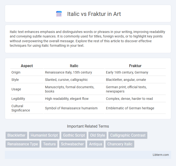
Table of Comparison
| Aspect | Italic | Fraktur |
|---|---|---|
| Origin | Renaissance Italy, 15th century | Early 16th century, Germany |
| Style | Slanted, cursive, calligraphic | Blackletter, angular, ornate |
| Usage | Manuscripts, formal documents, books | German print, official texts, newspapers |
| Legibility | High readability, elegant flow | Complex, dense, harder to read |
| Cultural Significance | Symbol of Renaissance humanism | Emblematic of German heritage |
Introduction to Italic and Fraktur Scripts
Italic and Fraktur are distinctive calligraphic styles with rich historical significance in Western typography. Italic script, originating in the Renaissance, is characterized by its slanted, cursive letters designed for readability and elegance in handwriting and print. Fraktur, a form of blackletter typeface from the early 16th century, features broken, angular strokes widely used in German texts, symbolizing tradition and cultural identity.
Historical Origins of Italic and Fraktur
Italic type originated in early 16th-century Italy, developed by Aldus Manutius to mimic the handwriting style of Italian Renaissance humanists, emphasizing elegance and readability. Fraktur emerged in early 16th-century Germany, rooted in Gothic scripts and characterized by its broken, angular strokes used primarily in German-speaking regions for printed texts. Both scripts reflect distinct cultural and aesthetic values of their respective periods and regions, with Italic linked to Renaissance humanism and Fraktur to Germanic tradition.
Key Characteristics of Italic Style
Italic style features a distinct rightward slant and cursive letterforms designed for fluidity and emphasis in text. Its key characteristics include angled strokes, a dynamic flow resembling handwriting, and often more compact spacing compared to upright Roman typefaces. This style enhances readability in printed materials by providing visual contrast and highlighting important content.
Distinctive Features of Fraktur Typography
Fraktur typography is characterized by its blackletter style with sharp, angular strokes and elaborate serifs, distinguishing it from the smooth, flowing curves of Italic scripts. Its letters often feature broken or fractured lines, creating a dense and textured appearance unique to German print traditions. The typeface emphasizes verticality and ornate detailing, making it highly recognizable in historical and decorative contexts.
Geographic and Cultural Influences
Italic script, originating from Renaissance Italy, reflects the region's emphasis on humanism and clarity, spreading mainly throughout Southern Europe and influencing modern Western calligraphy. Fraktur, developed in Germany during the early 16th century, embodies the Gothic tradition and became a symbol of Germanic identity, persisting in Central Europe's printed texts well into the 20th century. Geographic isolation and cultural nationalism played crucial roles in maintaining Fraktur's dominance in German-speaking regions, contrasting with Italic's broader adoption across Latin-based languages.
Usage in Printing and Manuscripts
Italic typefaces, characterized by their slanted and cursive style, were widely used in Renaissance printing for emphasis and to denote foreign words, enhancing readability in printed texts. Fraktur, a form of blackletter script with fractured and angular strokes, dominated German manuscripts and printed materials from the 16th to the early 20th century, symbolizing tradition and national identity. While Italic became standard in Latin-script publications for its elegance and clarity, Fraktur remained prevalent in historical German documents, religious texts, and official decrees before gradually being replaced by Antiqua typefaces in modern printing.
Readability and Legibility Comparison
Italic fonts enhance readability by offering clear, slanted letterforms that guide the eye smoothly across text, making them ideal for emphasis and continuous reading. Fraktur, with its intricate, blackletter style and sharp angular shapes, often reduces legibility, especially in smaller sizes or digital displays, due to its dense and ornate strokes. Studies show that italic typefaces outperform Fraktur in quick text recognition and comprehension, highlighting the importance of font choice in user experience design.
Modern Applications and Revivals
Italic typefaces continue to be widely used in modern digital publishing, graphic design, and branding for emphasizing text and adding elegance to layouts. Fraktur, a historical blackletter script, experiences revitalization through niche applications such as tattoo art, logo design for cultural or traditional products, and contemporary typography projects seeking Gothic or medieval aesthetics. Both styles benefit from digital font foundries offering high-quality, versatile versions, making them accessible for diverse modern uses.
Influence on Contemporary Typeface Design
Italic and Fraktur styles have significantly influenced contemporary typeface design by introducing unique aesthetic and functional elements. Italic's slanted, cursive forms inspire modern fonts' elegance and readability, while Fraktur's intricate, blackletter features are often adapted in display typefaces to evoke historical or Gothic themes. These styles continue to shape digital typography, blending tradition with innovation in branding and editorial design.
Conclusion: Choosing Between Italic and Fraktur
Choosing between Italic and Fraktur depends largely on the intended context and audience of the text. Italic typefaces offer a modern, readable style suitable for emphasis and flow in contemporary documents. Fraktur, with its historical and ornamental characteristics, is best reserved for decorative or culturally specific designs that evoke Germanic heritage.
Italic Infographic