Roman Square Capitals, also known as Capitalis Monumentalis, are a classical script characterized by their elegant, geometric letterforms used in ancient Roman inscriptions. This style features sharp serifs, balanced proportions, and a formal appearance that conveys a sense of timeless authority and clarity. Discover how mastering Roman Square Capitals can enhance your understanding of typography and historical design by exploring the rest of this article.
Table of Comparison
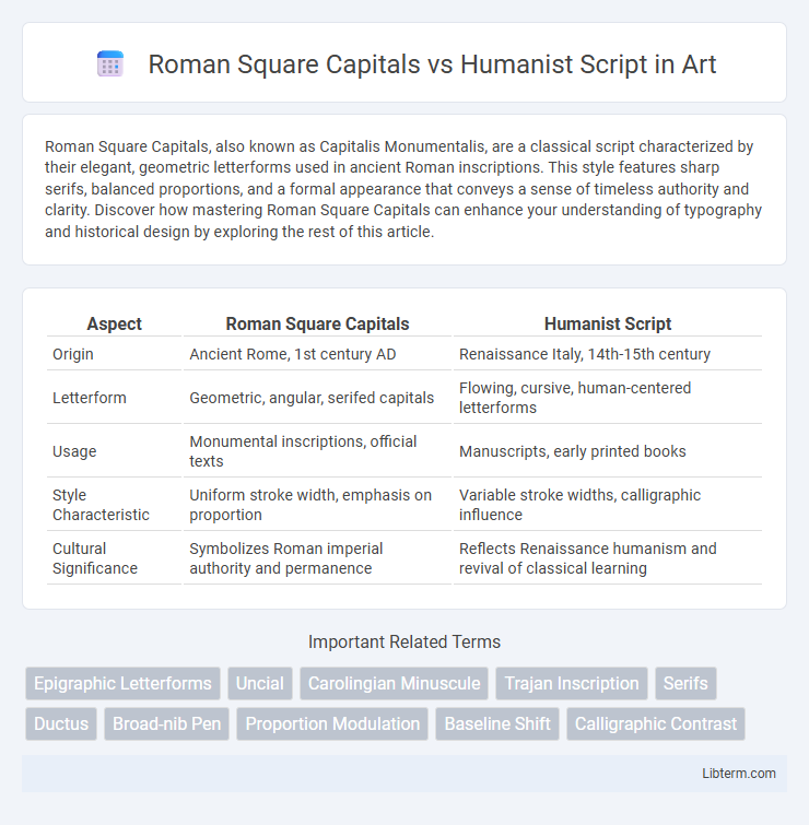
| Aspect | Roman Square Capitals | Humanist Script |
|---|---|---|
| Origin | Ancient Rome, 1st century AD | Renaissance Italy, 14th-15th century |
| Letterform | Geometric, angular, serifed capitals | Flowing, cursive, human-centered letterforms |
| Usage | Monumental inscriptions, official texts | Manuscripts, early printed books |
| Style Characteristic | Uniform stroke width, emphasis on proportion | Variable stroke widths, calligraphic influence |
| Cultural Significance | Symbolizes Roman imperial authority and permanence | Reflects Renaissance humanism and revival of classical learning |
Introduction to Roman Square Capitals and Humanist Script
Roman Square Capitals, characterized by their precise geometric forms and majestic proportions, served as the epitome of classical Roman inscriptions, reflecting clarity and authority. Humanist Script emerged during the Renaissance, inspired by the clarity and balance of Roman Square Capitals but adapted for faster handwriting with more fluid, human-centered letterforms. Both scripts symbolize the evolution of Western calligraphy, blending aesthetic beauty with functional communication.
Historical Origins and Evolution
Roman Square Capitals originated in ancient Rome, primarily used for monumental inscriptions during the early centuries AD, characterized by their geometric precision and uniform stroke weight. In contrast, Humanist Script emerged in 15th-century Italy during the Renaissance, inspired by the classical Roman inscriptions but evolving into a more fluid, cursive handwriting that emphasized readability and elegance. The evolution of Humanist Script marked a shift from rigid formalism towards a script that influenced modern typefaces, blending classical heritage with human-centered design principles.
Key Characteristics of Roman Square Capitals
Roman Square Capitals feature uniform, geometric letterforms with sharp serifs and consistent stroke widths, emphasizing clarity and formality. These inscriptions showcase precise proportions and strong vertical lines, often engraved in stone for monumental texts. Their design prioritizes legibility and timeless elegance, contrasting with the more fluid, calligraphic style of Humanist Script.
Key Features of Humanist Script
Humanist Script is characterized by its clear, rounded letterforms inspired by Carolingian minuscule, promoting legibility and elegance. Unlike the rigid, formal geometry of Roman Square Capitals, Humanist Script exhibits more fluid strokes and moderate contrast between thick and thin lines. Its emphasis on natural proportions and open apertures makes it highly readable and influential in the development of modern typefaces.
Influences of Roman Square Capitals on Later Typography
Roman Square Capitals, characterized by their geometric precision and elegant proportions, profoundly influenced the development of later typography by establishing foundational letterforms that emphasized clarity and harmony. These capitals inspired Humanist Script, which adapted their structural principles but introduced more fluid, calligraphic strokes reflecting Renaissance humanism and a revived interest in classical antiquity. The synthesis of Roman Square Capitals' formal qualities with the organic rhythm of Humanist Script paved the way for the evolution of serif typefaces used in modern print and digital typography.
Humanist Script’s Impact on Renaissance Calligraphy
Humanist Script revolutionized Renaissance calligraphy by emphasizing clarity, proportion, and elegance, inspired by the ancient Roman Square Capitals yet designed for practical use in everyday writing. This script introduced a more fluid and legible form, influencing the development of modern Roman typefaces and shaping the visual language of the Renaissance period. Its blend of classical aesthetics with humanist ideals marked a pivotal shift from the formal rigidity of Roman Square Capitals to a more expressive and accessible form of handwriting.
Visual Comparison: Structure and Proportion
Roman Square Capitals exhibit rigid, geometric structure with uniform stroke widths and precise, symmetrical proportions, emphasizing clarity and monumentality. Humanist Script features more fluid, organic shapes with varied stroke thickness and slightly irregular proportions, reflecting natural handwriting and emphasizing readability. The contrast highlights Roman Square Capitals' formal, architectural qualities against Humanist Script's elegant, human-centered approach.
Cultural and Artistic Significance
Roman Square Capitals epitomize classical Roman heritage, characterized by precise geometric forms and monumental inscriptions that symbolize authority and permanence in Western art. Humanist Script emerged during the Renaissance, reflecting a revival of classical learning and emphasizing legibility, elegance, and the democratization of knowledge through manuscript culture. The artistic significance of Roman Square Capitals lies in their influence on modern typography, while Humanist Script represents a cultural shift toward human-centered expression and intellectual rebirth.
Modern Applications and Revivals
Roman Square Capitals, characterized by their geometric precision and classical proportions, are frequently employed in architectural inscriptions, luxury branding, and digital typography to evoke timeless elegance and authority. Humanist Script, inspired by Renaissance manuscripts, finds modern use in editorial design, wedding invitations, and digital interfaces that seek a blend of warmth, readability, and historical authenticity. Contemporary revivals of both styles leverage advanced typeface technologies and variable fonts to adapt their distinct aesthetics across print and digital media, enhancing cultural resonance and visual impact.
Conclusion: Legacy of Roman and Humanist Letterforms
Roman Square Capitals established the foundation for Western typography with their geometric precision and monumental form, influencing inscriptions and formal texts for centuries. Humanist script revived classical ideals through a more readable, flowing style, laying the groundwork for modern serif typefaces and Renaissance calligraphy. The enduring legacy of these letterforms lies in their combined impact on typography, blending structural clarity with human-centered design principles that continue to shape contemporary typeface development.
Roman Square Capitals Infographic