Monochromatic color schemes use variations in lightness and saturation of a single hue to create a harmonious and cohesive design. These palettes enhance visual unity while allowing dynamic contrasts through different tones, shades, and tints. Discover how to effectively apply monochromatic colors to elevate Your creative projects by reading the full article.
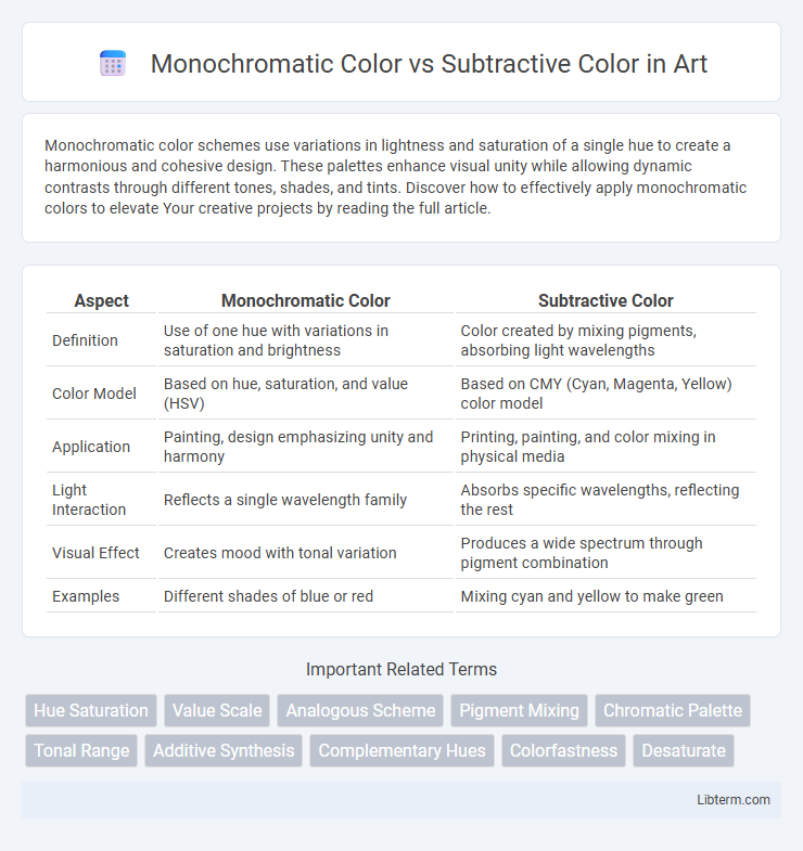
Table of Comparison
| Aspect | Monochromatic Color | Subtractive Color |
|---|---|---|
| Definition | Use of one hue with variations in saturation and brightness | Color created by mixing pigments, absorbing light wavelengths |
| Color Model | Based on hue, saturation, and value (HSV) | Based on CMY (Cyan, Magenta, Yellow) color model |
| Application | Painting, design emphasizing unity and harmony | Printing, painting, and color mixing in physical media |
| Light Interaction | Reflects a single wavelength family | Absorbs specific wavelengths, reflecting the rest |
| Visual Effect | Creates mood with tonal variation | Produces a wide spectrum through pigment combination |
| Examples | Different shades of blue or red | Mixing cyan and yellow to make green |
Introduction to Monochromatic and Subtractive Color
Monochromatic color schemes consist of various shades, tints, and tones of a single hue, creating a cohesive and harmonious visual effect. Subtractive color mixing involves combining cyan, magenta, and yellow pigments, absorbing specific wavelengths of light to produce a wide range of colors commonly used in printing. Understanding the distinction between monochromatic color and subtractive color is essential for designers working in both digital and traditional media.
Defining Monochromatic Color Schemes
Monochromatic color schemes are composed of varying tints, tones, and shades derived from a single base hue, creating harmonious and visually cohesive designs. These schemes emphasize consistency by blending different lightness and saturation levels of one color, enhancing depth and contrast without introducing multiple hues. Unlike subtractive color mixing, which combines cyan, magenta, and yellow to produce a broad color range in printing and pigment applications, monochromatic schemes focus strictly on variations within one hue for simplicity and elegance in art and design.
Understanding Subtractive Color Mixing
Subtractive color mixing involves combining cyan, magenta, and yellow pigments to absorb specific wavelengths of light, resulting in various colors by subtracting wavelengths from white light. Unlike monochromatic color schemes that use variations of a single hue, subtractive mixing relies on layering physical inks or paints to produce a wide color spectrum through light absorption. This process is fundamental in printing, where precise pigment balances create accurate color reproductions on paper.
Key Differences Between Monochromatic and Subtractive Color
Monochromatic color involves variations in lightness and saturation of a single hue, creating a cohesive and harmonious palette ideal for minimalist design. Subtractive color, based on mixing pigments like cyan, magenta, and yellow, produces color by absorbing wavelengths, essential in printing and painting. Key differences lie in monochromatic's single base hue focus versus subtractive color's combination of multiple pigments to create a broad color spectrum.
Applications of Monochromatic Color in Design
Monochromatic color schemes in design utilize variations in lightness and saturation of a single hue, creating cohesive and visually harmonious compositions ideal for branding and user interfaces. These applications enhance focus and readability by reducing visual clutter and emphasizing content through subtle contrast. Designers often apply monochromatic palettes in minimalistic layouts, product packaging, and interior design to evoke elegance and simplicity.
Uses of Subtractive Color in Art and Printing
Subtractive color, achieved by mixing cyan, magenta, and yellow pigments, is essential in art and printing for creating a wide color gamut through pigment absorption and light reflection. This method is primarily utilized in painting, where mixing physical pigments produces various hues, and in color printing processes such as CMYK, enabling precise reproduction of images and vibrant designs on paper. Unlike monochromatic color schemes focusing on variations of a single hue, subtractive color facilitates full-color imagery critical for realistic and dynamic visual presentations.
Visual Impact: Monochromatic vs Subtractive Color Schemes
Monochromatic color schemes utilize variations in lightness and saturation of a single hue, creating a harmonious and cohesive visual impact that enhances simplicity and elegance. Subtractive color schemes, based on mixing pigments like cyan, magenta, and yellow, produce a broader range of colors with deeper, richer tones that emphasize contrast and vibrancy in printed media. The visual impact of monochromatic schemes relies on subtlety and unity, while subtractive colors deliver intensity and dynamic interaction between multiple hues.
Advantages and Limitations of Monochromatic Color
Monochromatic color schemes offer visual harmony and simplicity by using variations in lightness and saturation of a single hue, enhancing focus and reducing visual clutter. This approach is advantageous in design for creating cohesive and elegant aesthetics but is limited by its lack of color diversity, which can lead to monotony and reduced emotional impact. In contrast, subtractive color involves mixing pigments (cyan, magenta, yellow) to produce a broad range of colors, providing greater color variety but potentially complicating design coherence.
Pros and Cons of Subtractive Color Techniques
Subtractive color techniques, primarily used in printing and painting, involve mixing cyan, magenta, and yellow pigments to absorb light and create various hues, offering a wide color range and cost-effective reproduction on physical media. However, these methods can suffer from color inaccuracies due to ink impurities and paper quality, leading to less vibrant results compared to additive color models. Despite the limitations, subtractive color systems excel in producing durable, tangible artwork and printed materials essential for commercial and artistic applications.
Choosing the Right Color Approach for Your Project
Monochromatic color schemes, built from variations of a single hue's intensity and brightness, promote visual harmony and simplicity, ideal for projects requiring a cohesive and elegant look. Subtractive color mixing, based on combining cyan, magenta, and yellow pigments, is essential for print media, enabling accurate color reproduction through physical inks. Selecting the right approach depends on the project medium: digital designs benefit from monochromatic palettes for clarity, while printed materials require subtractive color methods for precise color accuracy.
Monochromatic Color Infographic